Клиент
"Золотой Колос"
Рабочая группа
Alexey Lysogorov | art director, graphic designer
Задача
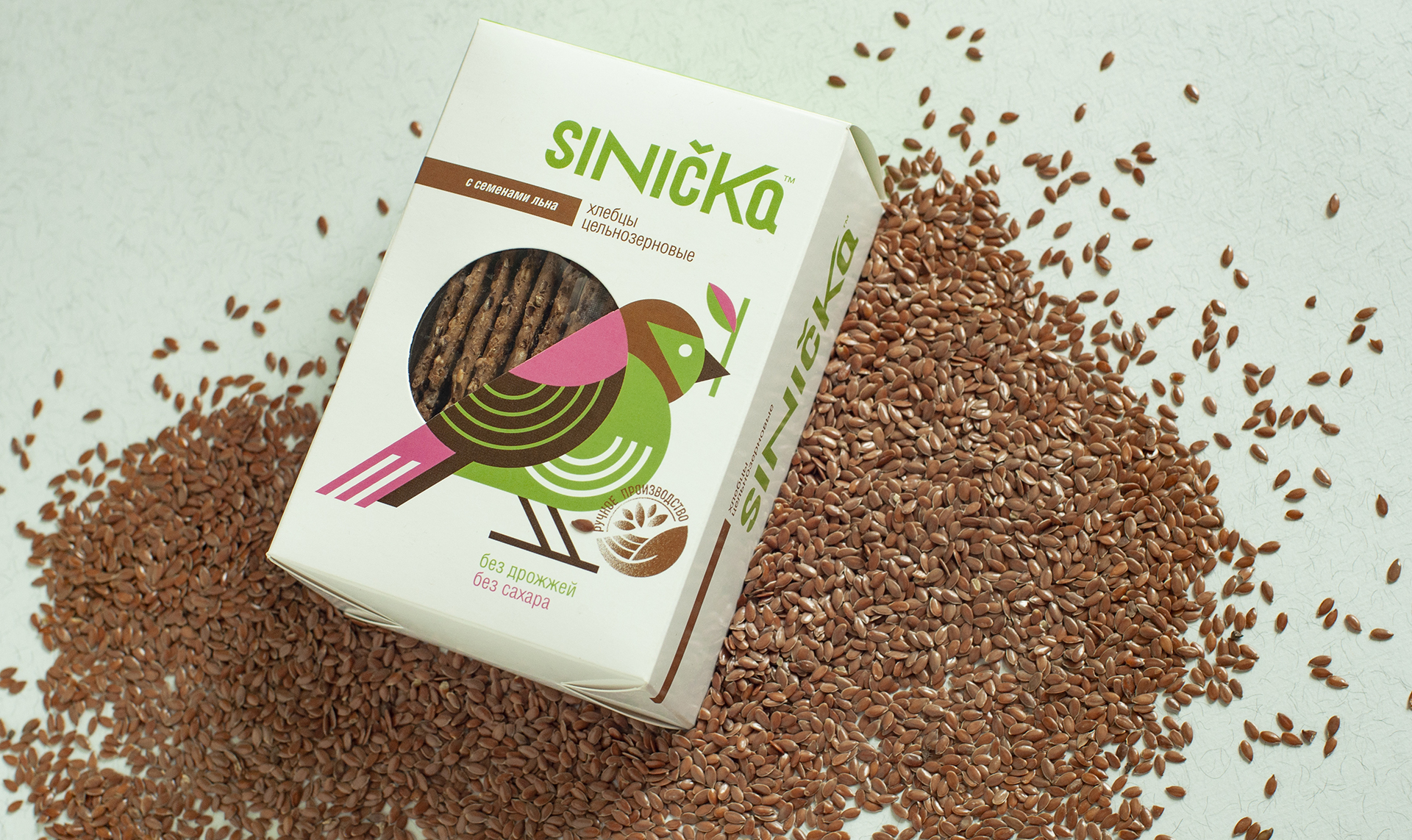
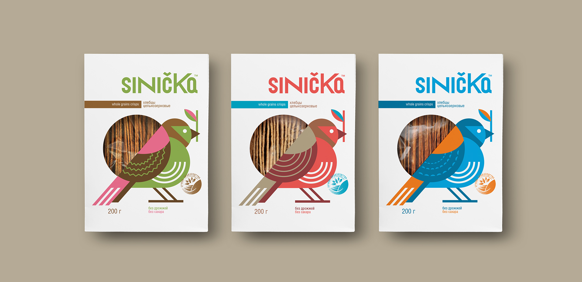
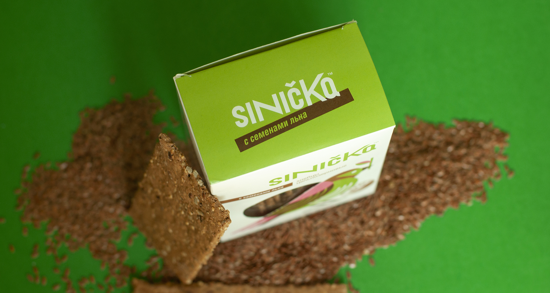
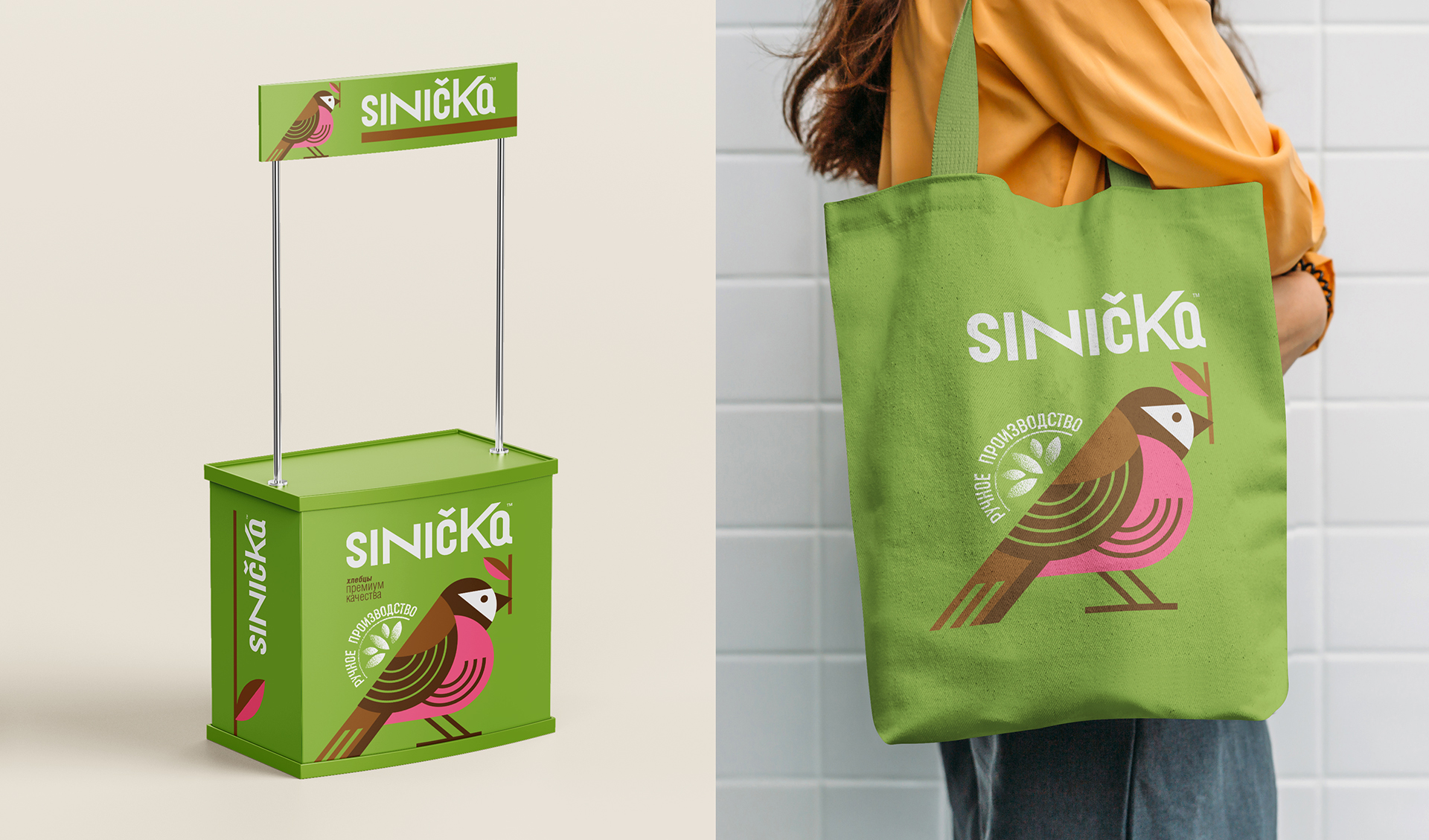
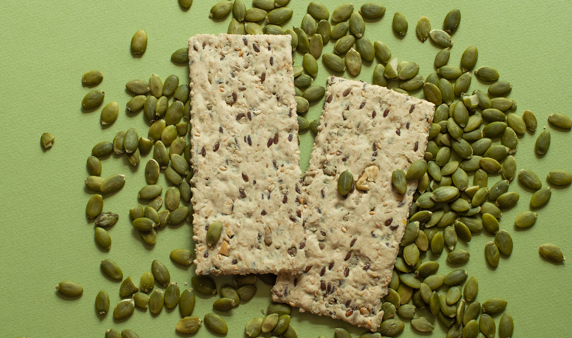
A product from the Kyrgyz Republic: a mini-series of special breads with sesame seeds and pumpkin seeds. The branding work consisted of market research, positioning, naming, visual language and packaging design.
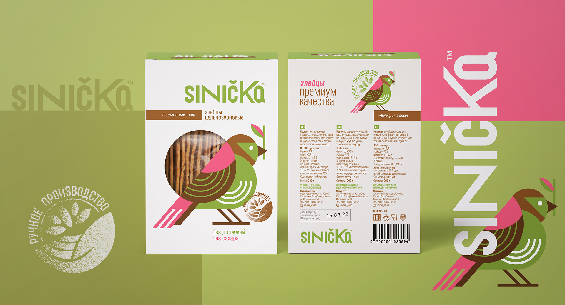
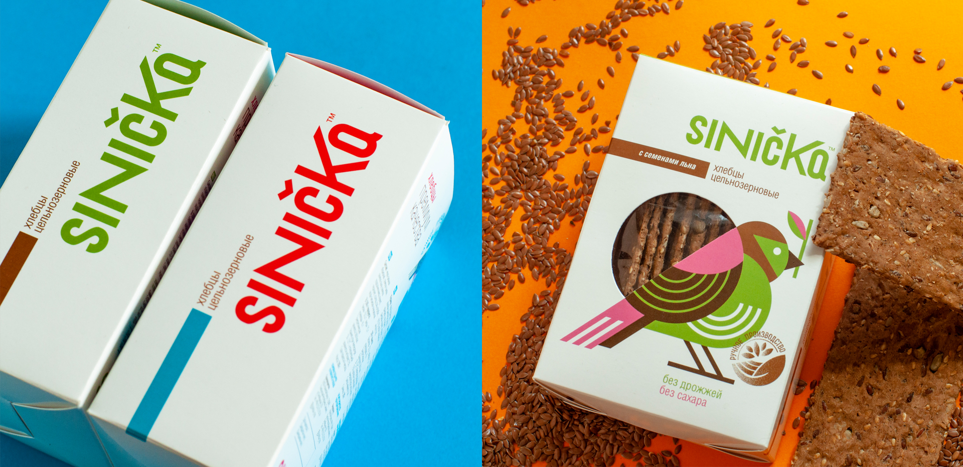
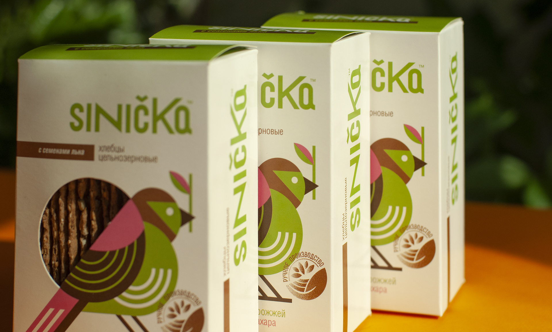
Naming and positioning: The original name “Sinička” associative with birds, and at the same time giving the impression of a European export product. Why a bird? Birds cannot be deceived – they select only natural selected grain for themselves. And this is the main message of the brand – the use of selected grain and manual labor in production. The design style was chosen for a more advanced audience who are willing to pay a little more for a very special handmade product.
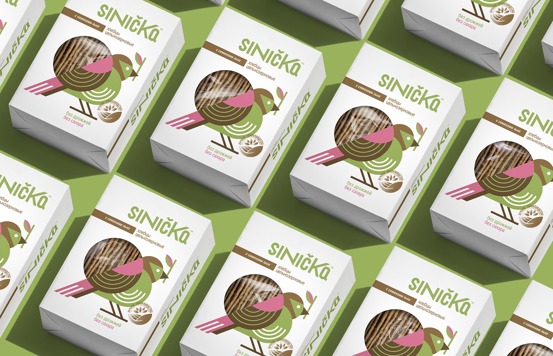
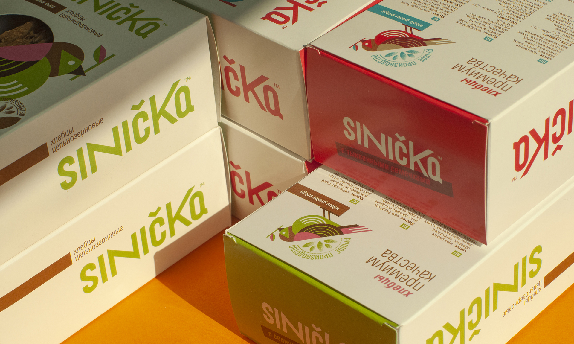
Visual Solution: A modern logo typeface with variable letterforms and a stylised bird. The shape of the cut-out window was originally incorporated into the design, for the visibility of the product itself. The attractive real product is honestly visible through the bird picking the beans. The series is easy to expand by simply shifting the colour scheme.
Recognition and trust. After the launch of the product, it quickly became recognisable, thanks to the naming and the clear image of the bird you feel sympathy for. In addition, the honest look of the loaves in the window on the package speaks louder in this design. The program of product tasting at points of sale (in the country’s large supermarkets) also contributed to the audience’s understanding of the quality of bread and the taste characteristics of the product.