Branding of Qaragandy Region
Клиент
SEC Saryarka
Рабочая группа
Creative director – Bakhytzhan Salikhov
Art Director – Olga Cheglakova
Art Director – Gulim Almabayeva
Project Manager – Elena Utyasheva
Account Manager – Svetlana Coi
Задача
THE PROBLEM
Although the Karaganda Region: has a number of unique advantages, is situated in the center of the country and continent, and has a developed industry and rich reserves of mineral resources, it cannot attract a sufficient number of investors and tourists.
THE TASK
Build a unique and attractive brand for the region and its identity is to be used in the promotion within the country and abroad.
THE SOLUTION
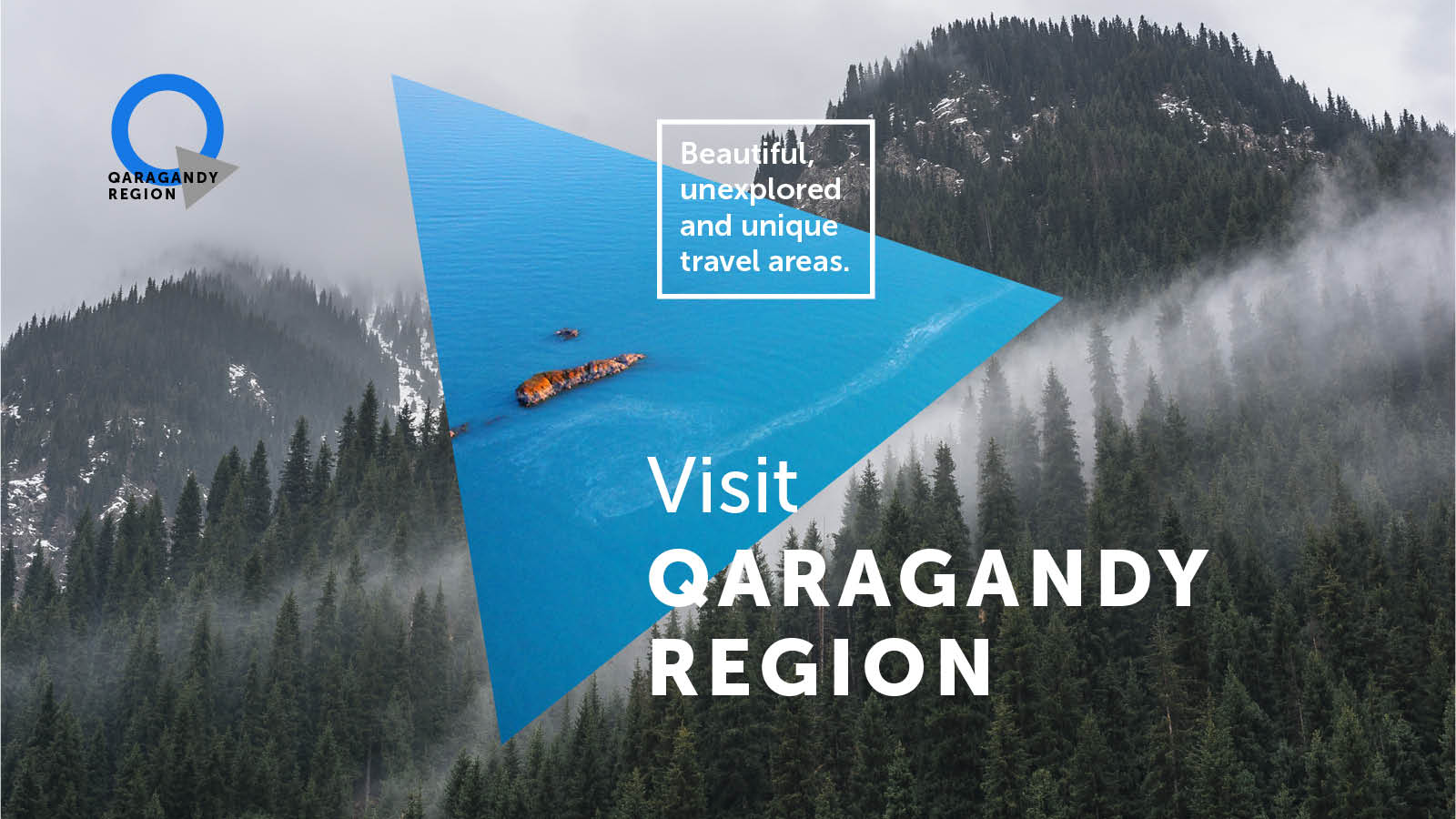
While creating the logo of the tourist and investment attractiveness of Qaragandy Region, we clearly imagined that it would be a symbol of the largest region in Kazakhstan, a visual image of its interesting multifaceted history and the people living here.
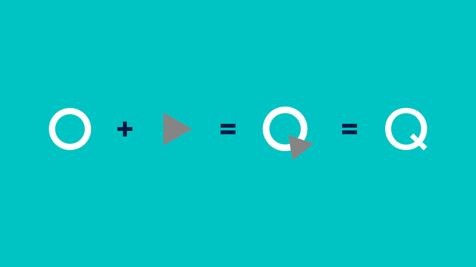
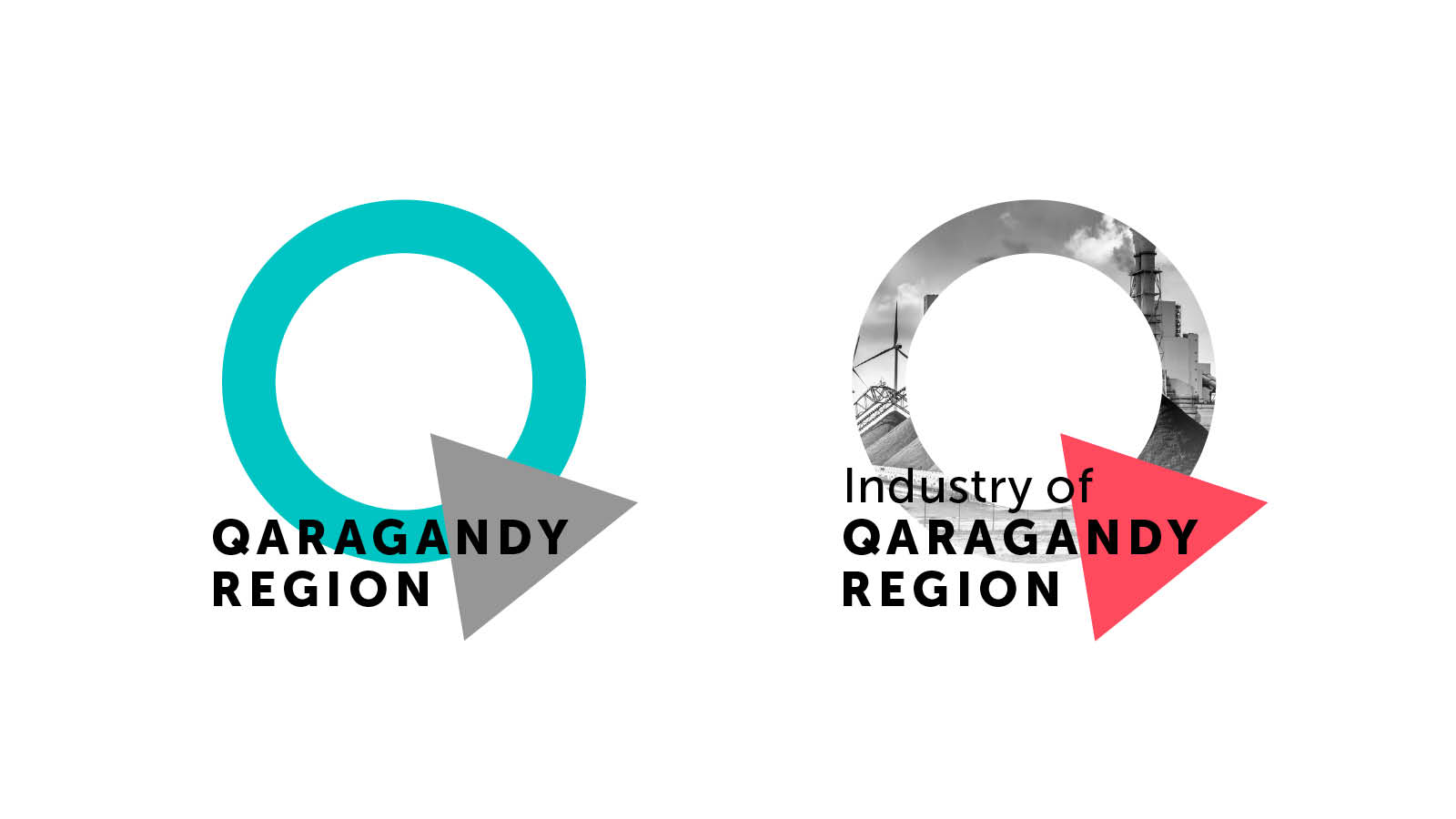
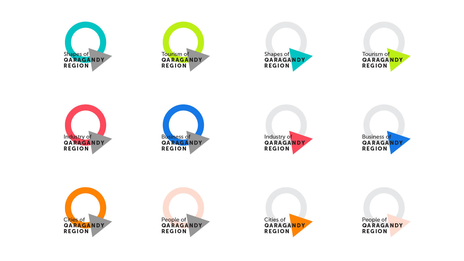
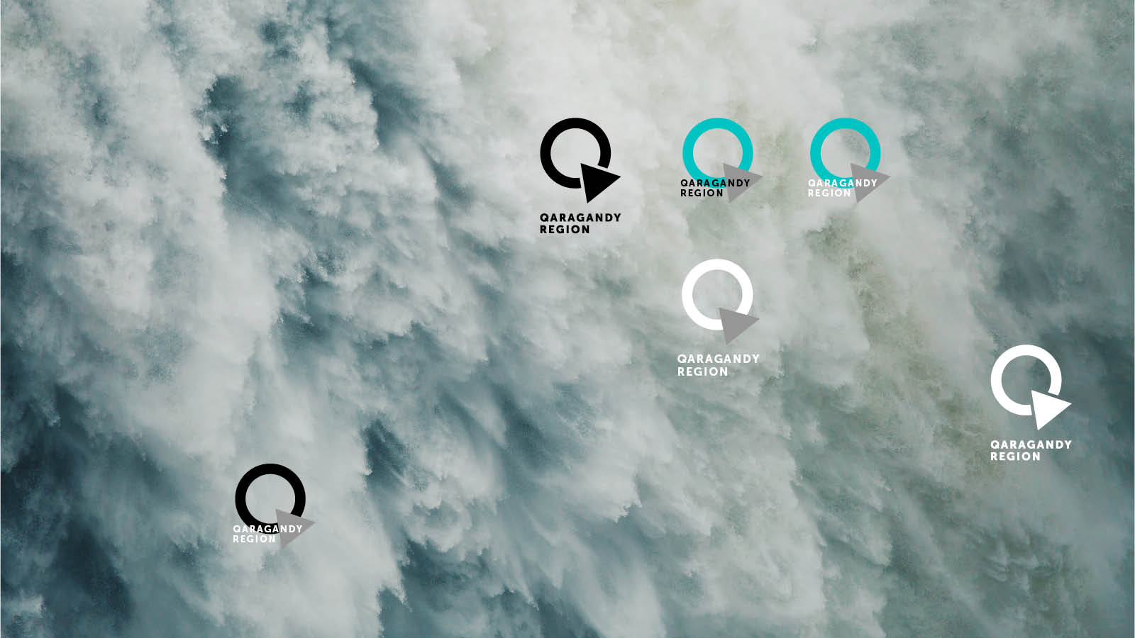
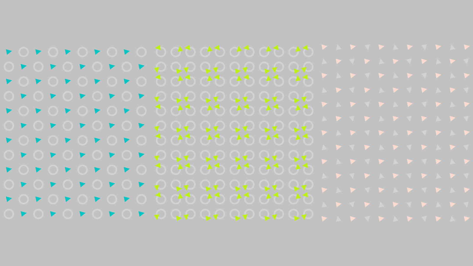
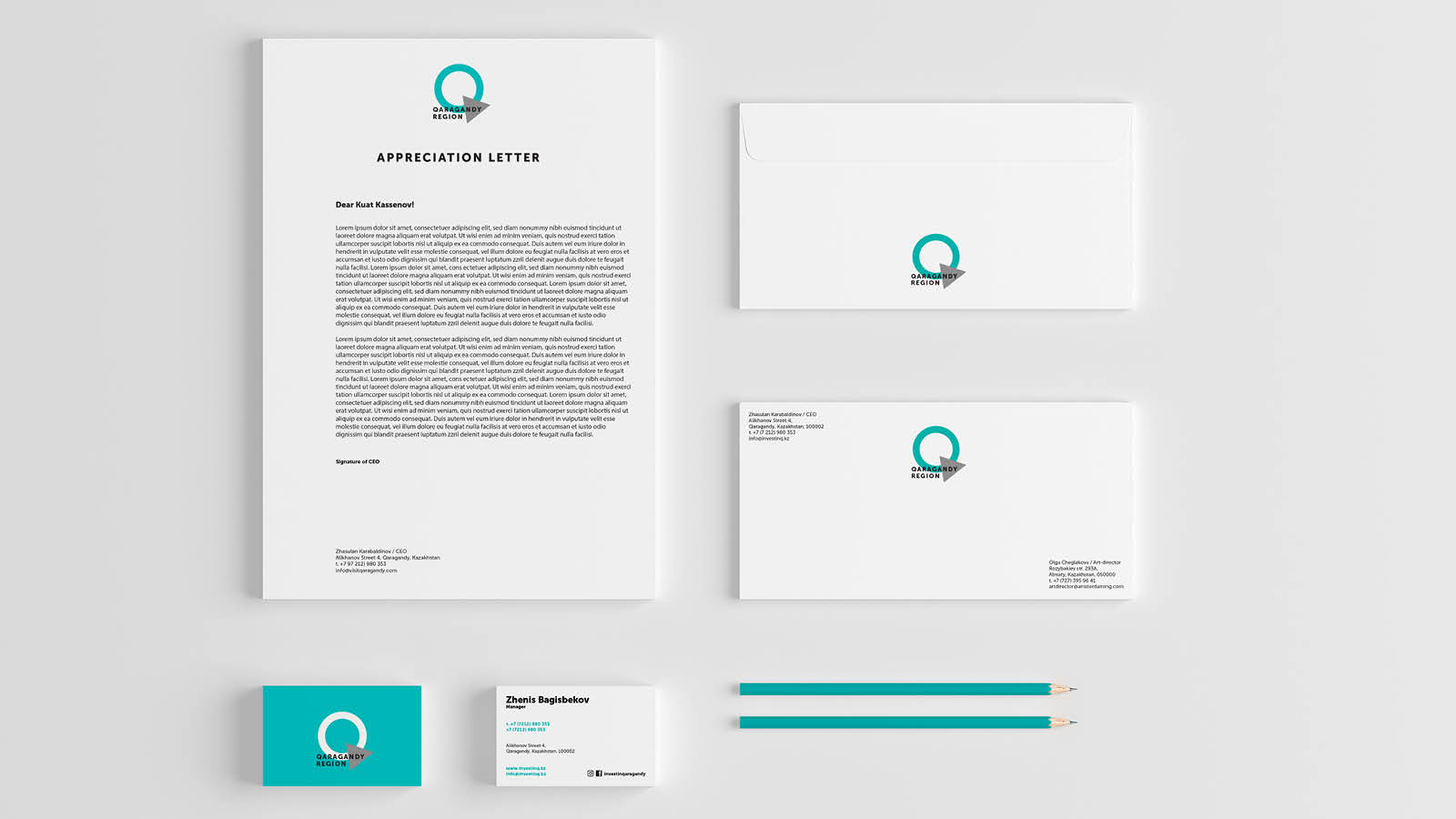
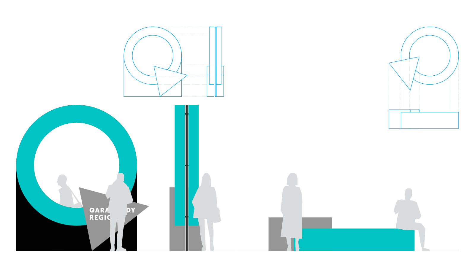
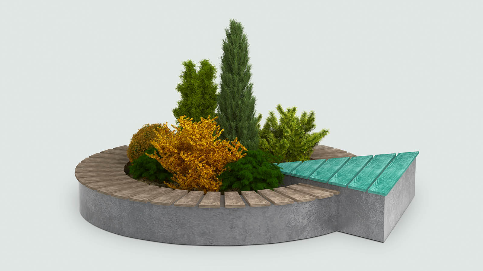
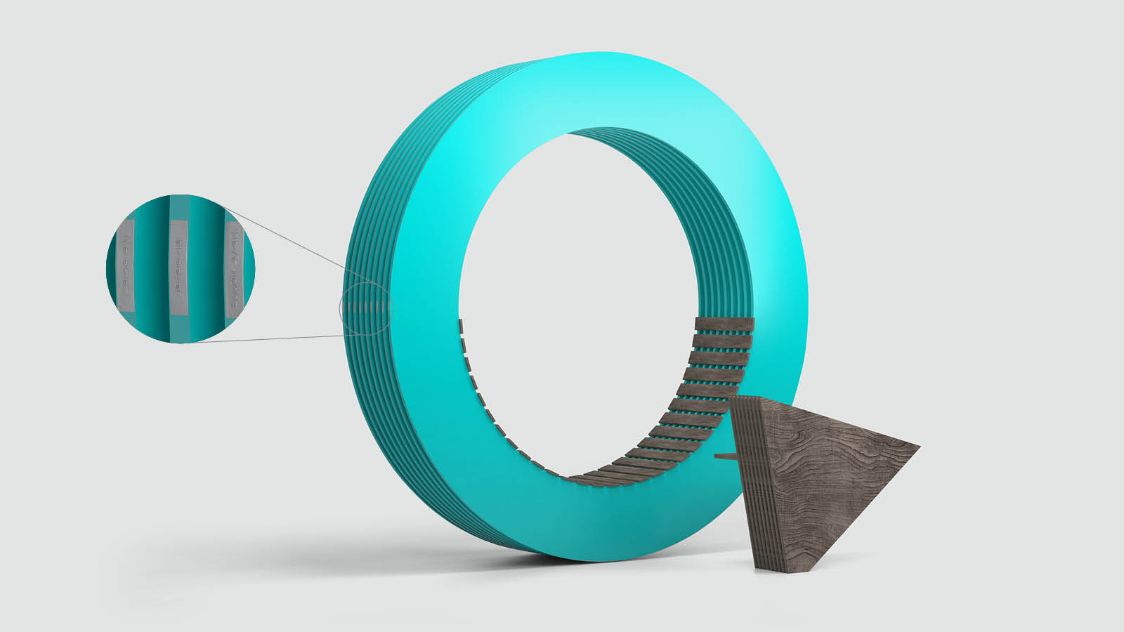
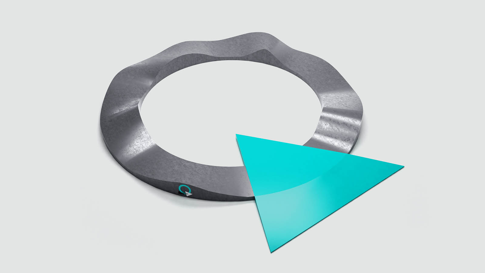
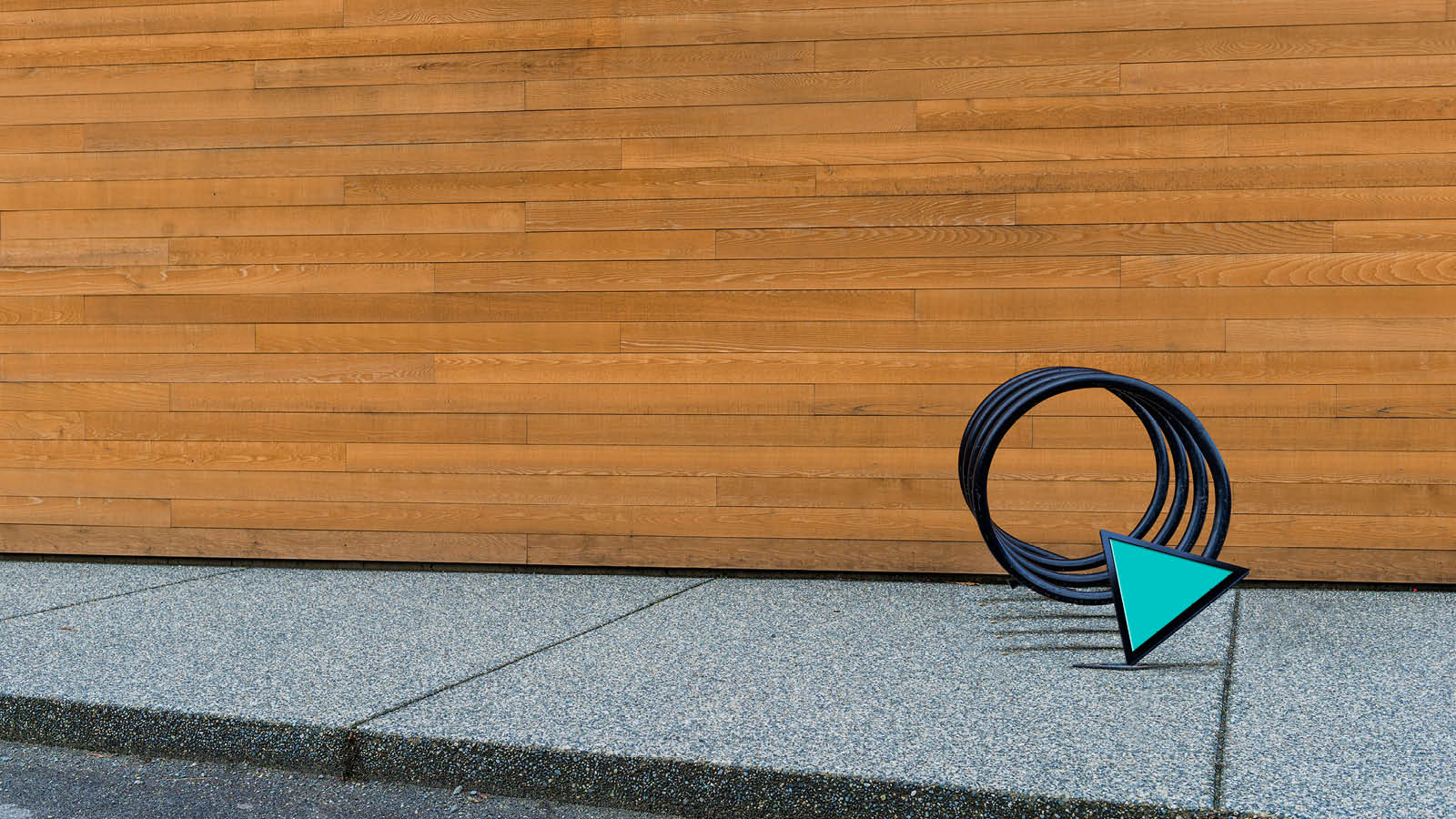
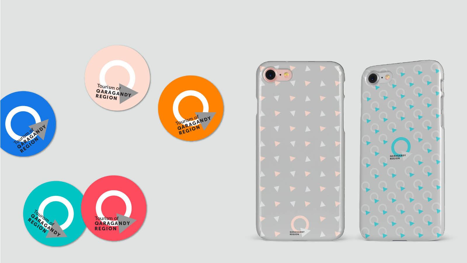
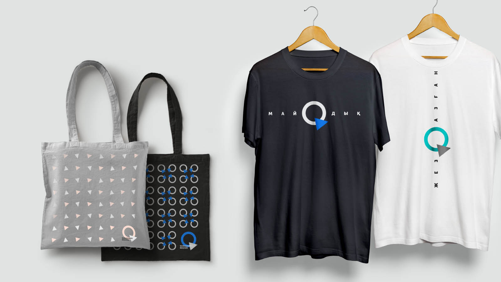
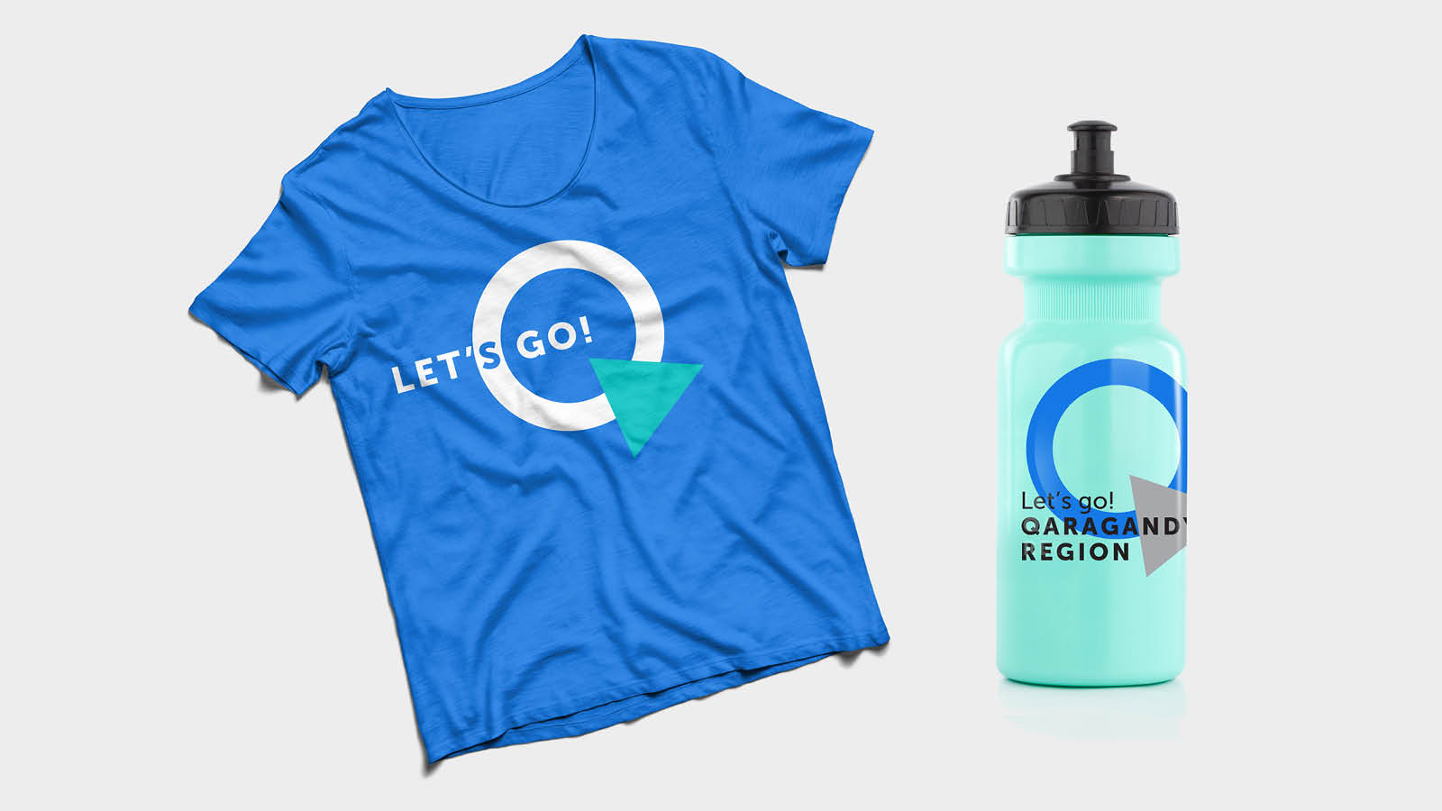
A shape creates images and therefore we have chosen three shapes as the logo of Qaragandy Region – a circle, a triangle and a rectangle. In our brand identity, the circle and the triangle are the main shapes and they form a “Q” symbol, the first letter of the region name in Kazakh in the Latin alphabet.
The rectangle appears only as part of the promotion campaign.
The form always has content, so we can fill in the circle and triangle with various images, and every time show a new aspect of the Qaragandy Region, while the rectangle will be filled in with text content - information, description of things depicted in other shapes.
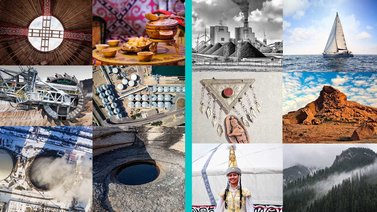
The circle shape is associated with shanyrak(1), a yurt(2), the world, the Kazakh word “Ainalaiyn”!
The triangle is one of the most ancient and most universal symbols. The sacral meaning of the figure three – three zhuzes(3) (үш жүз), three bies(4) (үш би), three virtues (үш қасиет) and much more are ingrained into the Kazakh culture as a whole.
The circle symbolizes dynamics, while the triangle symbolizes stability. By combining these two shapes, we got an even more universal and stable symbol – the symbol of the Qaragandy Region.
At the beginning, we have add an explanation to the symbol in the textual form - Qaragandy region - and we get the main logo.
Subsequently, as recognition increases, only a symbol will remain.
RESULTS
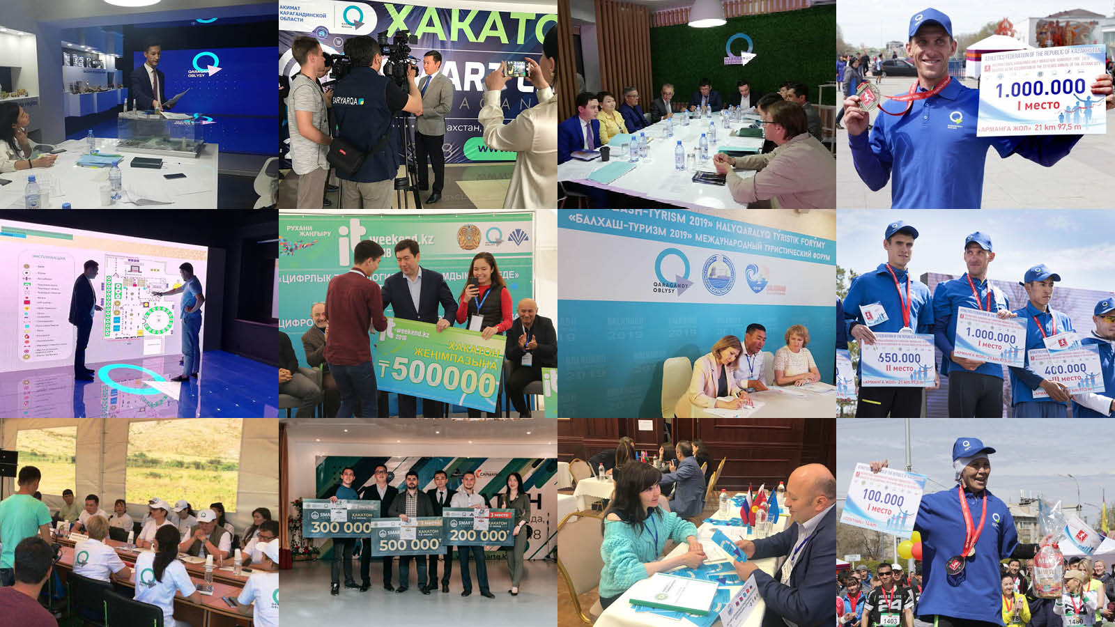
Upon approval, the logo of tourist and investment attractiveness of the Qaragandy Region started to be actively used: in the design of public and government-held events (Karaganda City Marathon, Hackathons, Jezkiik festival, etc.), in the design of pages on social media (https://www.facebook.com/InvestinQaragandy/ , https://www.facebook.com/TravelinQaragandy/ etc.)
The new identity of the region was used in 24 videos for social media, in 2 films devoted to tourist and investment attractiveness released in four languages – Kazakh, Russian, English and Chinese, it appeared on official documents and letterheads for more than 60 events, and was used more than 5 times during international events abroad (Russia, Armenia, China, Japan, etc.)
(1) Shanyrak is a circle-shaped structural part topping the yurt’s dome
(2) Yurt is a portable, round tent covered with skins or felt and used as a dwelling by Kazakhs.
(3) Zhuzes – Kazakh tribal unions.
(4) Bies – “judges” in Kazakh.