Silkavia. Silky smooth flights
Клиент
Uzbekistan Airports LLC
Рабочая группа
MA'NO Branding:
Vlad Zamanov, Livery & concept Designer
Elina Ibragimova, CEO
Temur Sagdiev, Design Director
Zokir Khalmatov, Art Director
Adelya Uzyakova, Client Service Director
Mansur Nabiev, Lead designer
Anastasia Kim, designer
Murat Risbikov, Graphic & Motion designer
Artyom Golubev, 3-d, motion & graphic designer
Alina Vagapova, Graphic designer
Zokhir Bozorov, Graphic designer
Svetlana Sarjan, Illustrator
Valentina Korobkina, Strategist
Alyona Matyushina, Project manager
Bonu Khanbabaeva, Project Manager
Music by Alexander Sukharev
Задача
Brief:
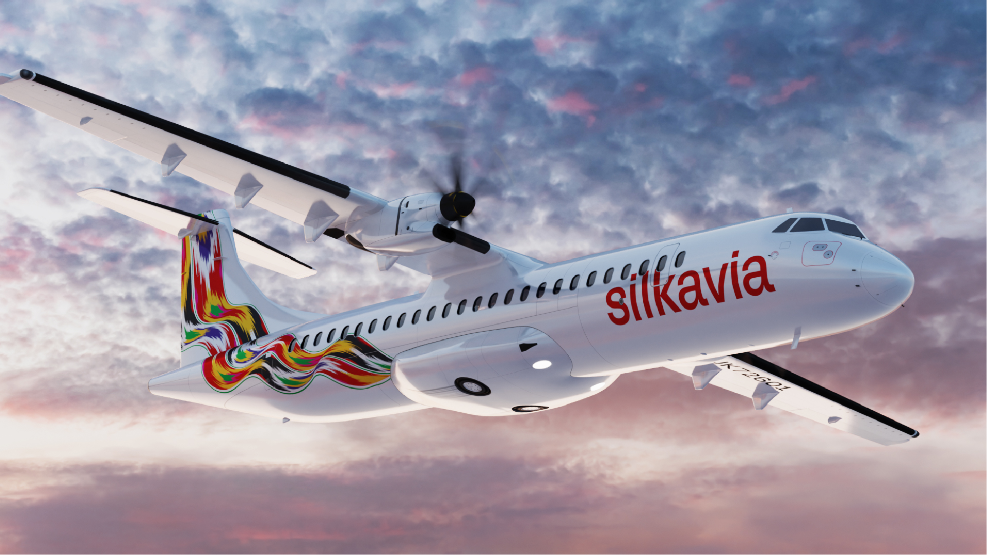
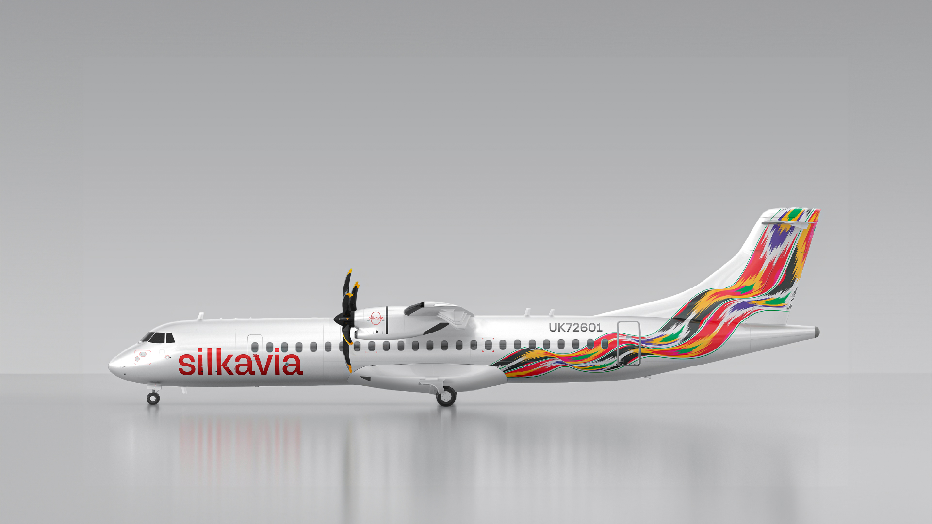
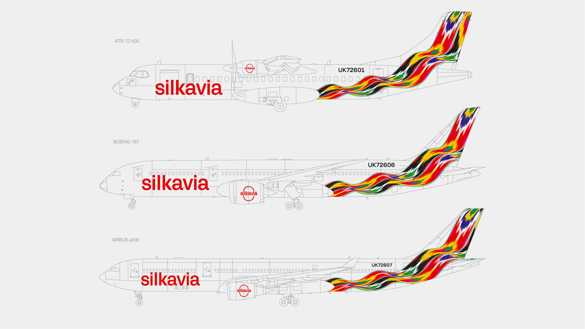
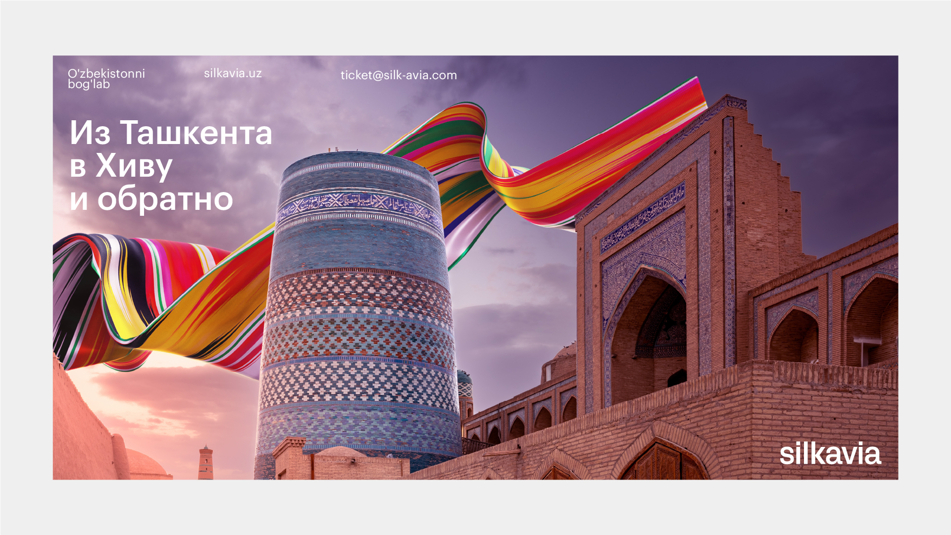
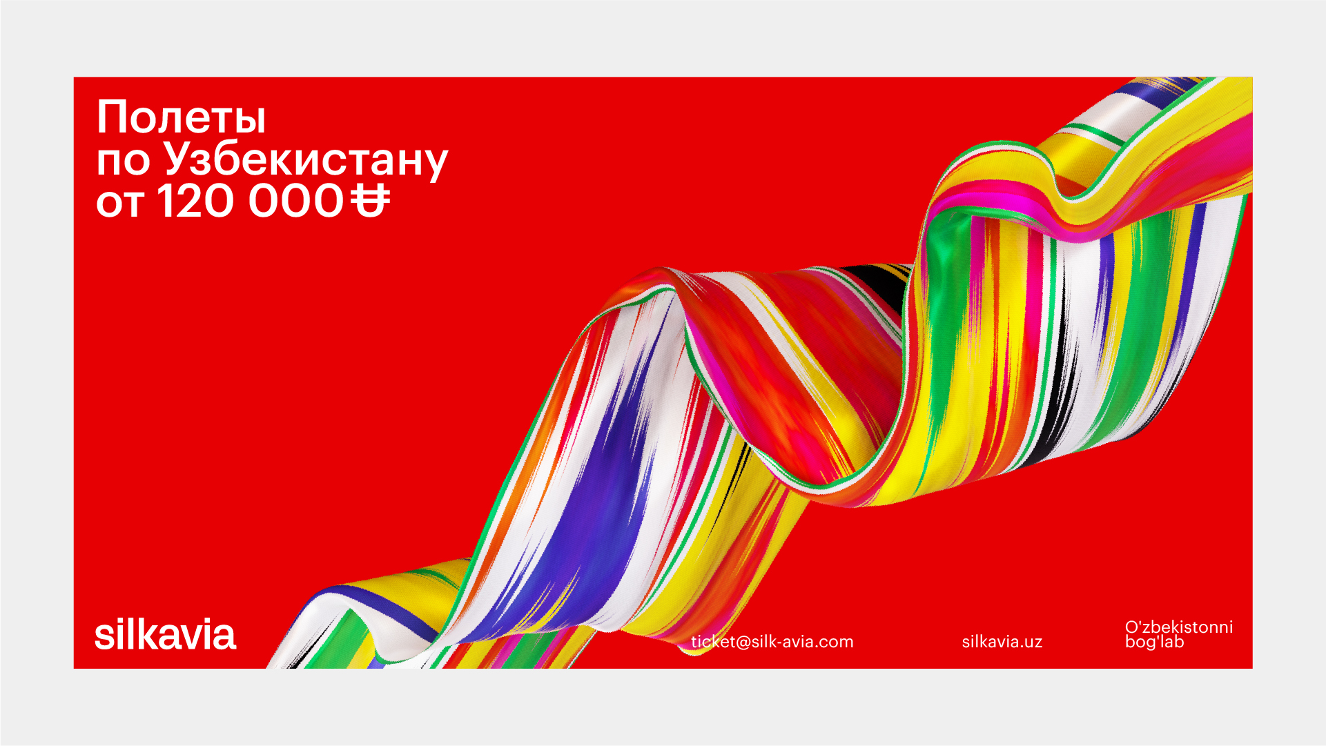
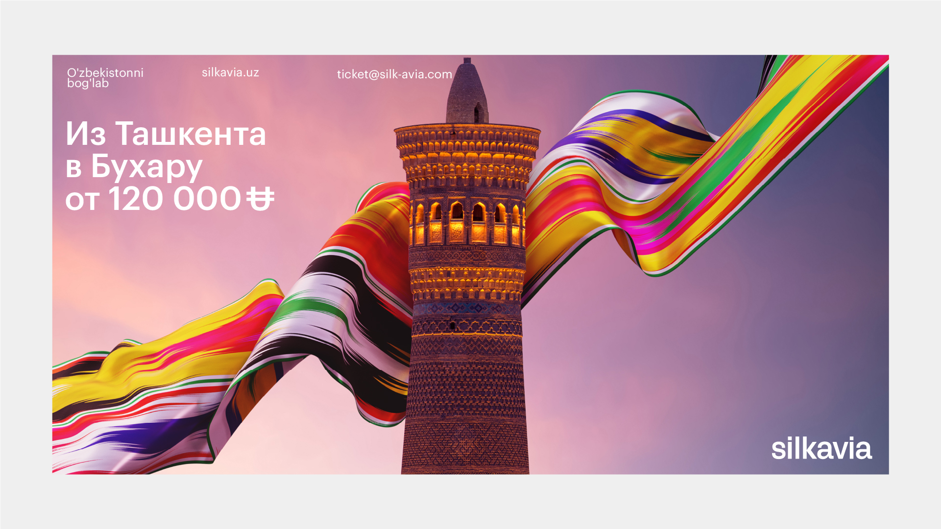
Silkavia is the first regional airline of Uzbekistan. The main mission of the company is to connect cities within Uzbekistan and create conditions for domestic tourism development. We were asked to design the logo, brand identity and the plane livery of Silkavia.
Execution:
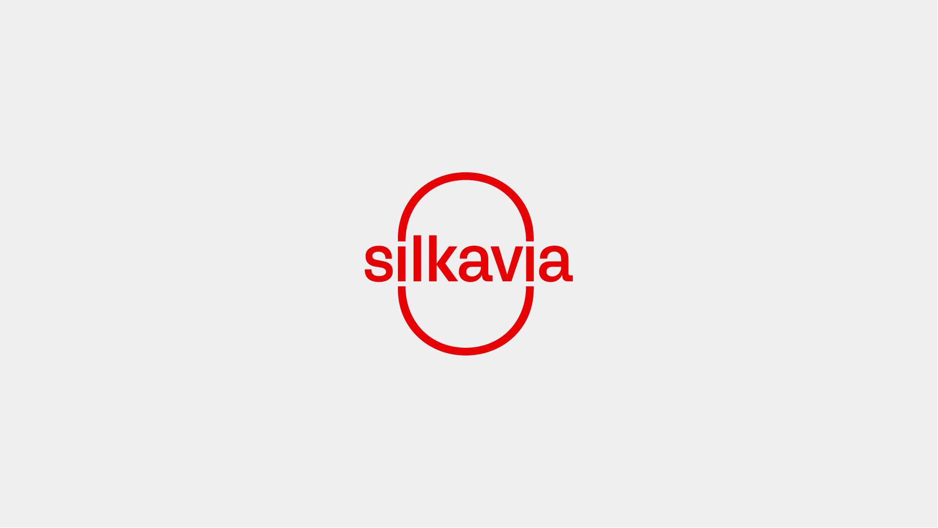
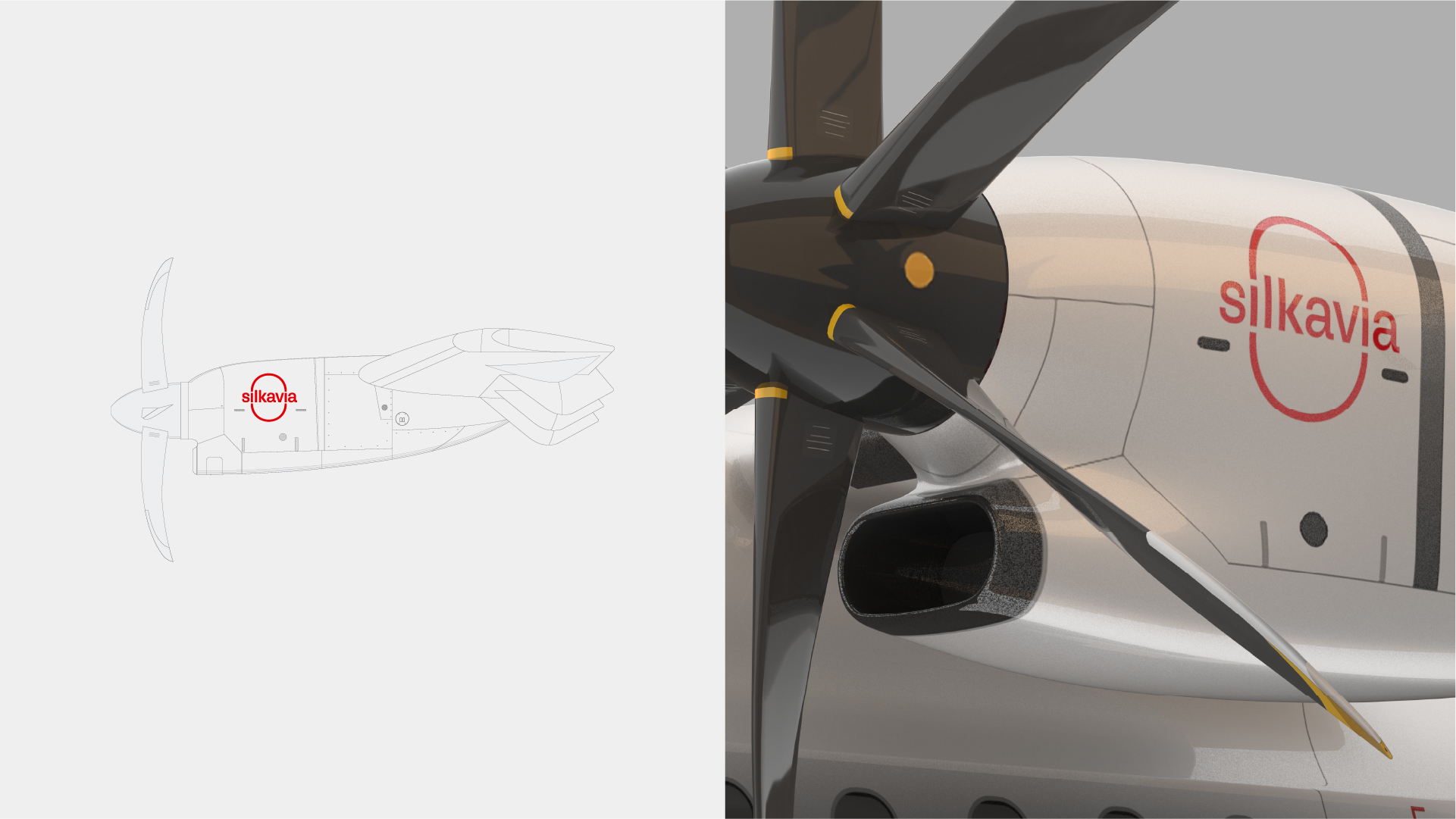
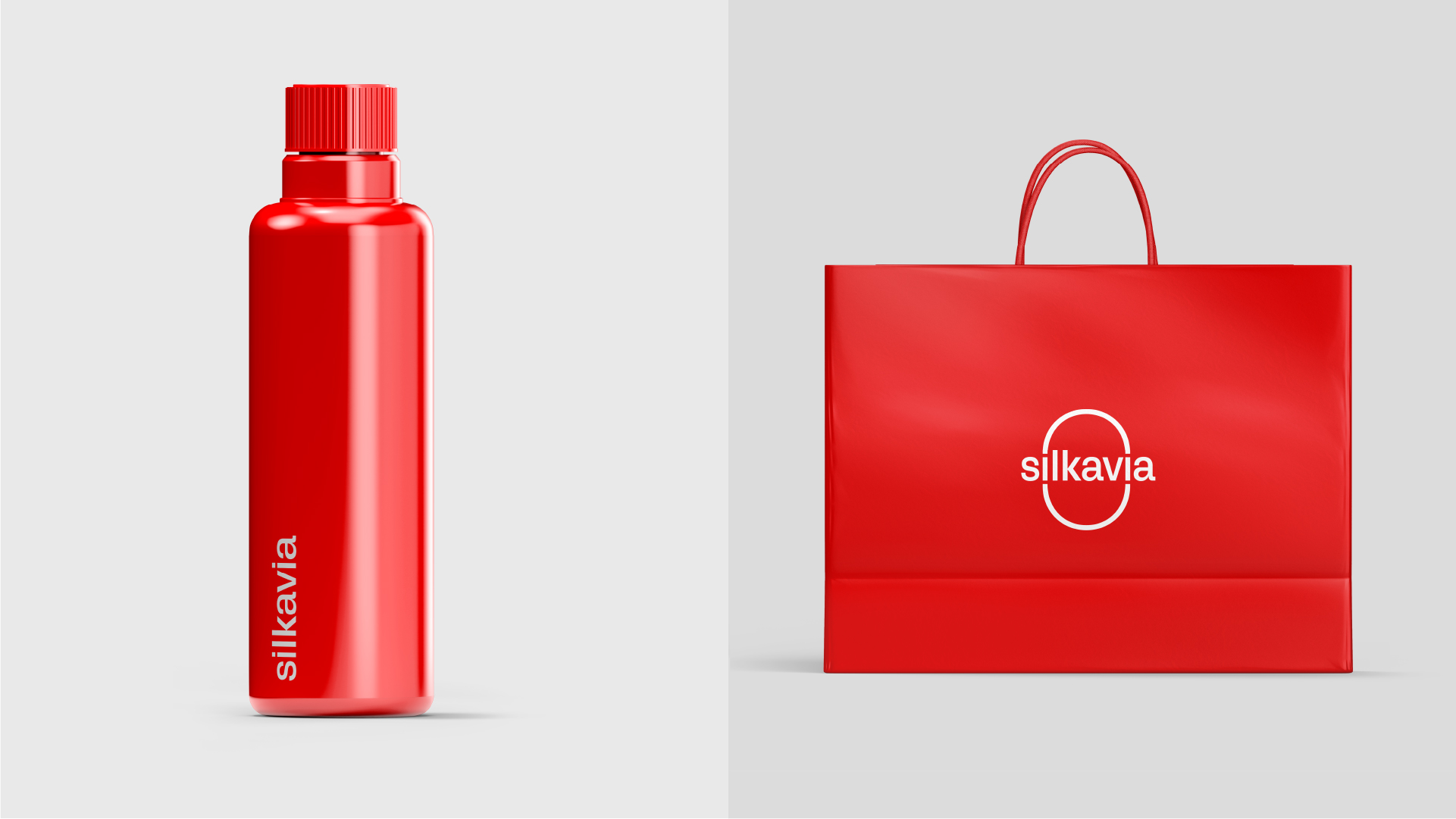
The logo directly reflects Silkavia's main goal of connecting cities in Uzbekistan. The arc that connects the top and bottom of the letters "i" symbolizes continuous flight routes. Together, they form a well known symbol — a window of an aircraft.
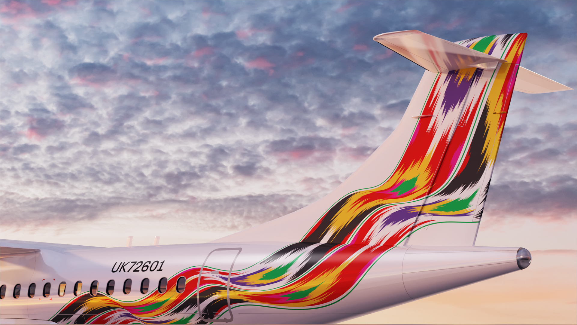
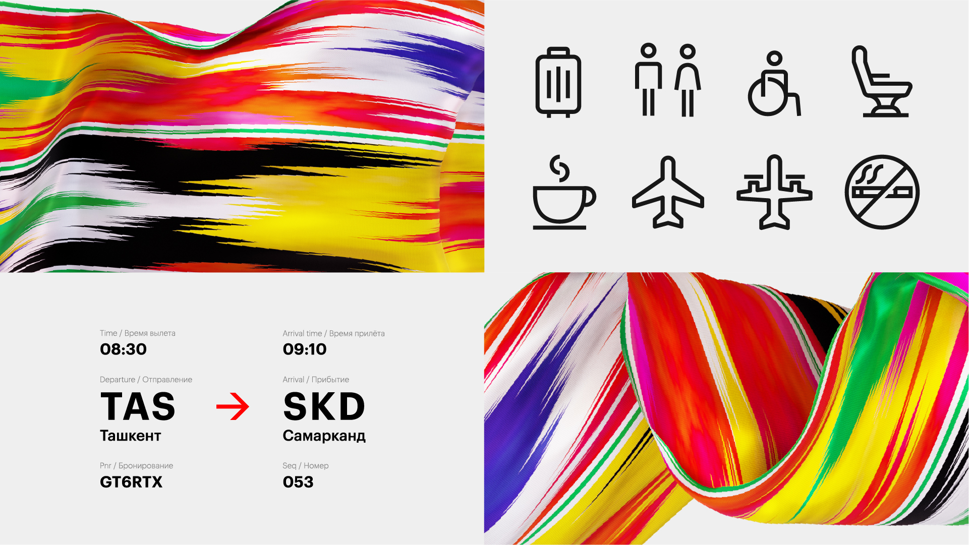
The design inspiration for the livery comes from the fabric called "khan-atlas." This fabric is one of the distinctive features of Uzbek craftsmanship and is included in UNESCO's Representative List of the Intangible Cultural Heritage of Humanity. The khan-atlas pattern perfectly emphasizes the name Silkavia. After all, Silkavia offers smooth flights throughout the republic, as smooth as silk, with a focus on consumer comfort. The patterned design of the fabric creates an effect of a wind-blown cloth, adding maximum dynamic to the livery's design. A silk scarf extends from the center of the aircraft to the end of the tail.
Results:
Silkavia has become the most popular local airline. And the design of the livery has become the most mentioned design in social media and press