EVA: aesthetics and protection
Клиент
EVA
Рабочая группа
Art direction: Rustem Zhali, Ernaz Ramazanov, Saltanat Askharova.
Project manager: Saltanat Askharova.
Senior designer: Ernaz Ramazanov.
Designer: Balzhan Abylgaziyeva.
Задача
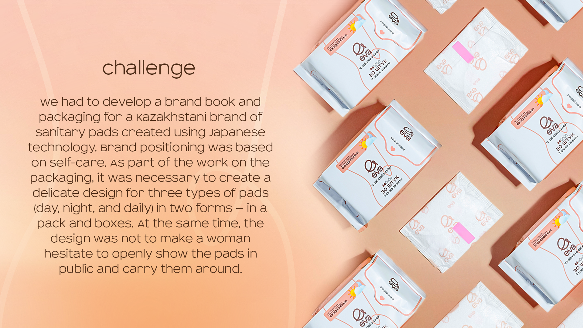
Challenge
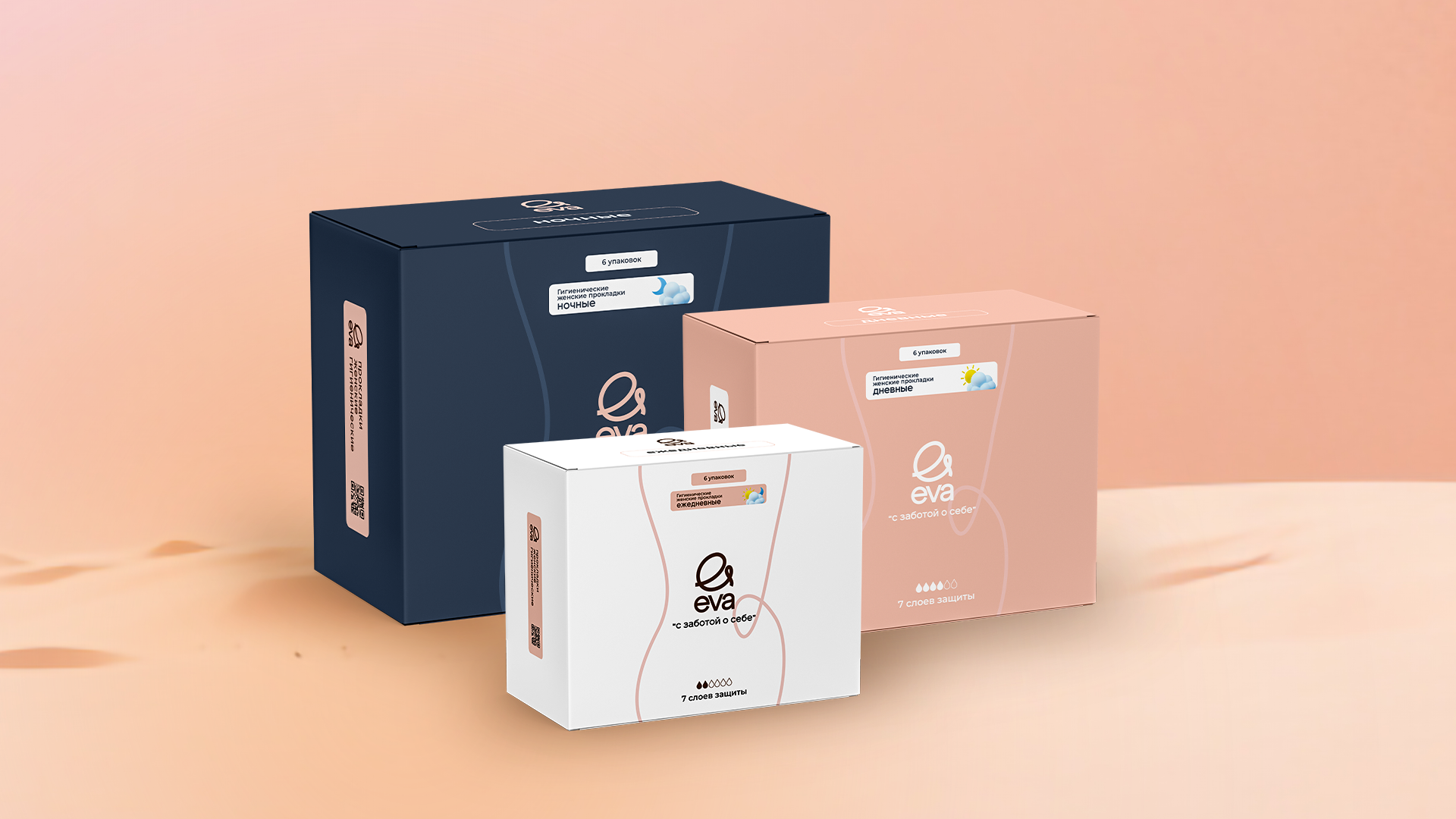
We had to develop a brand book and packaging for a Kazakhstani brand of sanitary pads created using Japanese technology. Brand positioning was based on self-care. As part of the work on the packaging, it was necessary to create a delicate design for three types of pads (day, night, and daily) in two forms — in a pack and boxes. At the same time, the design was not to make a woman hesitate to openly show the pads in public and carry them around.
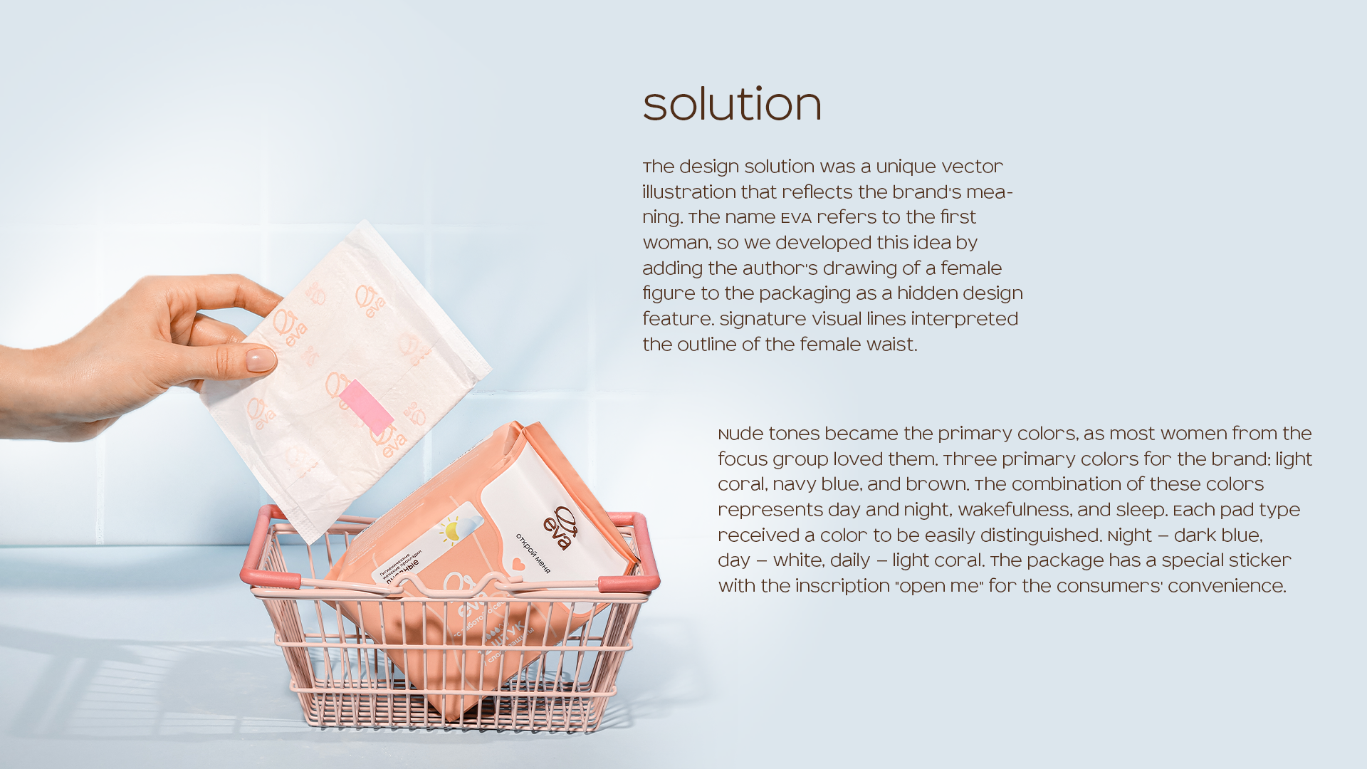
Solution
The design solution was a unique vector illustration that reflects the brand's meaning. The name EVA refers to the first woman, so we developed this idea by adding the author's drawing of a female figure to the packaging as a hidden design feature. Signature visual lines interpreted the outline of the female waist.
Nude tones became the primary colors, as most women from the focus group loved them. Three primary colors for the brand: light coral, navy blue, and brown. The combination of these colors represents day and night, wakefulness, and sleep. Each pad type received a color to be easily distinguished. Night — dark blue, day — white, daily — light coral. The package has a special sticker with the inscription "open me" for the consumers' convenience.
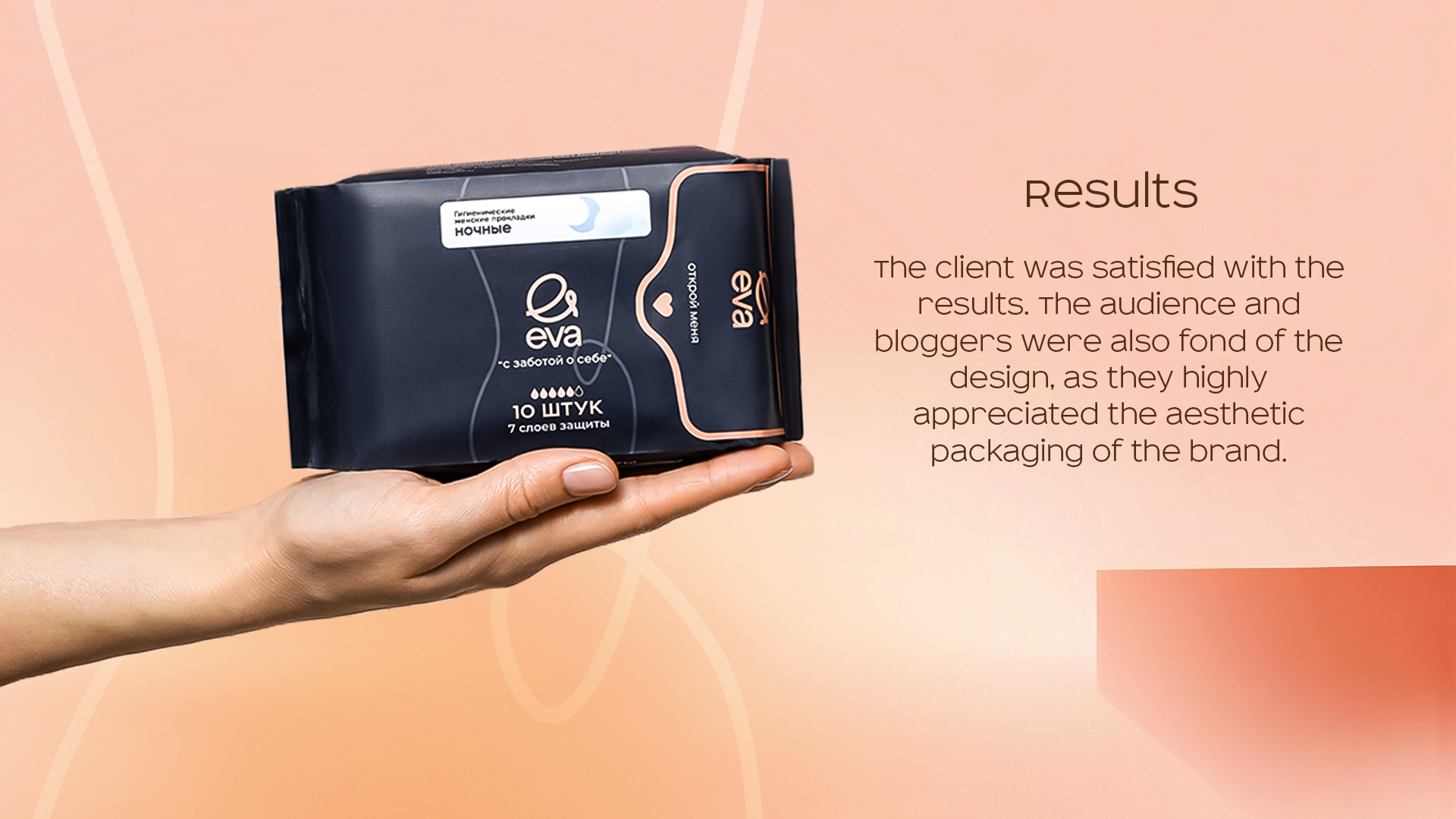
Results
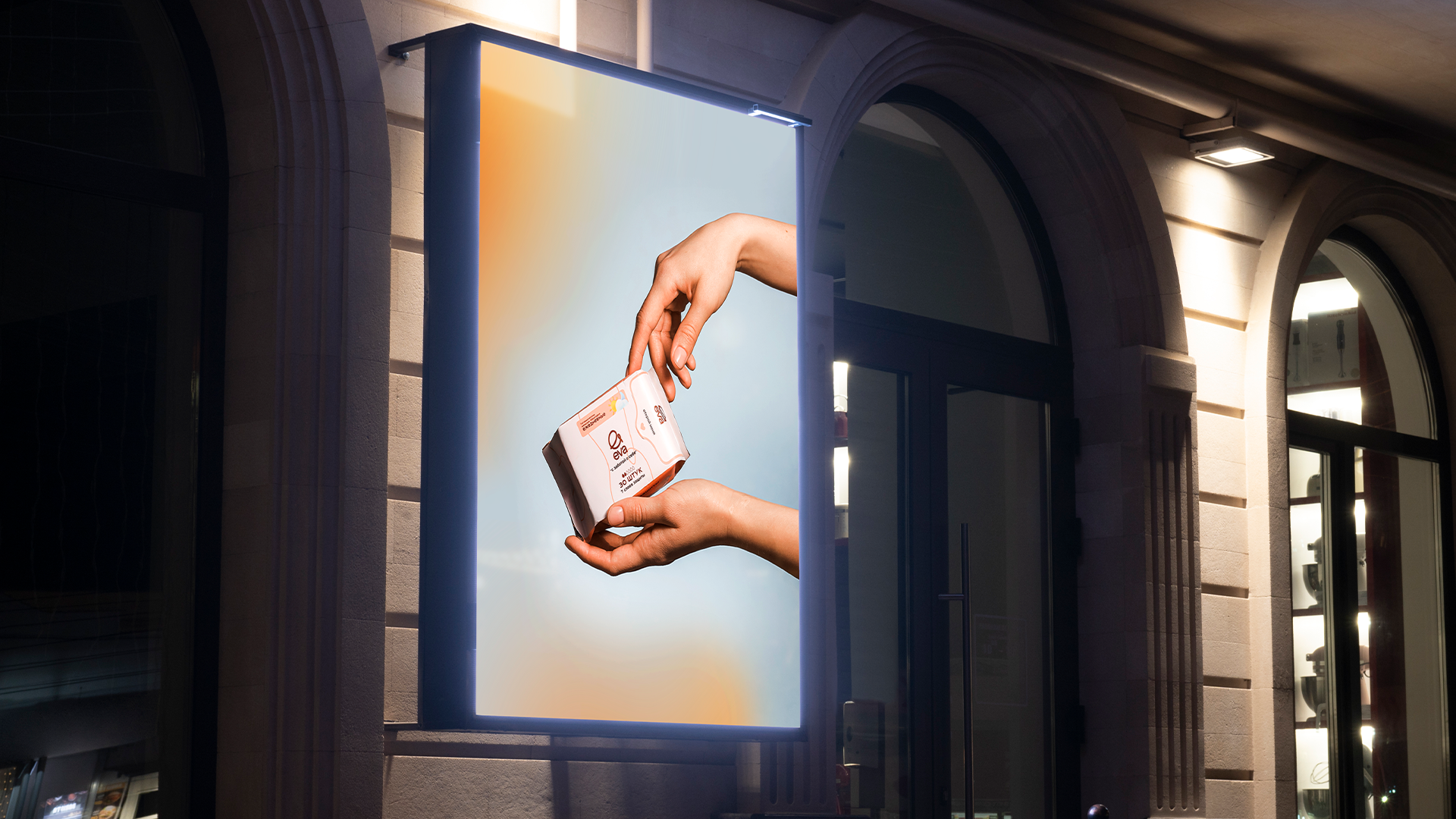
The client was satisfied with the results. The audience and bloggers were also fond of the design, as they highly appreciated the aesthetic packaging of the brand.
Website: https://evapads.kz
Instagram: https://www.instagram.com/evapads.kz/