Neftçi New Identity
Клиент
Neftçi PFK
Рабочая группа
Advertising Agency: Endorphin, Baku, Azerbaijan
Production Company: Artfilmbaku, Baku, Azerbaijan
Executive Creative Director: Orkhan Kerimov
Project Director: Farhad Shabanov
Art Director: Rizvan Bagirli
Creative Head: Sabina Rustamli
Digital Group Head: Mushfig Shiraliyev
Director: Emil Guliev
DOP: Mahammad Osmanov
Copywriter: İlham Akbarli, Farid Asgerov
Graphic Designer: Ramin Farzullayev
Motion Designer: Murad Mammadov
Producer: Kenan Nadirli
Задача
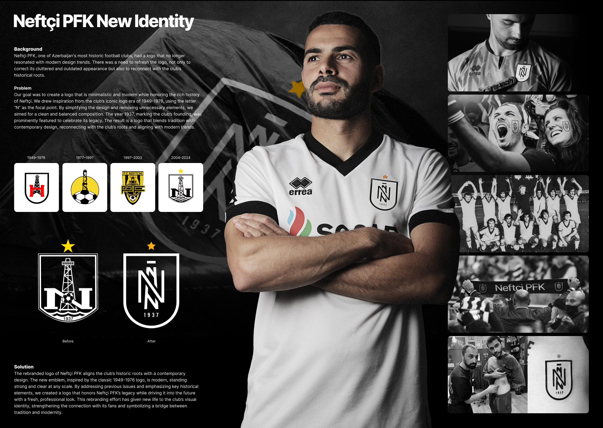
Problem
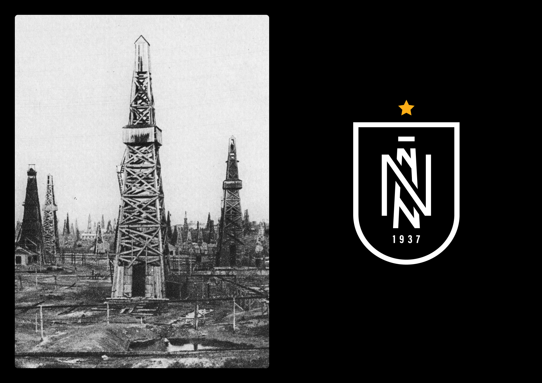
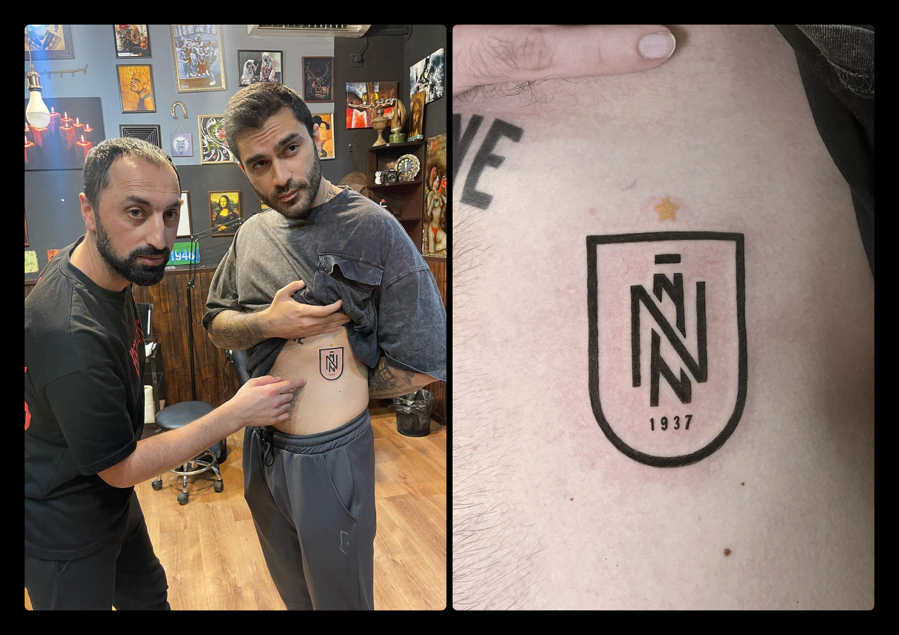
Neftçi PFK, one of Azerbaijan's oldest football clubs, had a logo that looked old and cluttered. It didn’t match modern design trends and needed an update to connect better with the club’s history and fans.
Idea
We decided to create a new logo that is simple and modern but still honors Neftçi PFK's rich history. We took inspiration from the club’s old logo from 1949-1976 and used the letter "N" as the main focus. We also included the year 1937, when the club was founded.
Execution
We removed unnecessary elements from the old logo to make it clean and balanced. We kept the traditional black and white colors of the club. Our design process involved studying the club’s historical logos and modern design trends. We made many versions until we found the perfect balance of simplicity and history.
Result
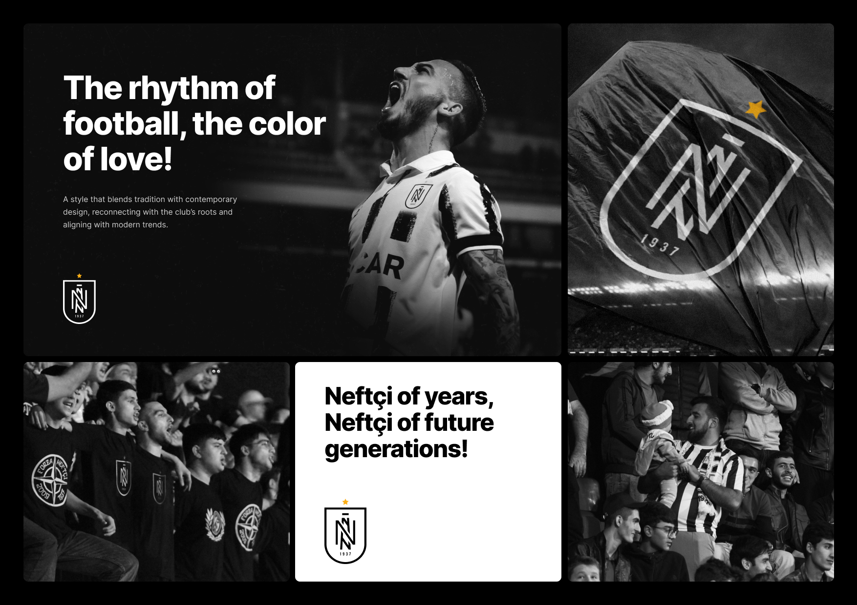
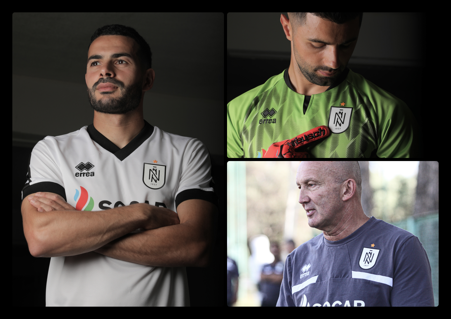
The new logo connects Neftçi PFK's history with a modern look. It gives the club a fresh visual identity that appeals to both old and new fans. The logo is clear and strong at any size, making it easy to use on different platforms, from digital to print. The rebranding has strengthened the bond with the club’s supporters and successfully met our goal of creating a simple, modern logo that honors the club’s legacy.