Aerolit Identity
Клиент
Aerolit
Рабочая группа
Client: Alexey Biryukov, Aerolit CEO
Creative Director: Anastassiya Aiguzina
Designer: Ekaterina Makarovskaya
3D: Dulat Armanuly
Sound Designer: yourfriendkas
Project Manager: Efrem Taskin
Special thanks to Amina Abdraimova
Задача
Context:
Aerolit is a manufacturer of concrete street furniture — benches, planters, bins, and parklets — that aims to stand out in a market void of identity.
Following our research, we have realised that our target audience is architects, individuals with a refined taste and intrinsic understanding of visual culture. Thus, the core element of our brand is an aesthetic that resonates with architects.
Identity concept:
In exploring the production process, we have discovered that stone transcends texture, as it is a product of complex manufacturing processes and enduring tradition. We recognised the parallels between our production and the craft of a sculptor, where thought meets aesthetics together and becomes a history.
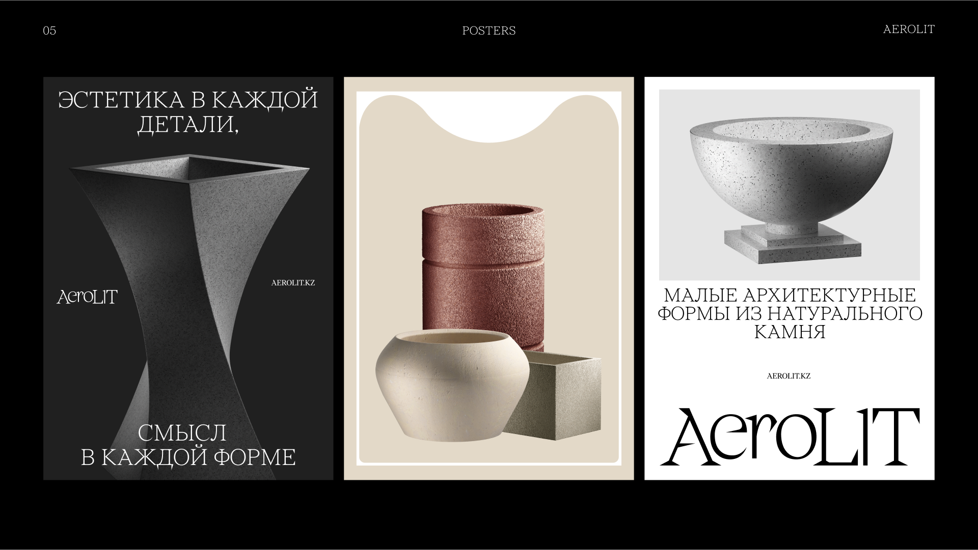
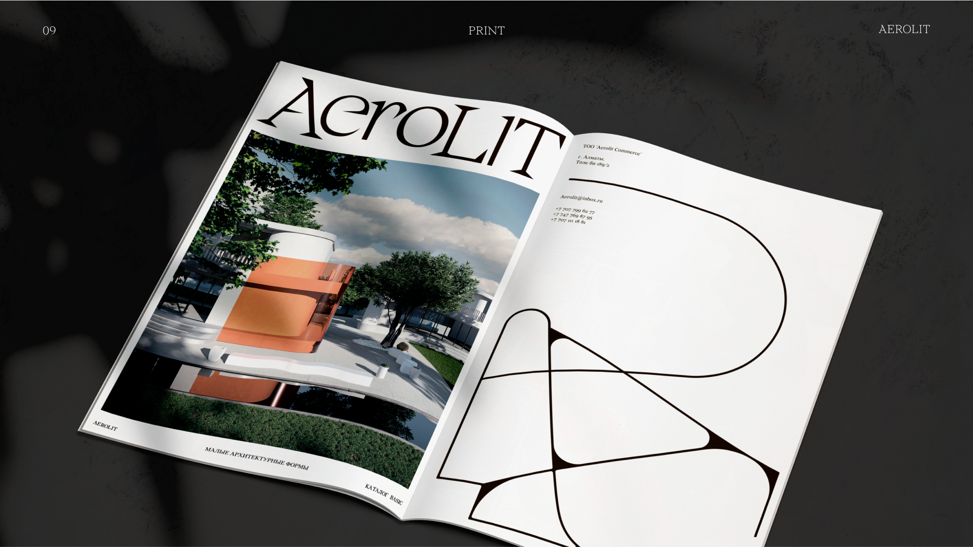
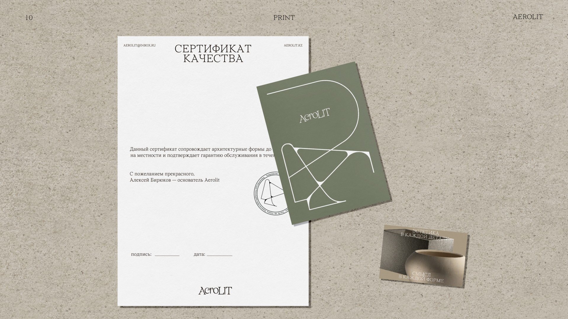
We chose to present our products in a hyper-realistic rendering with direct lighting to evoke the notion of monumental museum exhibitions.
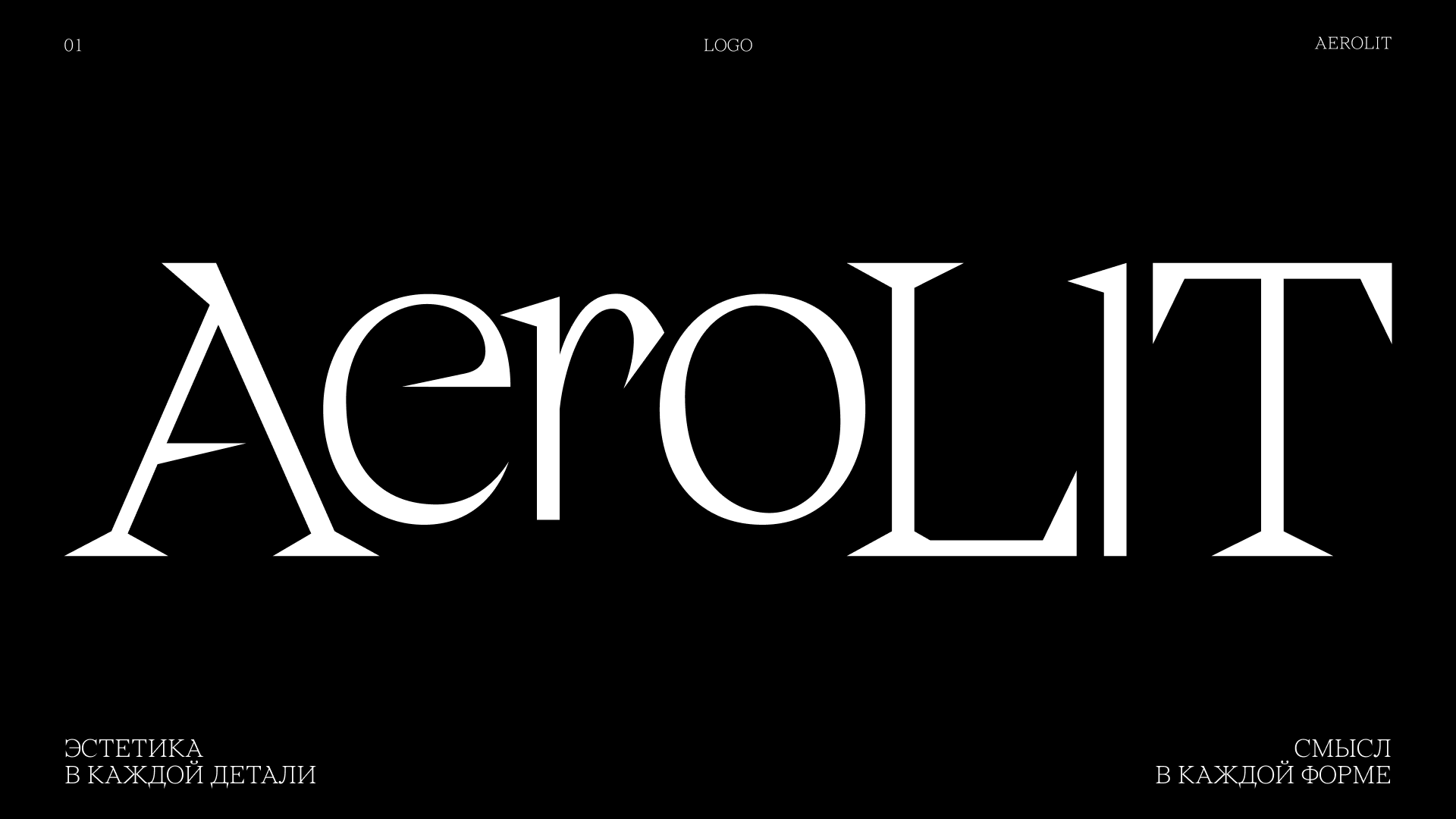
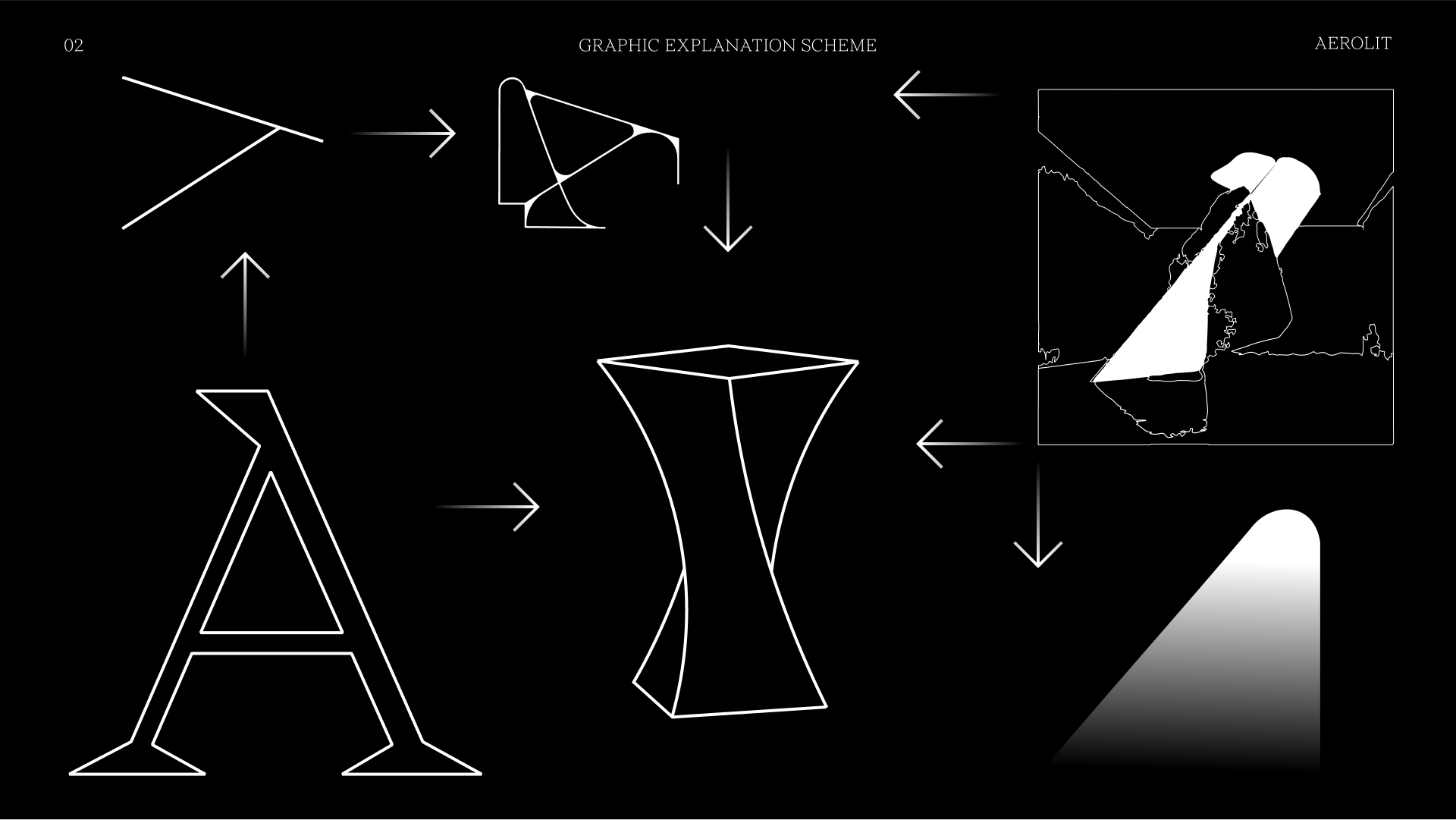
Our typographic logo highlights a dialectic in the brand name where space and form seamlessly merge. Sharp angular accents and elegant curves of the letters draw inspiration from Roman capitals, the aesthetics of which are shaped by the manner of working with chisels and other stone-carving tools.
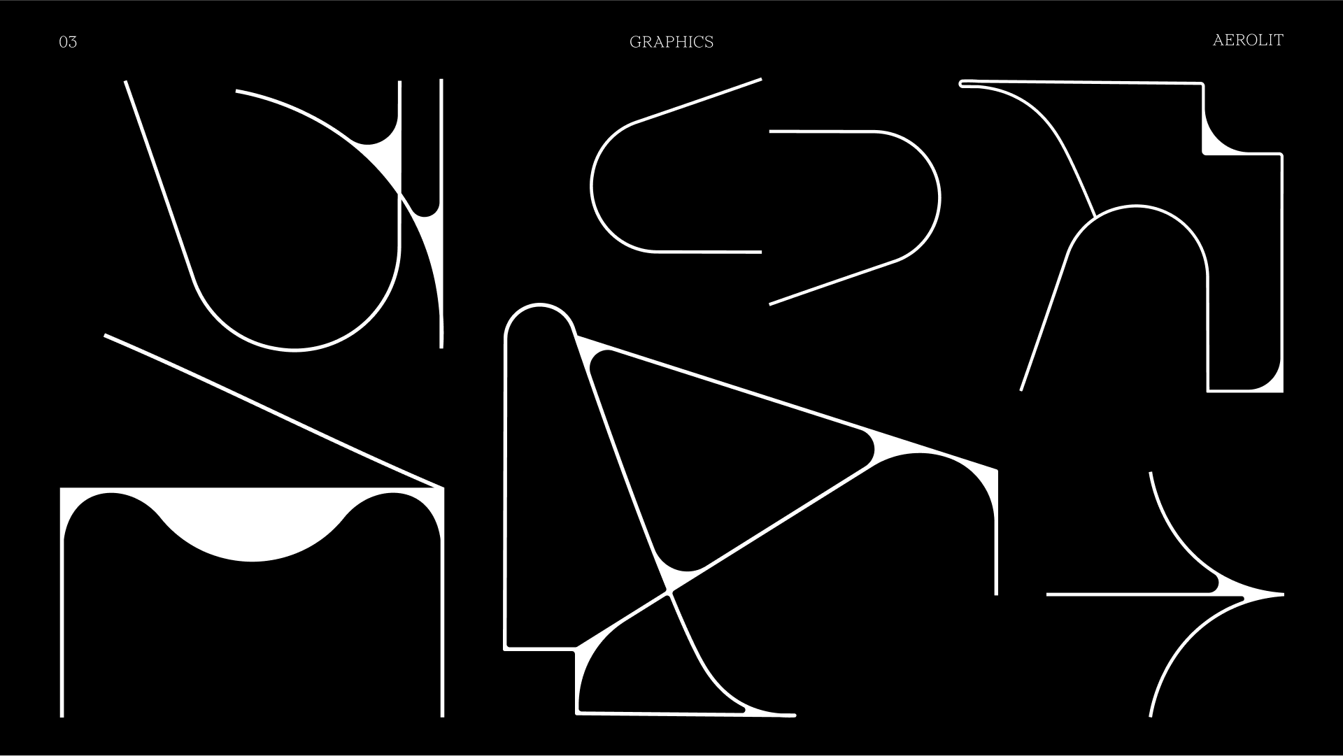
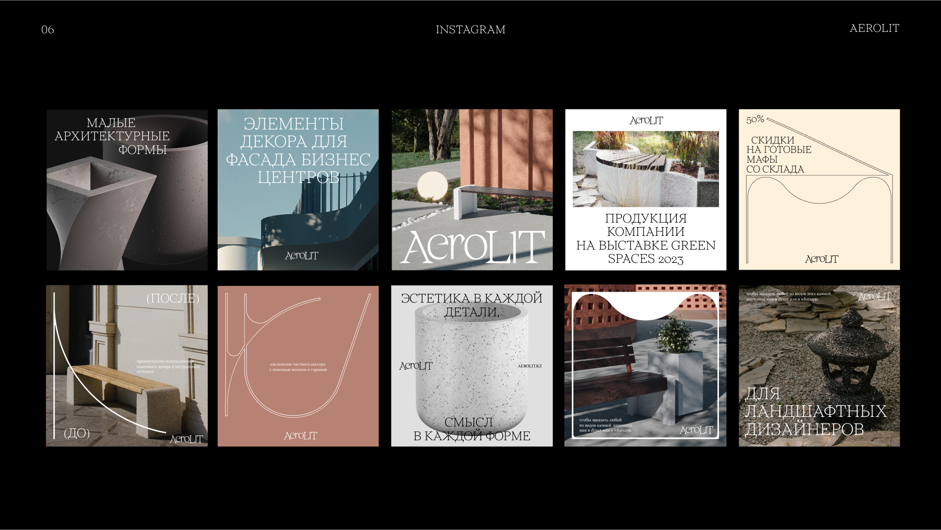
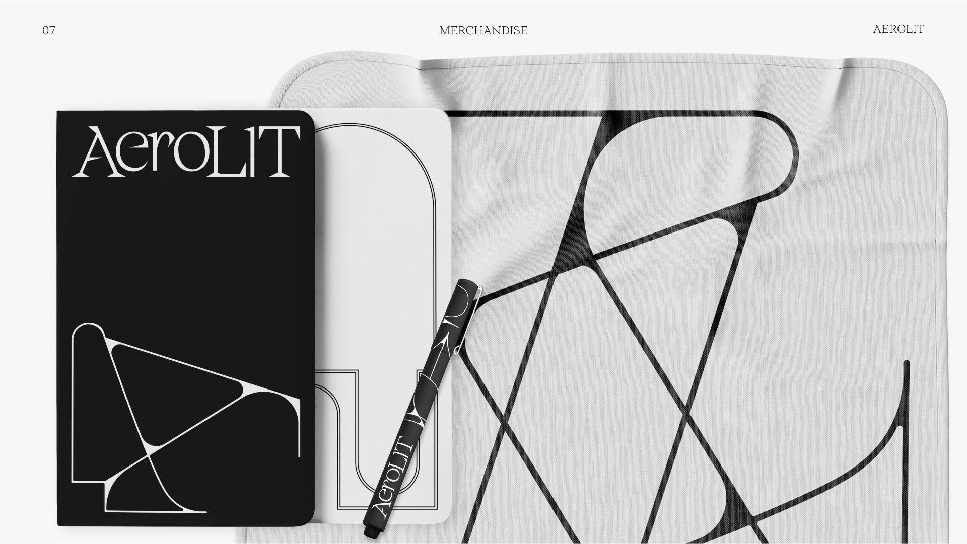
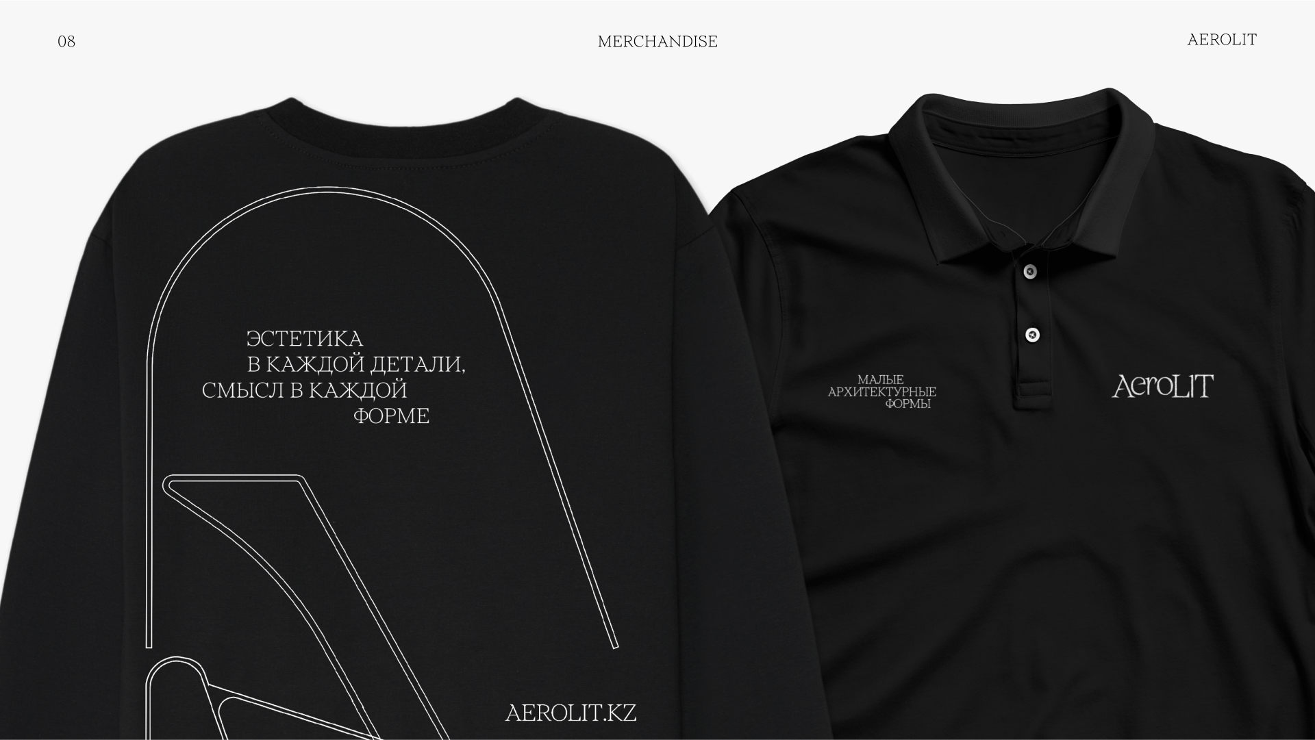
We experimented graphically with the concepts of space and form to enhance our identity while adding a touch of modernity and boldness. One of the ways to reach that was through incorporating abstract graphics that call back to the shapes of our typeface and products.
Result:
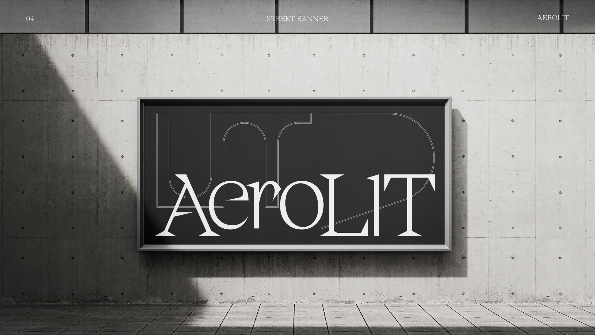
The result is a sophisticated, intellectual style that effectively showcases our products and gives our brand a unique voice in an otherwise uniform market. This new identity defines Aerolit's online presence on social media platforms and shapes its physical appearance through print and merchandise.