SUMMER 365 branding
Клиент
Smart Development
Рабочая группа
Creative Director: Margarita Urmantseva
Art Director: Timur Nusharov
Lead Designer: Abdulaziz Abdurakhimov
Designers: Shodiyor Djurabekov, Alibek Azimov
3D Designers: Rustam Akhmedov, Mikhail Tiora
Project Manager: Nafisa Amerkhanova
Content Manager: Svetlana Chernikova
Information Analytics: Malika Nikolaeva, Aziz Nadjimutdinov
Задача
Background:
The problem with the real estate market in Batumi is the existence of impersonal residential complexes or apartments that lack any reference to Georgian culture or the unique characteristics of the resort city.
It was necessary to develop naming and branding for a distinctive complex that would immediately showcase its uniqueness against the general mass.
The goal is to create an identity that will make the complex stand out among competitors and be equally strong in both communication and architectural solutions.
Solution & Execution:
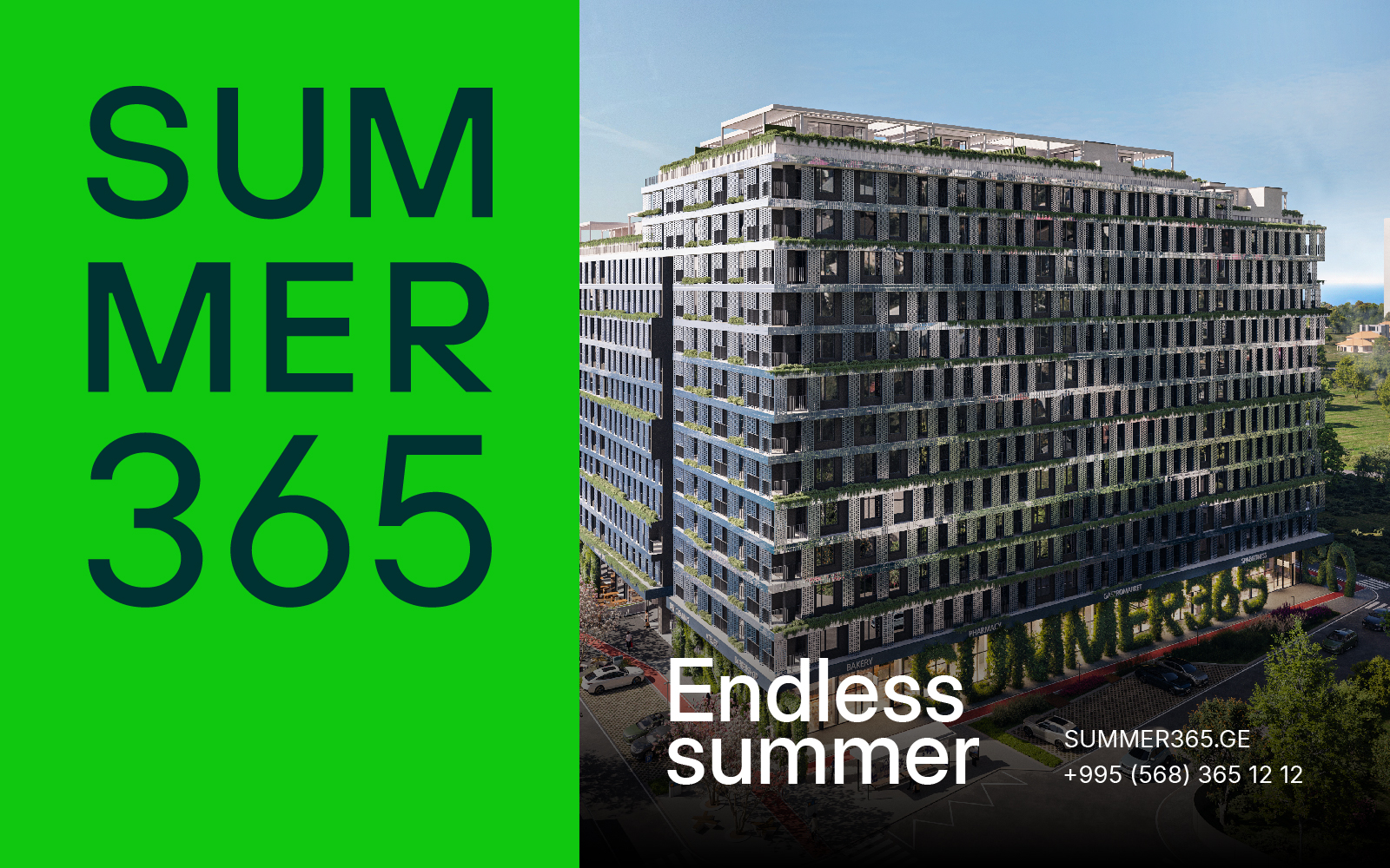
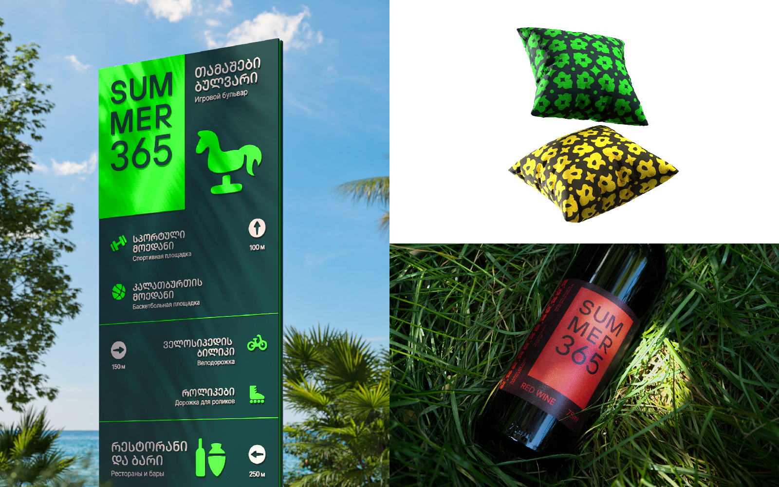
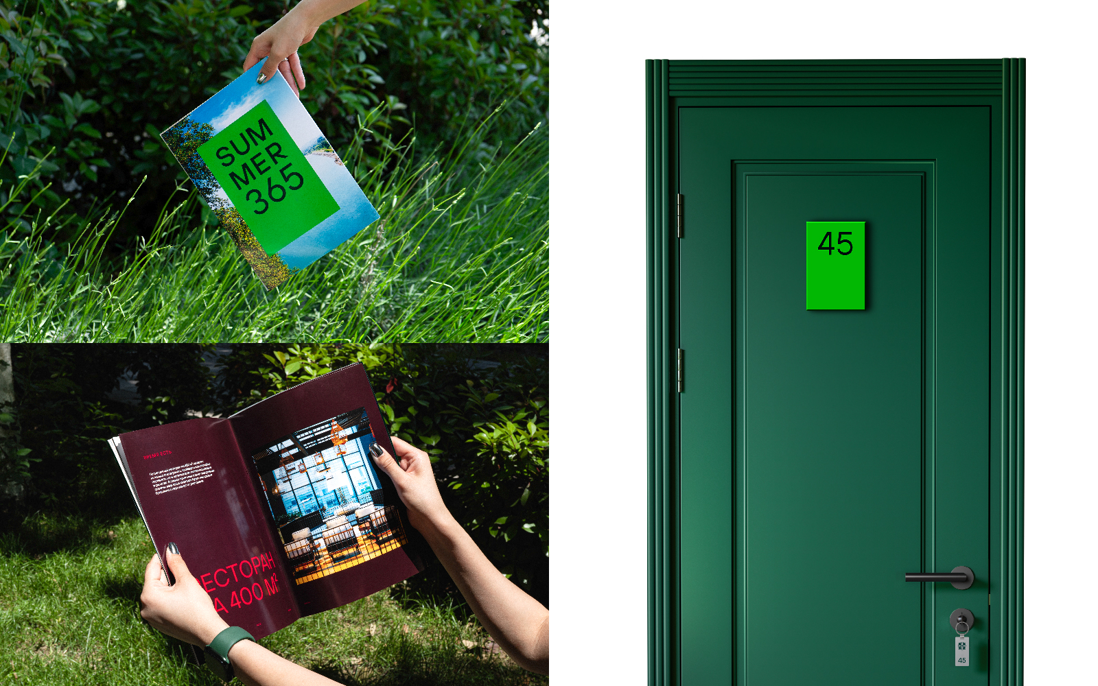
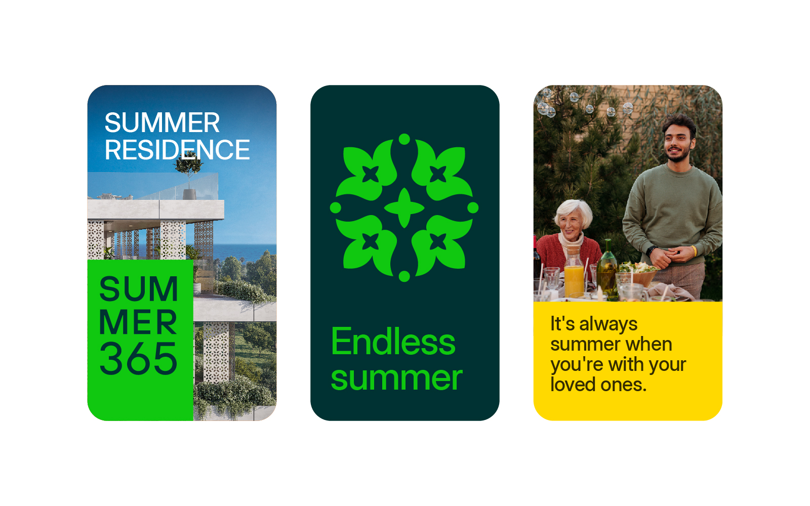
The main idea is to emphasize that real estate in Batumi is attractive because in this resort city, it's always summer. This led to the naming — SUMMER365 and the slogan "Endless Summer".
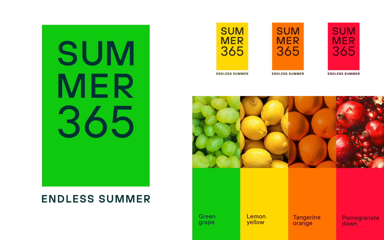
This is also reflected in the brand's colors, which are inspired by the gardens of Batumi.
The simplicity of the logo is due to the fact that it was important for us to convey the relative affordability of housing in the complex, as well as the overall architectural concept of the construction project.
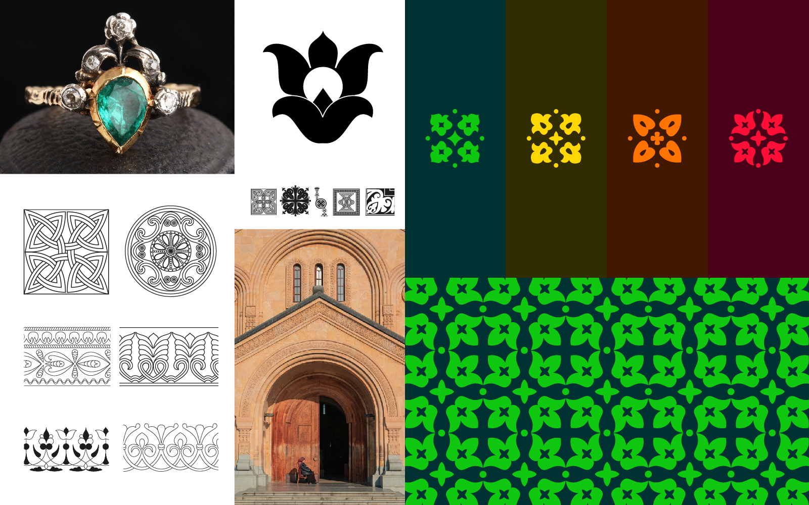
The elements of the brand identity are based on ornaments that we discovered with the help of Georgian sociologists. These ornaments can be found in historical architectural monuments and traditional jewelry, in writing, and decorative elements. They served as inspiration for the patterns that will be used both on branded materials and on the facades of the complex and small architectural forms.
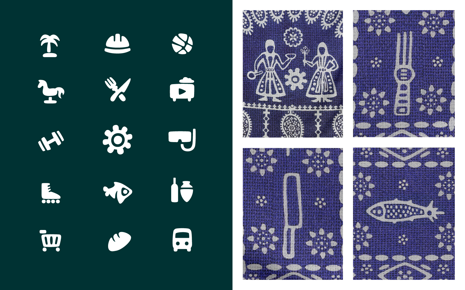
Another inspiring element was the patterns of the traditional Lurji Supra tablecloth, which we adapted to develop iconography and navigation elements.
Results:
25%+ of the apartments were sold during the construction phase. Clients are attracted by the unconventional approach to visual communication and the progressive nature of the brand identity. The recognizability of the property has been noted just a few months after the start of the promotion.