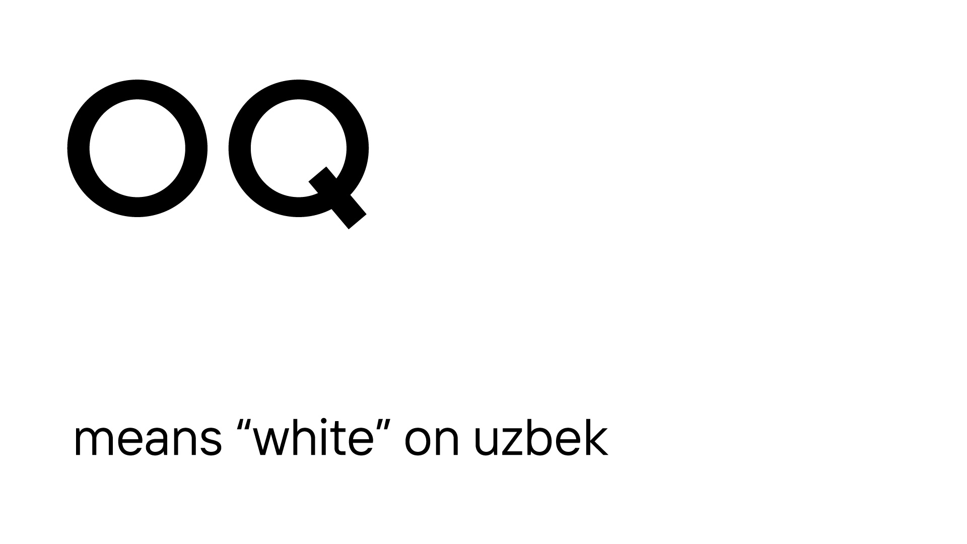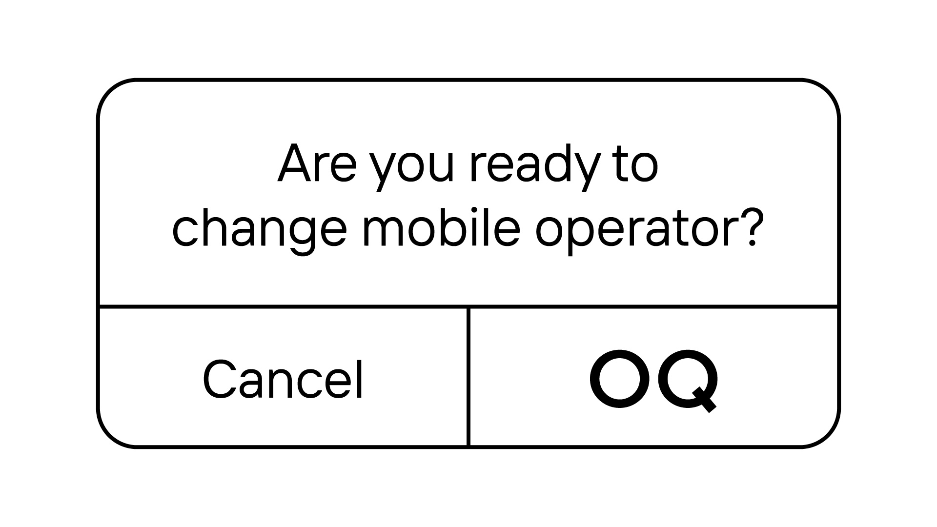
OQ brand launch
Клиент
VEON
Рабочая группа
Creative Director: Margarita Urmantseva
Art Director: Timur Nusharov
Designers: Abdulaziz Abdurakhimov, Alisher Rakhimov, Shodiyor Djurabekov
Project managers: Malika Nikolayeva, Aziz Nadjimutdinov
3D Designer: Mikhail Tiora
Architect: Khodjiakbar Latipov
Задача
Problem:
In Central Asia, mobile operators typically use bright and bold colors in their advertising, leading to a saturated and cluttered visual environment. This common approach creates "banner blindness," where audiences become desensitized to the overwhelming visuals, reducing the effectiveness of advertisements.
Solution:
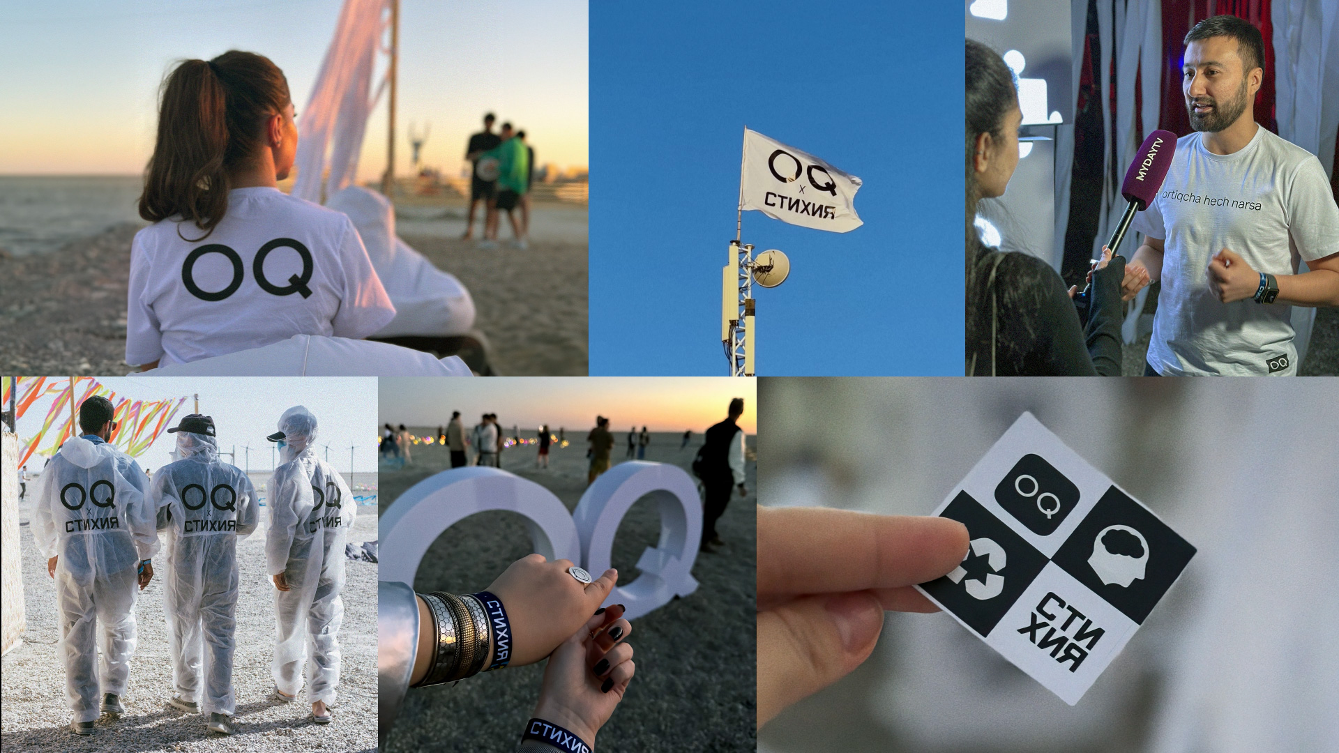
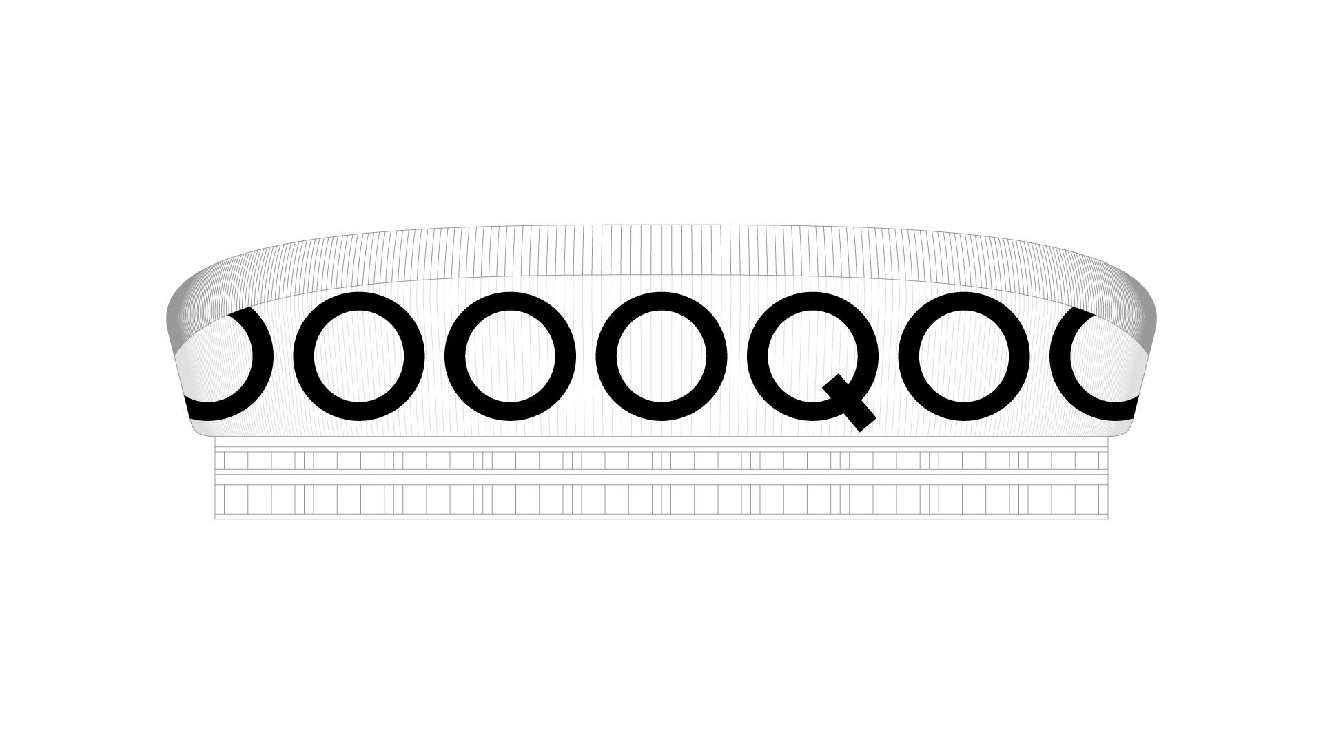
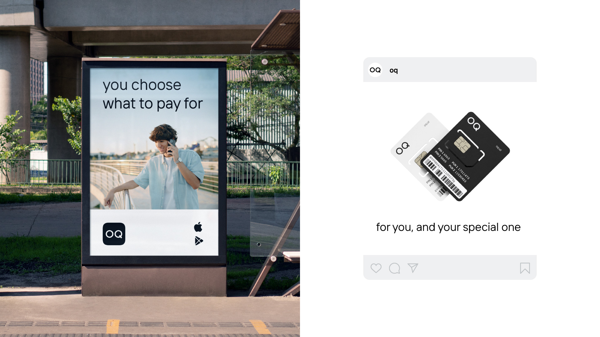
To stand out in this crowded landscape, we took a bold risk by developing a "colorless" branding strategy for the OQ communication app. We designed a black-and-white brand identity, emphasizing simplicity and directness. This minimalist approach was first introduced through a teaser campaign with the slogan "nothing extra," which drew immediate attention from users and the creative community alike. We further reinforced the brand's philosophy of sustainability by partnering with the environmentally focused festival "Stikhia," where we showcased simple, utilitarian merchandise and created a stylized lounge area that resonated with festival participants.
Result:
This unconventional approach proved highly effective. The OQ brand quickly gained traction, particularly among a young, active audience. Within a year, the app achieved over 500,000 downloads, amassed more than 20,000 social media followers, and participated in over 10 collaborations at educational, cultural, and social events. What started as a simple black-and-white branding strategy became a vibrant and engaging presence in the market, proving that simplicity can indeed make a powerful impact.