OQ branding
Клиент
VEON
Рабочая группа
Creative Director: Margarita Urmantseva
Art Director: Timur Nusharov
Designers: Abdulaziz Abdurakhimov, Alisher Rakhimov, Shodiyor Djurabekov
3D Designer: Mikhail Tiora
Architect: Khodjiakbar Latipov
Задача
Context:
The market of mobile operators in Uzbekistan is saturated with overpromises. It was crucial to embed principles of mindfulness, eco-friendliness, and utility, without imposed services or hidden fees in a new digital operator.
Solution & Execution:
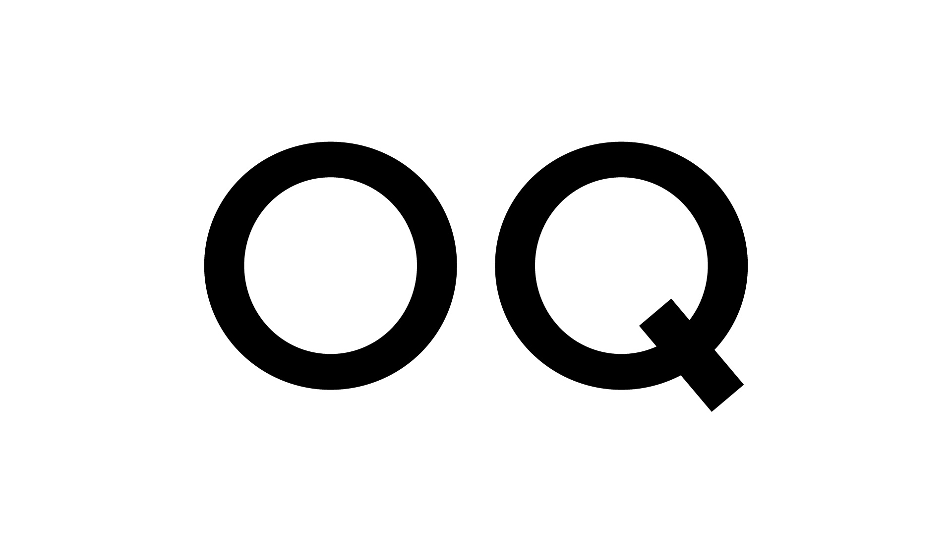
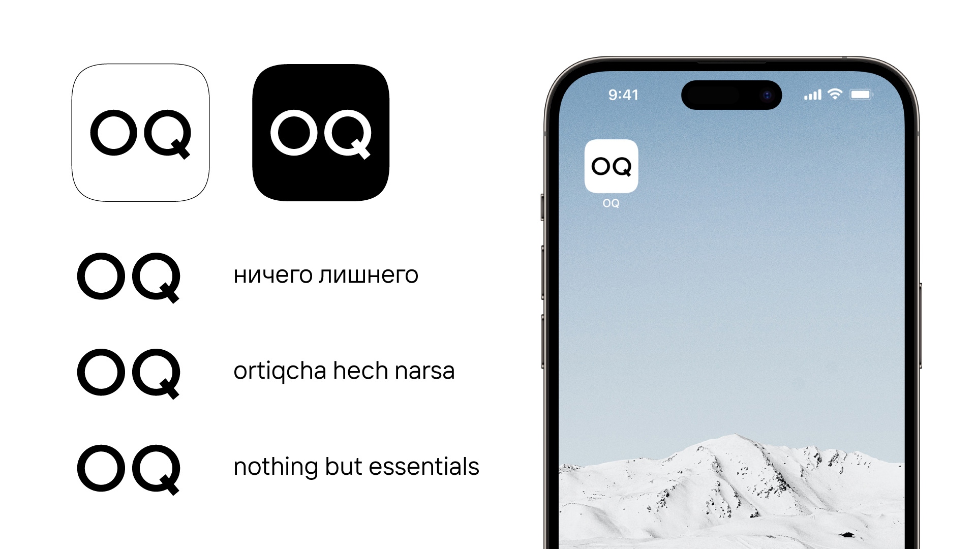
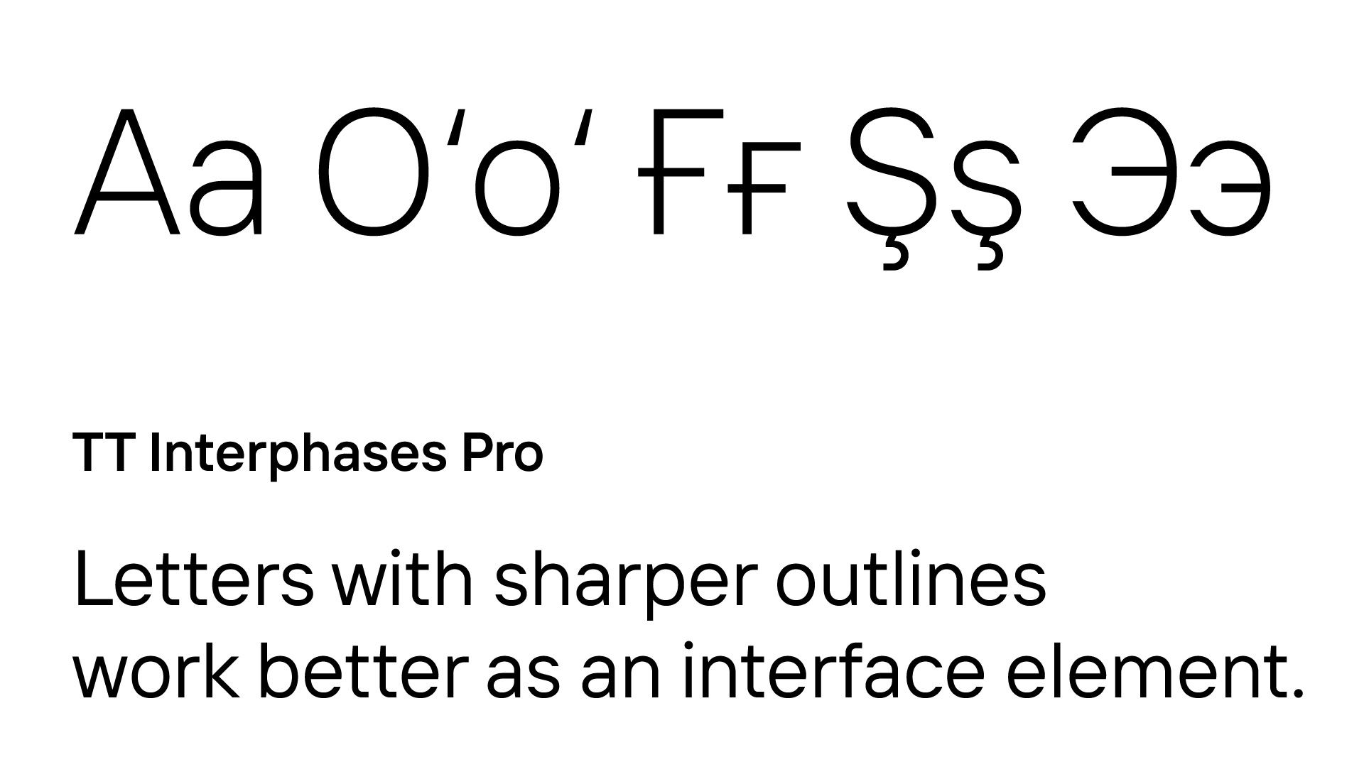
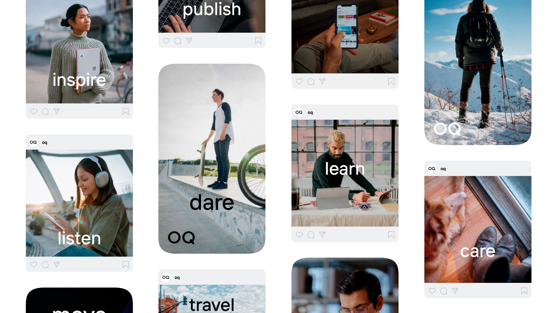
The goal was to create a name and brand image that reflects its values. We chose a simple name, OQ, meaning "white" in Uzbek, to embody core principles like eco-friendliness, honesty, mindfulness, and transparency. These values shaped the brand's character as open, intelligent, digital, and progressive.
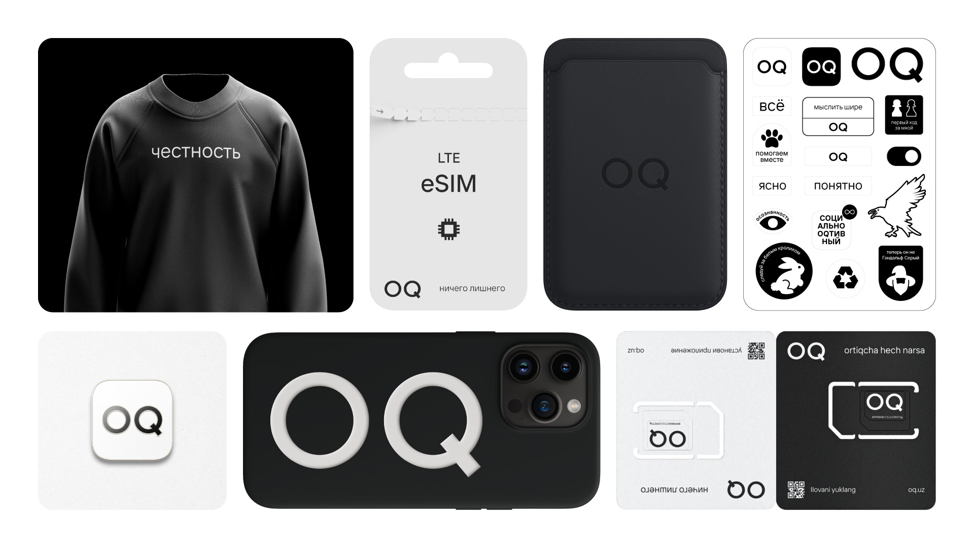
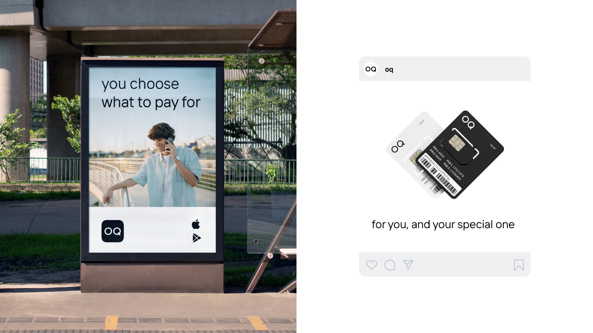
The logo is both distinctive and serves as the app icon, acting as the user's entry point. Its simplicity and clean design make it stand out. This bold choice contrasts with the bright colors typical in Central Asia, helping OQ gain attention even at the teaser stage.
The brand palette includes just two colors — white and black. This strategic choice sets the brand apart from competitors and aligns with its eco-friendly mission. The limited color palette also reduces production costs, allowing for the use of eco-friendly soy-based inks.
The result:
The result was a sensation at the teaser stage when outdoor advertising across the city, as well as metro stations and buses, were painted in the unusual black-and-white combination. In just one year, the app was downloaded by 500,000 users. The brand became a partner of several youth events — festivals, startup accelerators, marathons, and summits.