Corporate Identity for "Silk Jet" - the first low-cost airline in Uzbekistan
Клиент
Silk Jet
Рабочая группа
Team leader: Malika Saatova
Designer: Yuliya Saatova
Designer: Diana Suleymanova
Copywriter: Rustam Makhamadjanov
Задача
Uzbekistan has always attracted interest thanks to its rich history and ancient cities – Khiva, Bukhara, Samarkand. But there were few factors distracting tourists such as strict passport control, the level of service and very expensive tickets. Due to the monopoly of “Uzbekistan Airways” national airline, prices for flights remain much higher than prices for flights in other countries. To solve the problem of expensive direct flights to Uzbekistan, the “Silk Jet” low-cost airline is launched.
Objective: to create modern identity for low-cost airline and avoid association with “Uzbekistan Airways”
Idea: to abandon the national Uzbek and Eastern patterns and to create dynamic and modern visual that is not connected with Uzbekistan.
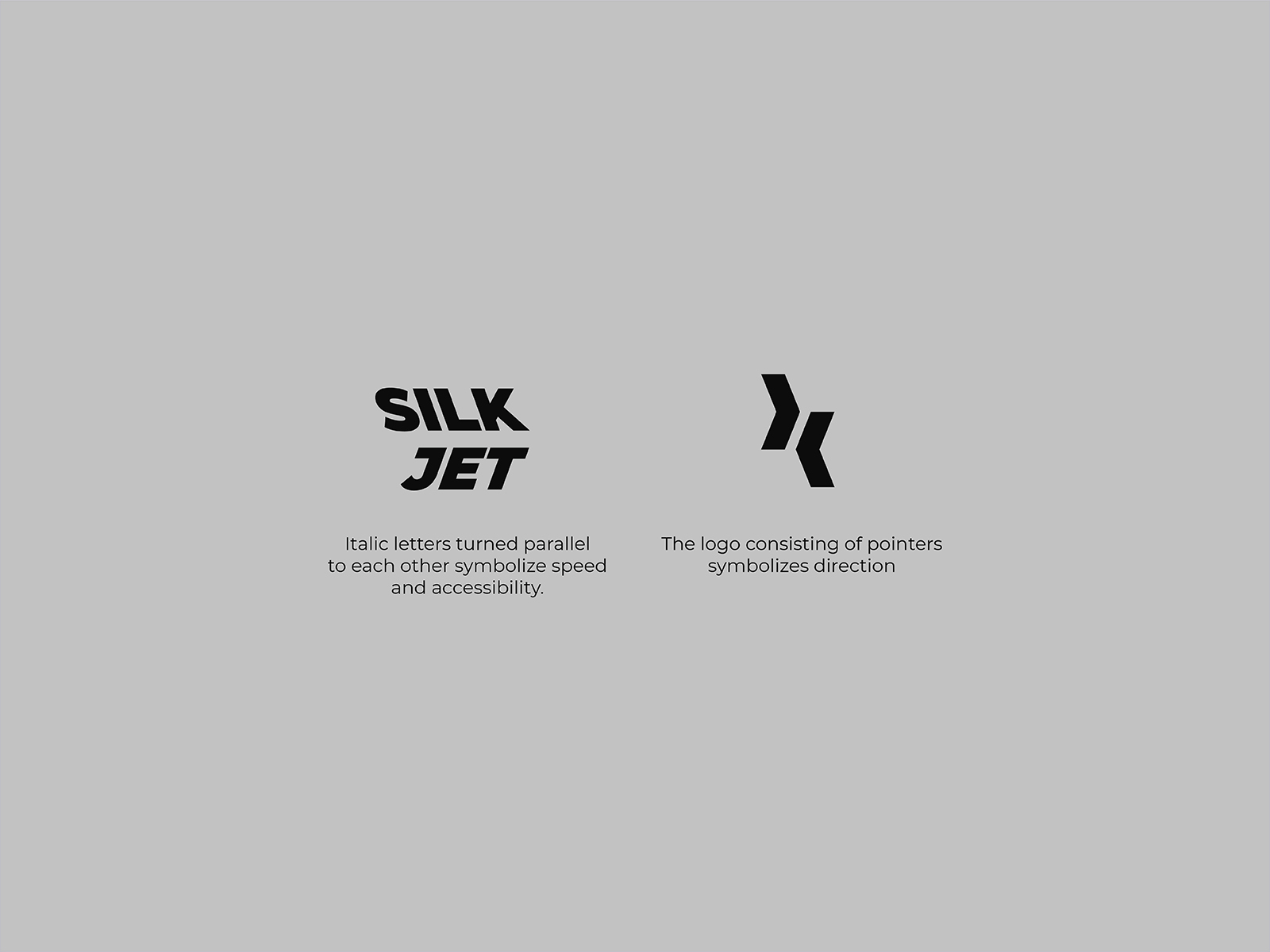
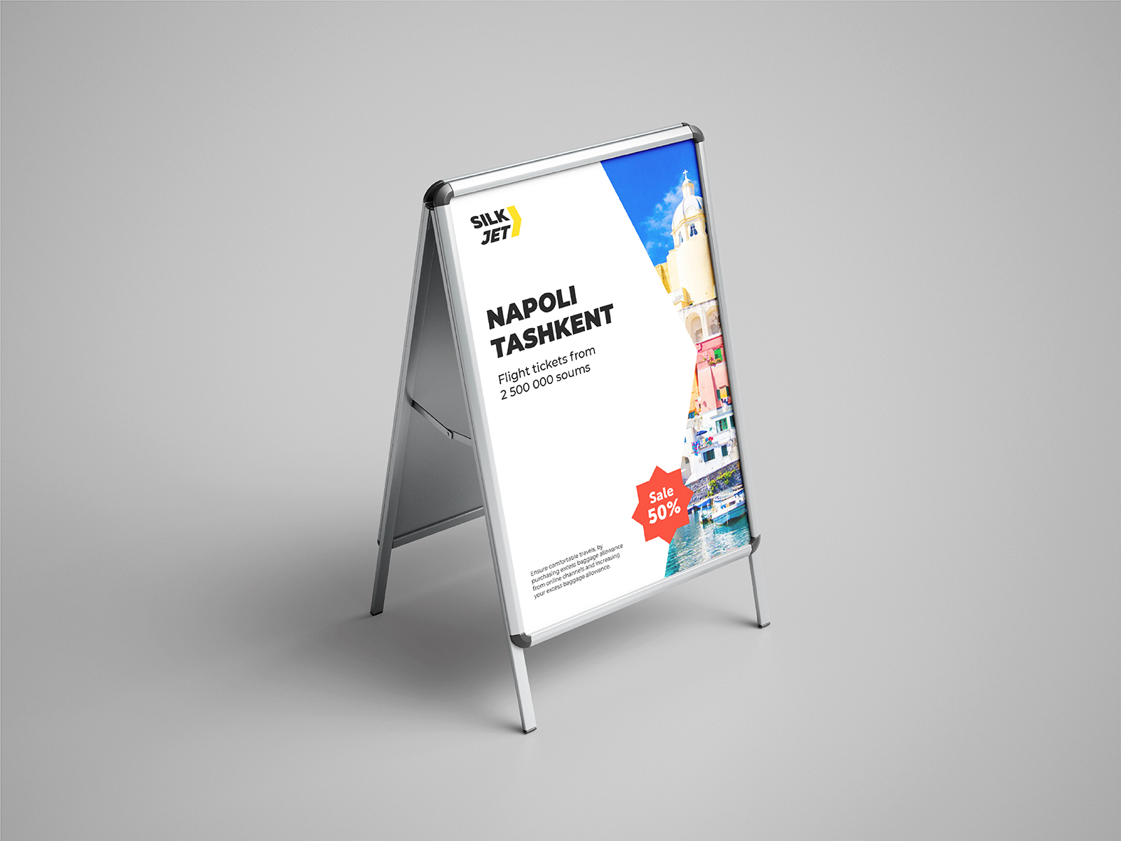
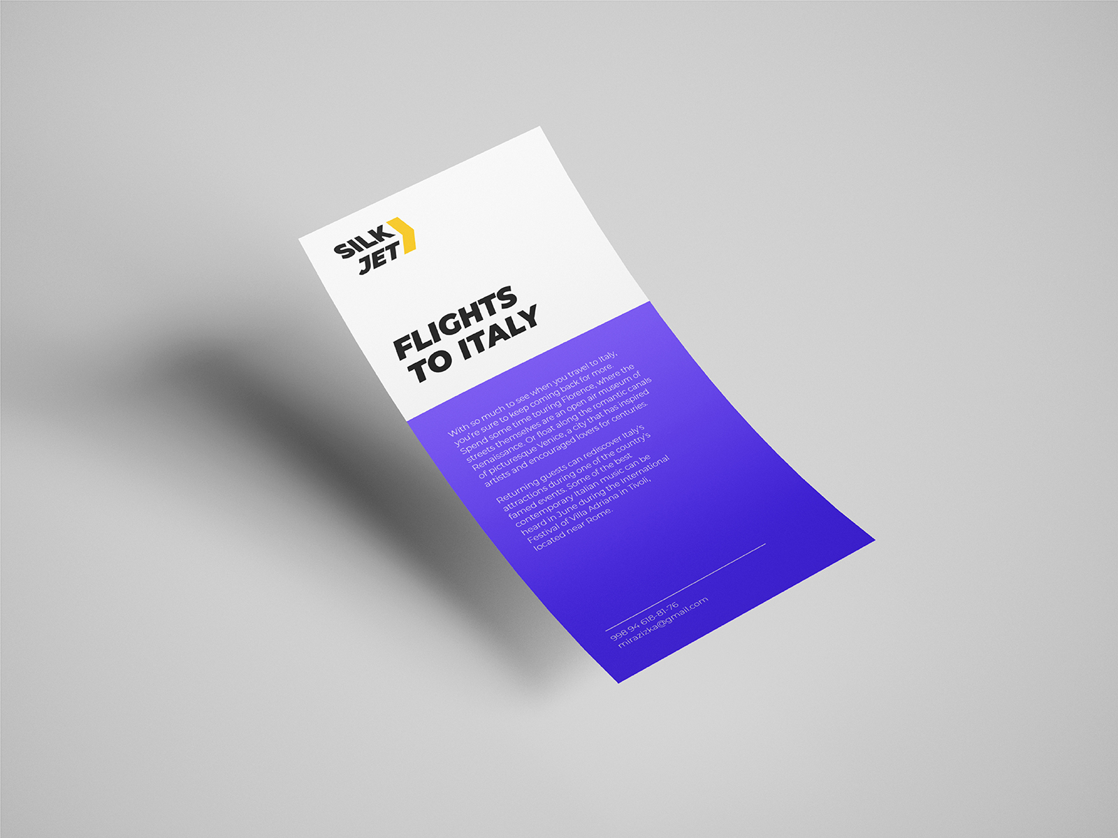
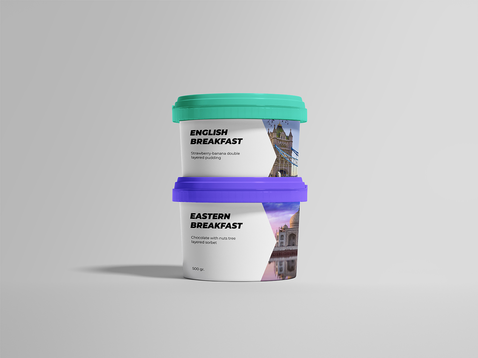
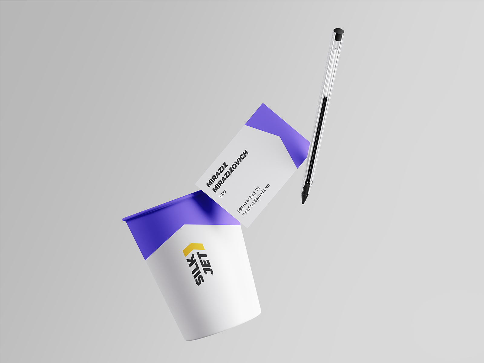
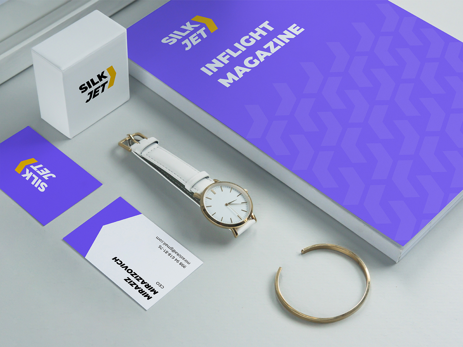
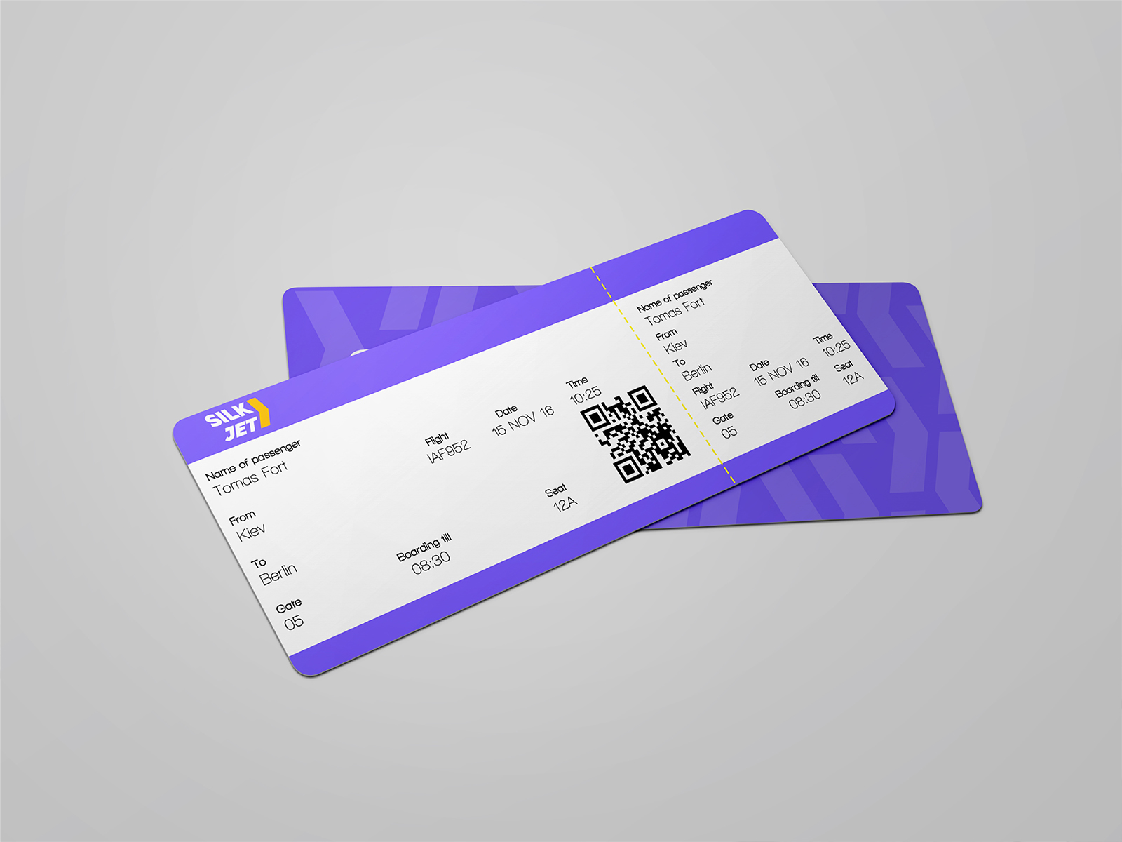
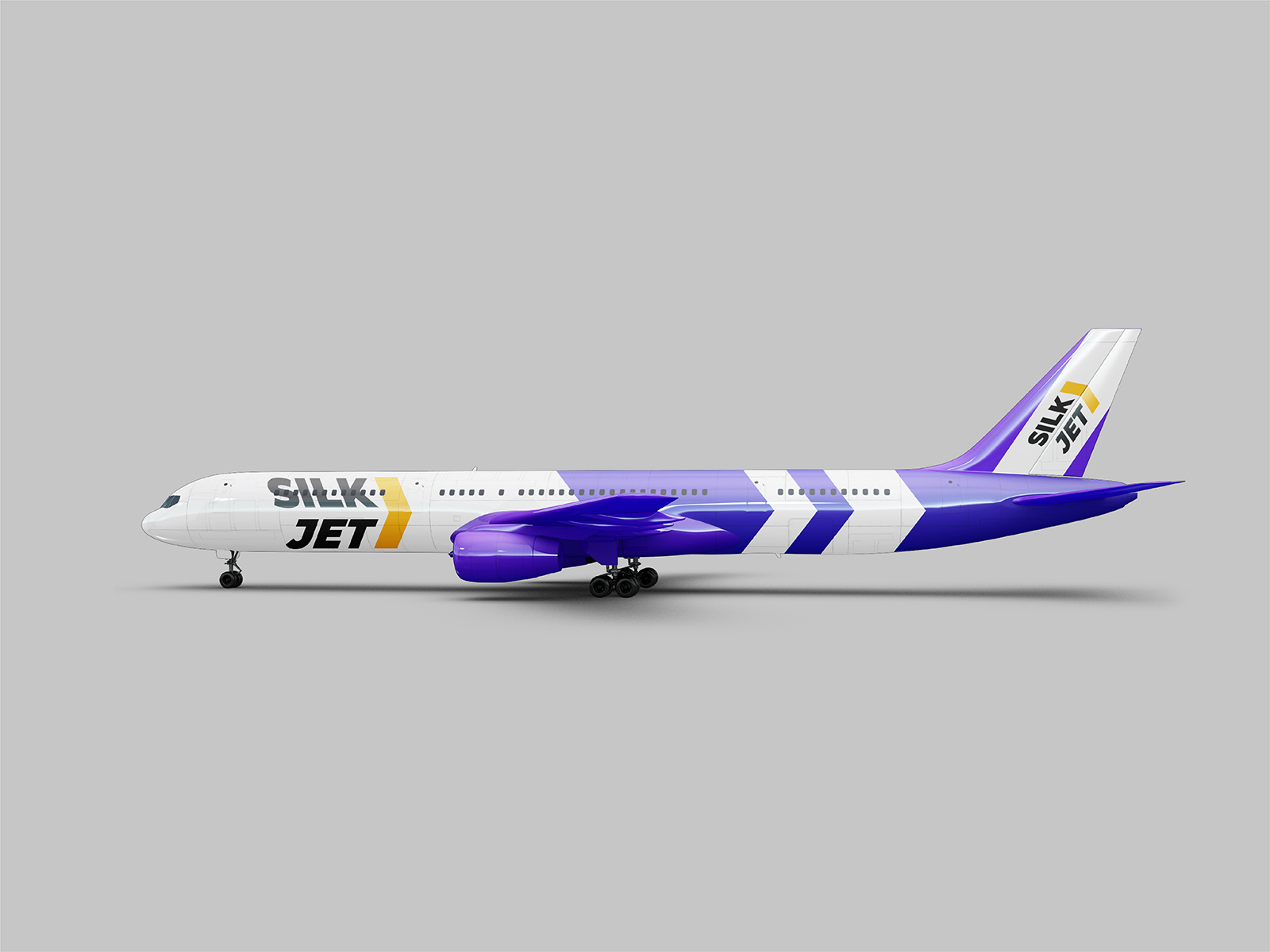
Solution: develop a logo that evokes associations with speed, direction and affordability. Italic letters turned parallel to each other symbolize speed and dynamics, and brand sign shows the direction – one of the most commonly used signs on travels (on highways, in airports etc). Moreover, it was decided to use bright colors in media to distinguish from “Uzbekistan Airways” company. The project start is scheduled to 2020.