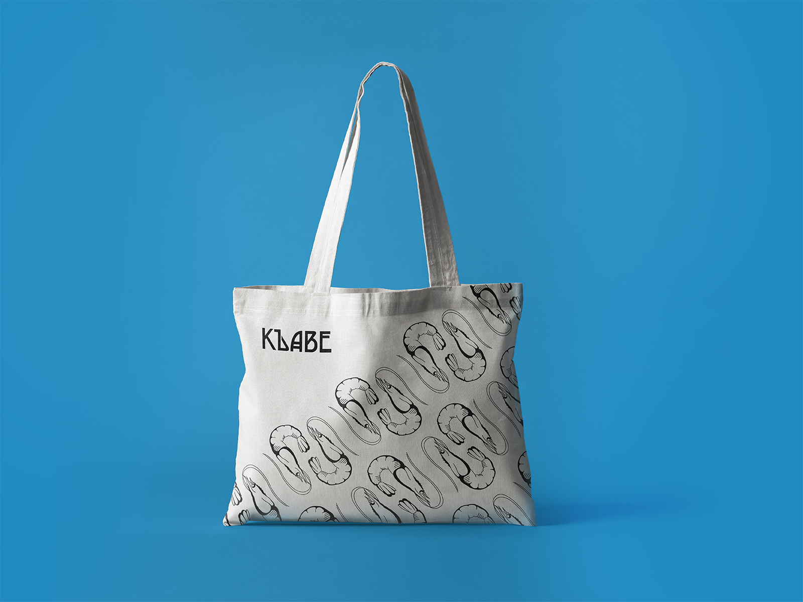
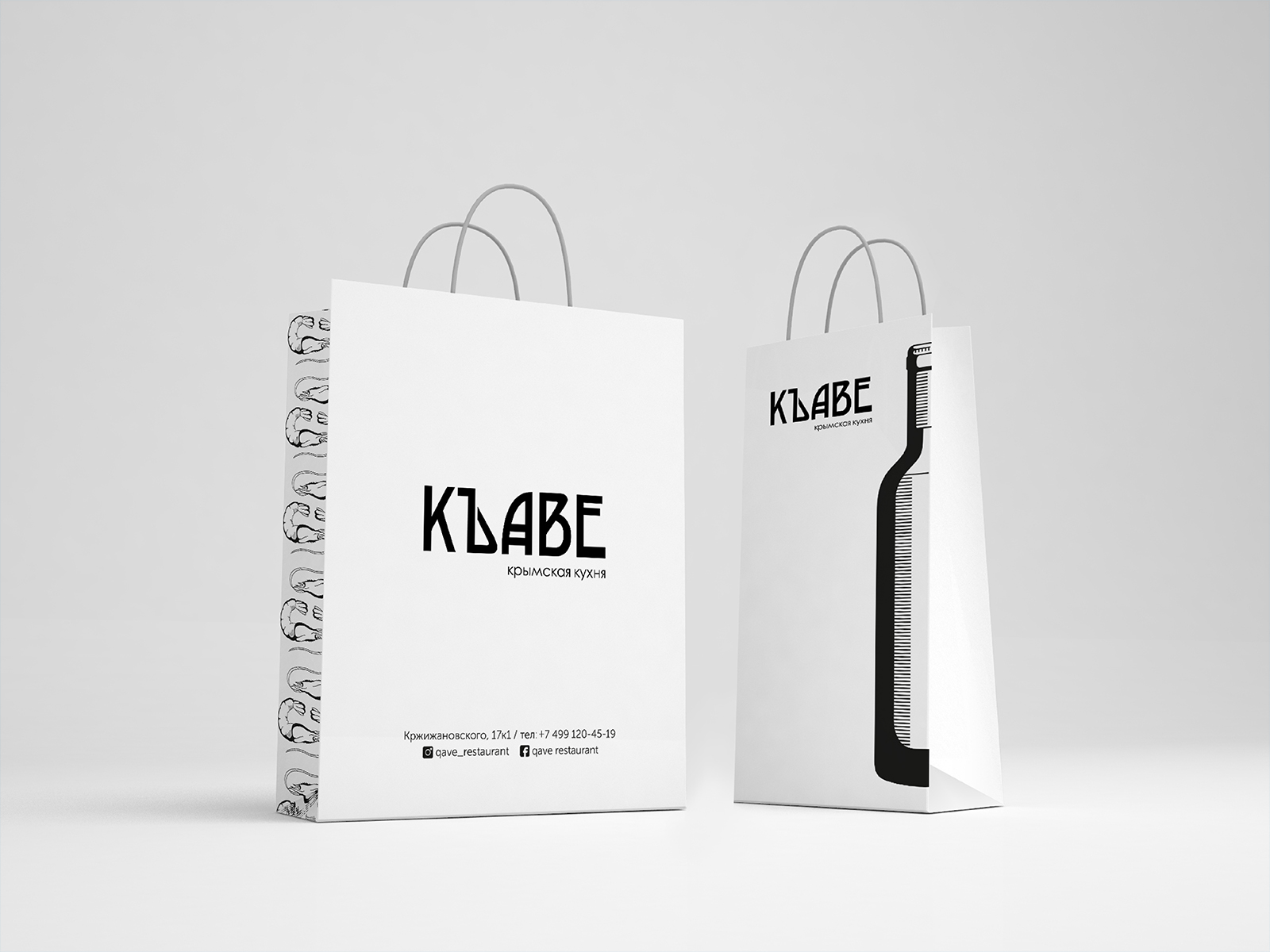
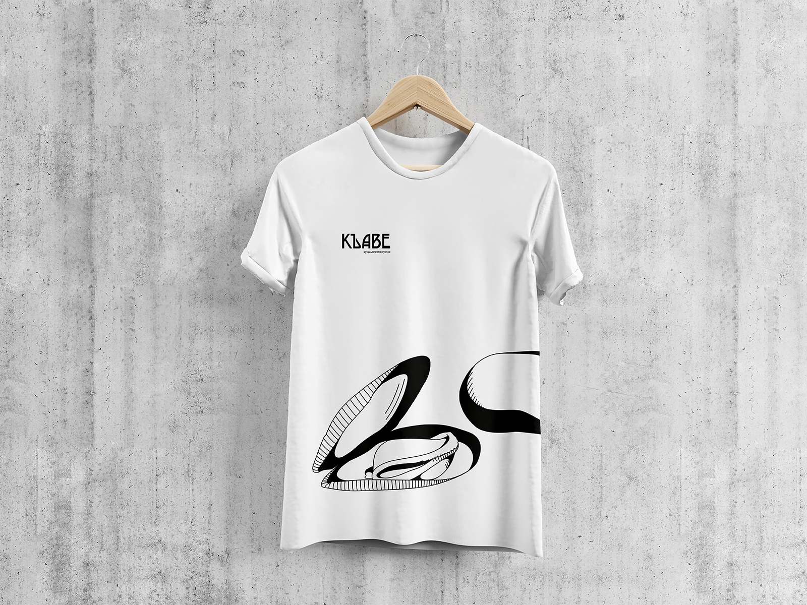
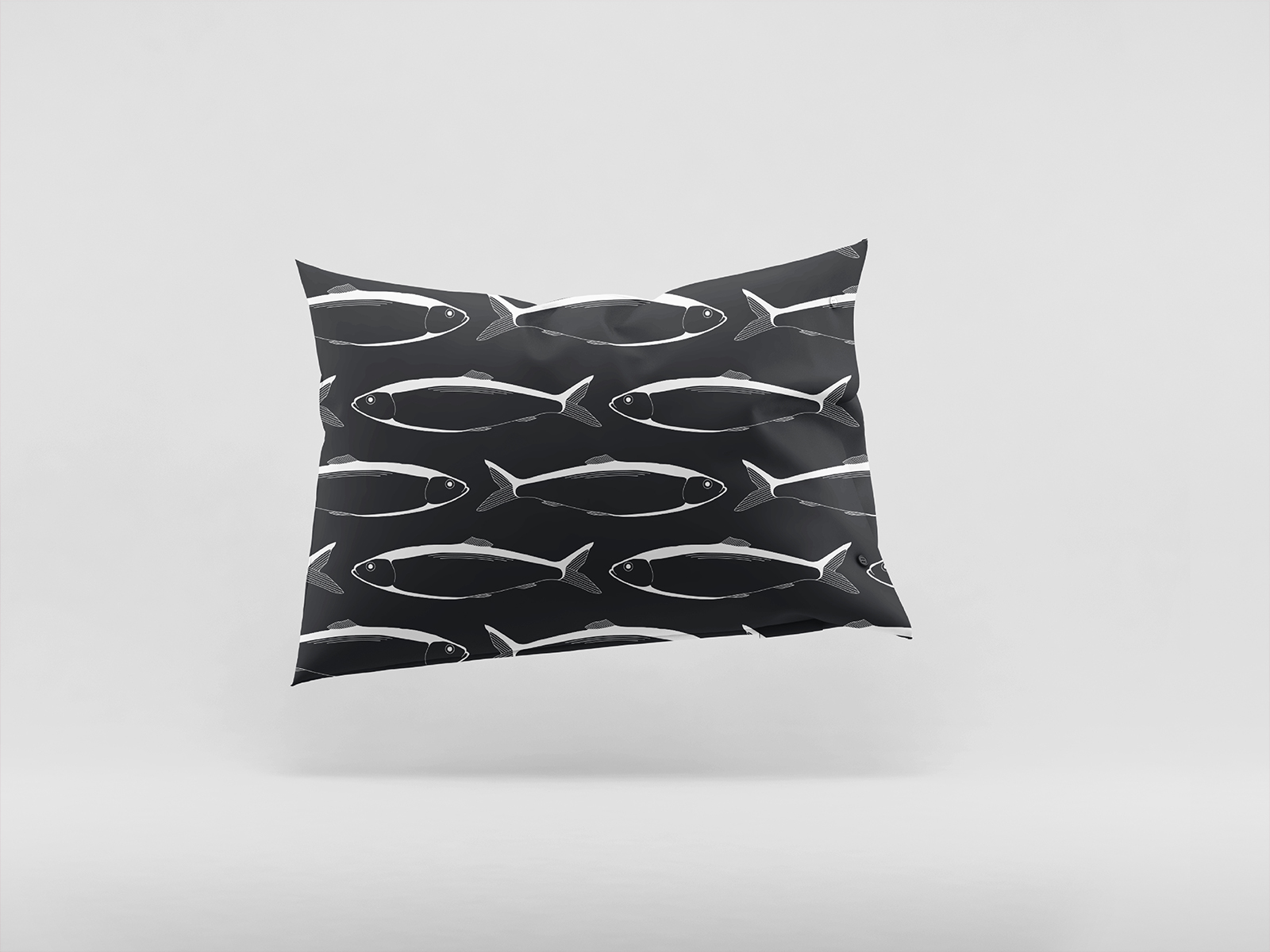
Corporate identity and packaging design for Crimean cuisine restaurant "Къаве" ("Kawe”)
Клиент
Crimean cuisine restaurant "Къаве" ("Kawe”)
Рабочая группа
Team leader: Malika Saatova
Designer: Diana Suleymanova
Copywriter: Rustam Makhamadjanov
Задача
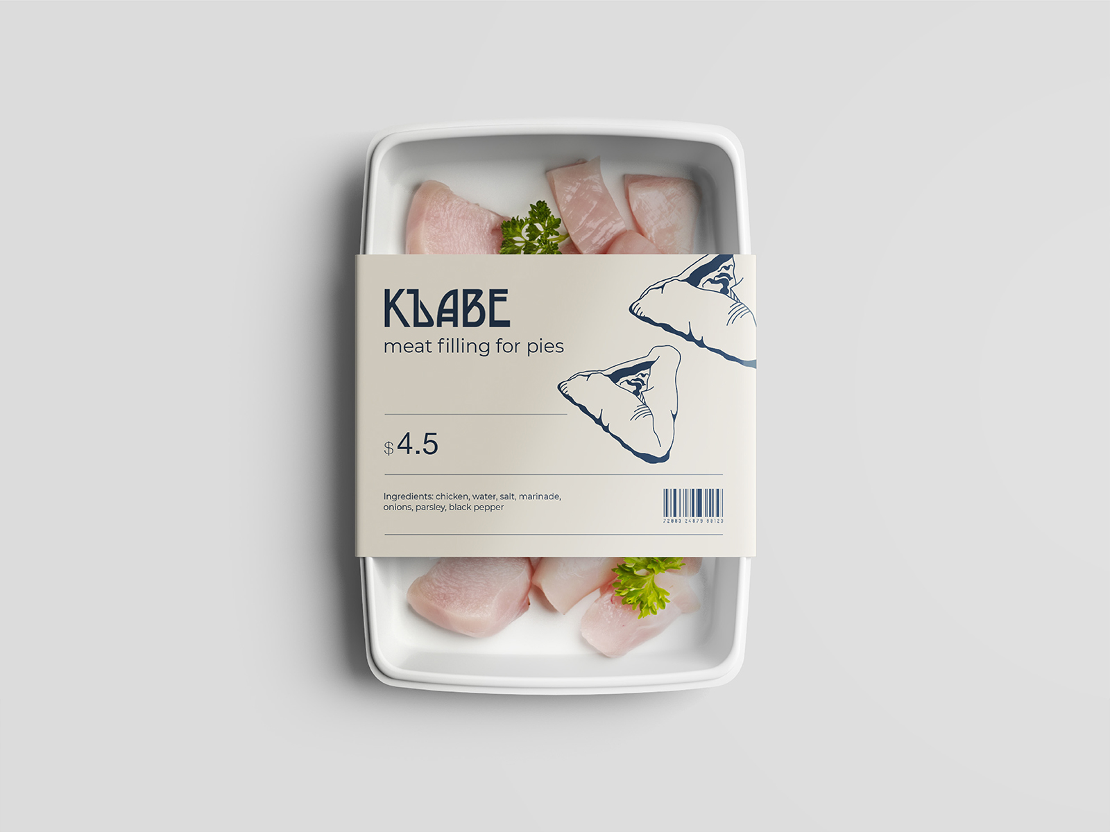
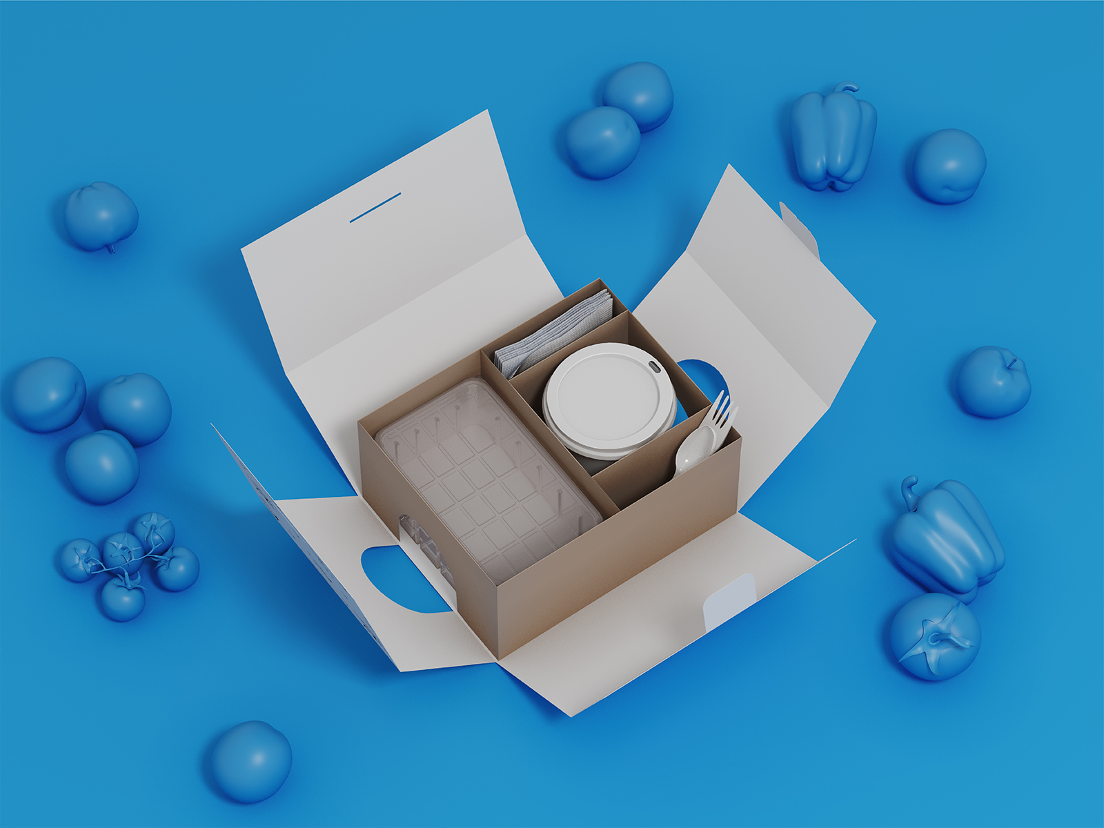
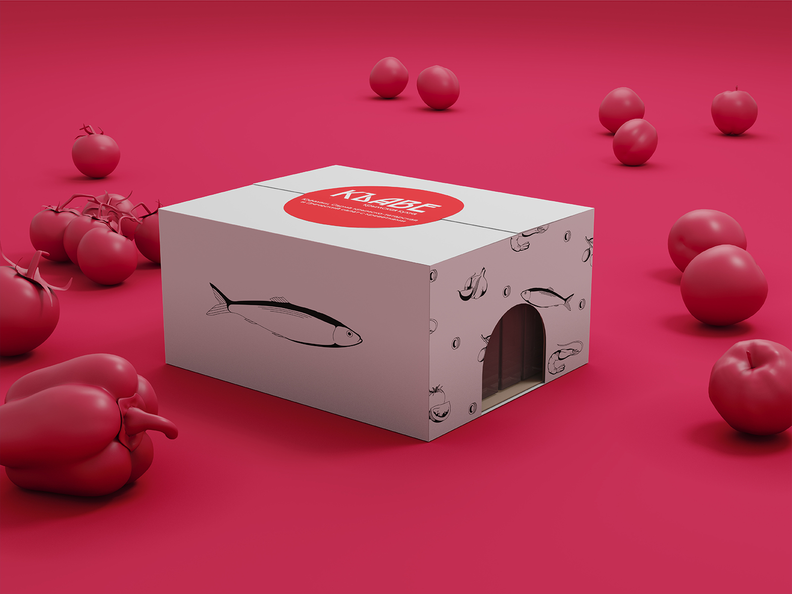
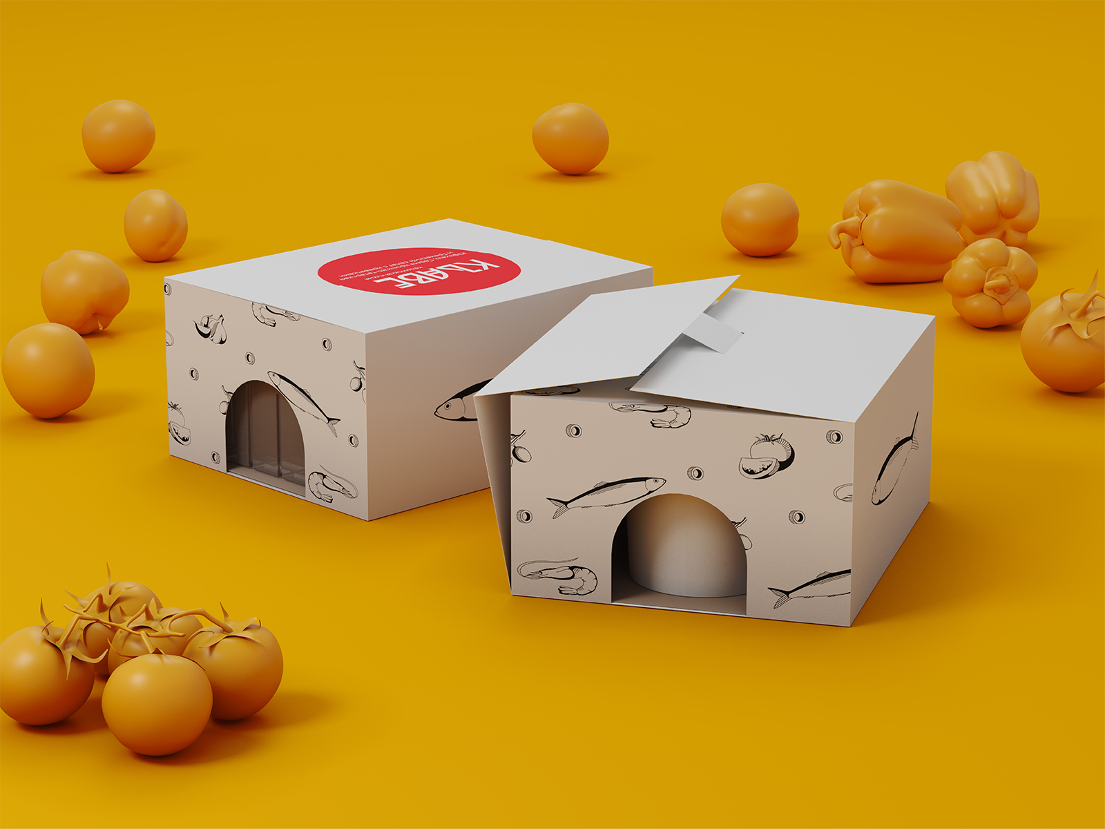
Objective: to show through the corporate identity the direction of the restaurant (the main product is seafood) and ease in positioning (a mid price range restaurant), and to touch the subject of coffee (the name “kawe” is translated from the Crimean Tatar language as “coffee”)
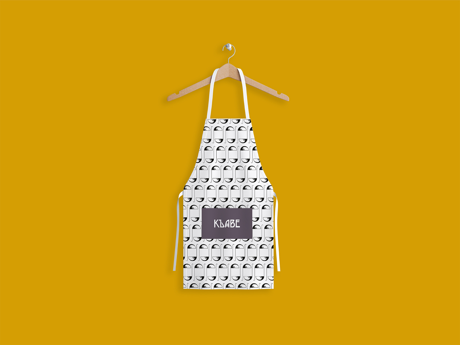
Solution: to use the most neat forms to deliver the mood of the restaurant - tasty, affordable, atmospheric. To show two main points of the restaurant, it was decided to use "Ъ" letter in a form of cezve, and the letter "A" in the form of a sail of a boat. On media, we used drawn patterns in a form of seafood, a bottle of wine, and cezve.