Visual identity for Children's School of Combat Arts #7
Клиент
Сhildren's School of Combat Arts #7
Рабочая группа
Designer: Rustam Sarsenov
Appazov Agency
Задача
Customer:
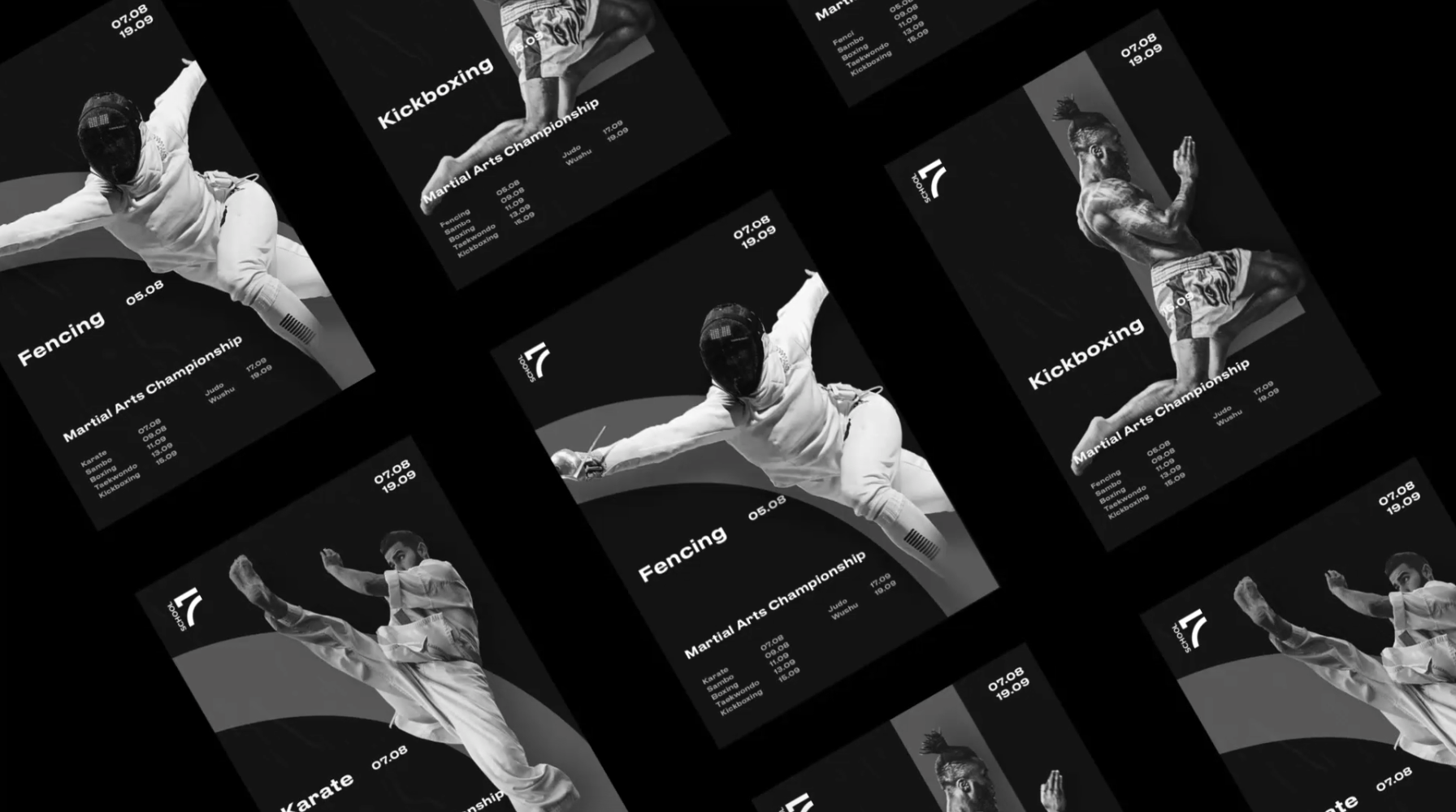
Children and youth sports school of Combat arts #7 in Astana.
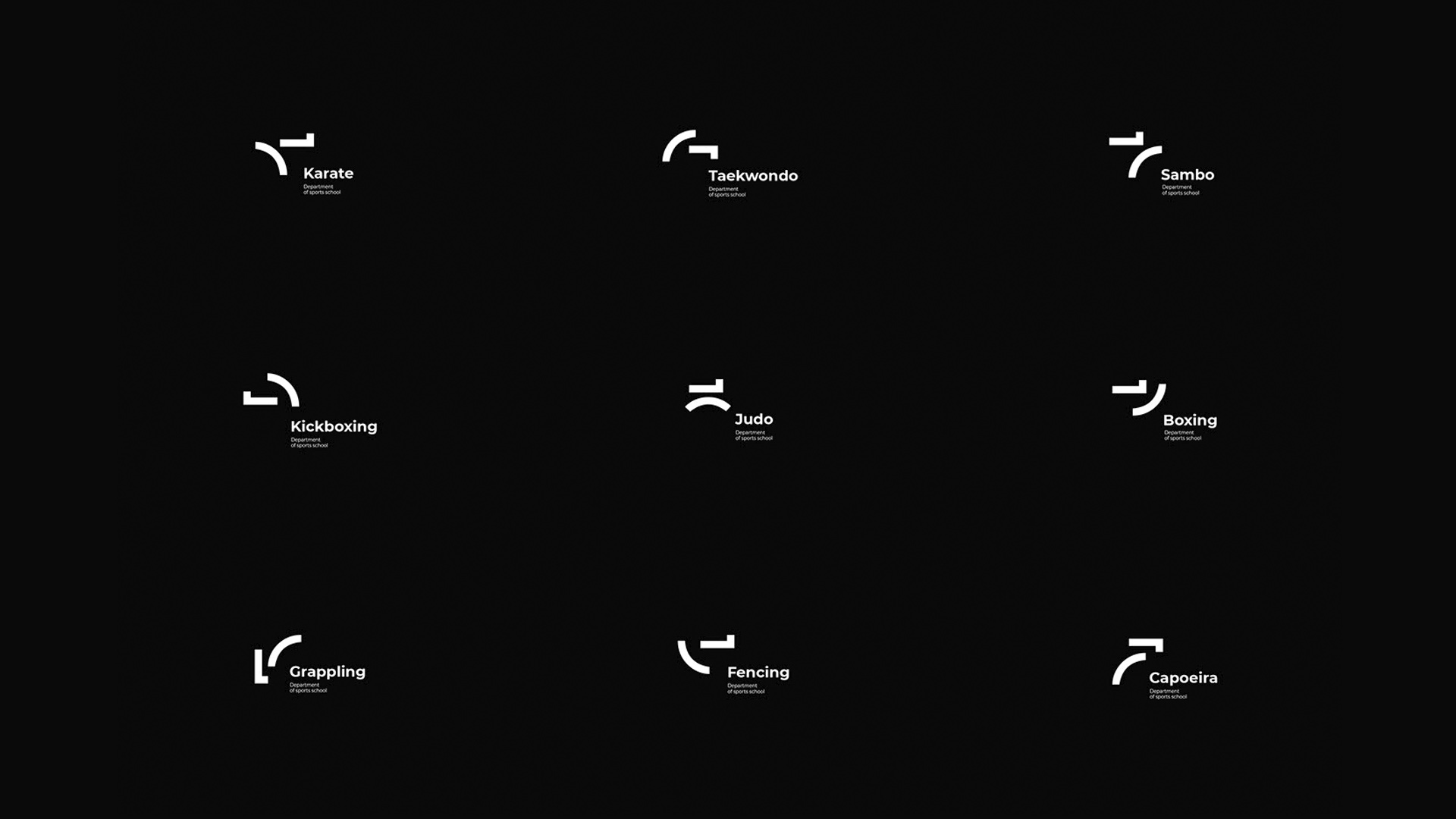
The school cultivates 9 areas of martial arts (karate, taekwondo, judo, sambo, etc.).
Task:
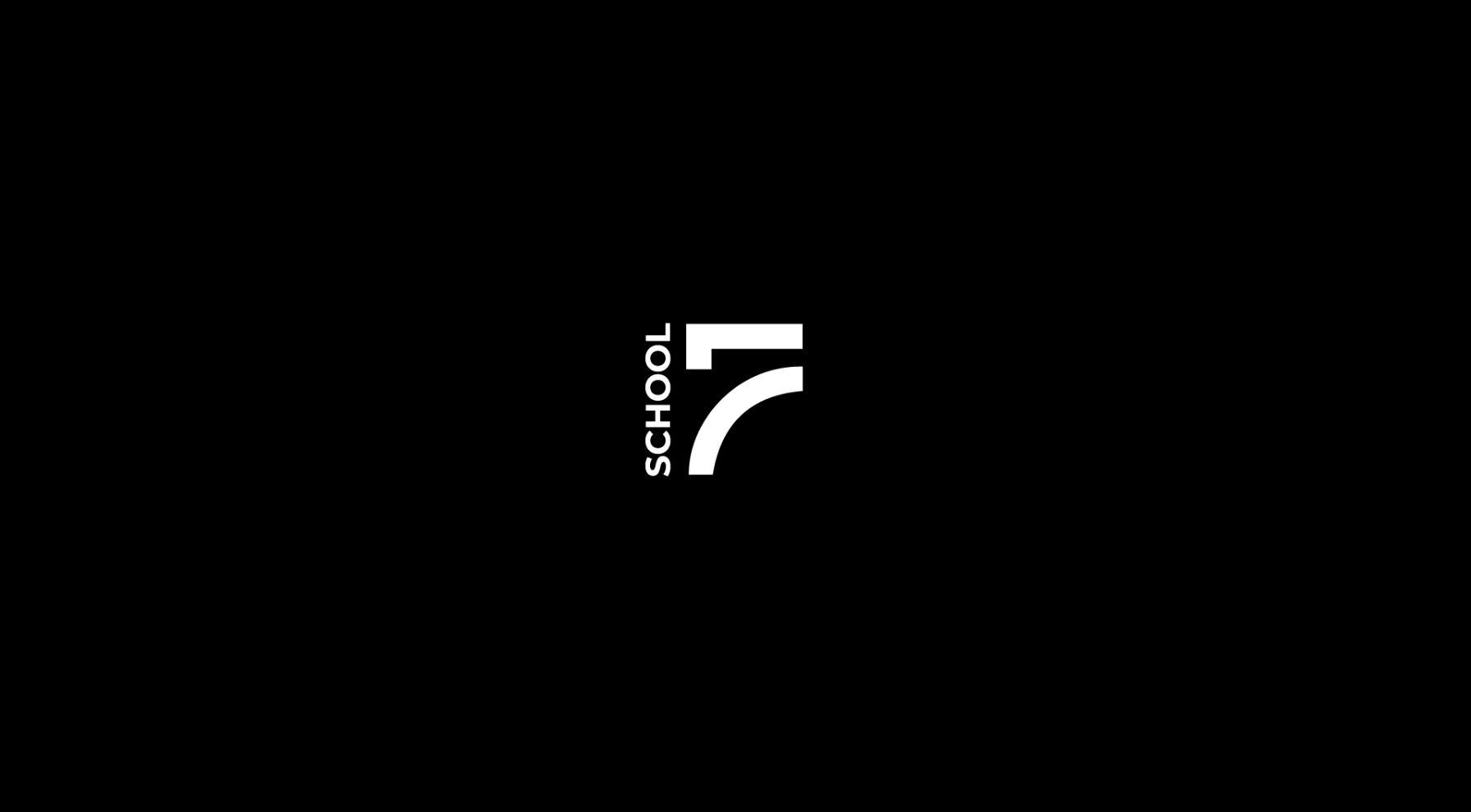
Develop a visual identity system that combines all 9 different units into a single visual style, with the mandatory presence of the number 7 in the logo.
Idea:
Any martial art is based on a confrontation between two rivals.
Like the eternal struggle of two opposites - black and white, old and new, good and evil, strong and weak.
This opposition was expressed through two diametrical figures - a square and a circle.
These forms were not chosen by chance, because they are most often used in the tatami pattern, on which the fighters perform.
Decision:
The collision of the square and the circle, black and white, dynamics and statics found reconciliation in the concept of the logo in the form of the number 7.
In addition to the common mark, it was necessary to develop separate characters for each unit of the school.
We decided to use transformable combinations of the two basic shapes that make up the main logo.
The figures are opposed to each other and turn into symbols that take the form of a combat of fighters in different types of martial arts (karate, taekwondo, wrestling, judo, etc.).
This visual solution allowed us to create dynamic and unique characters for each school unit.
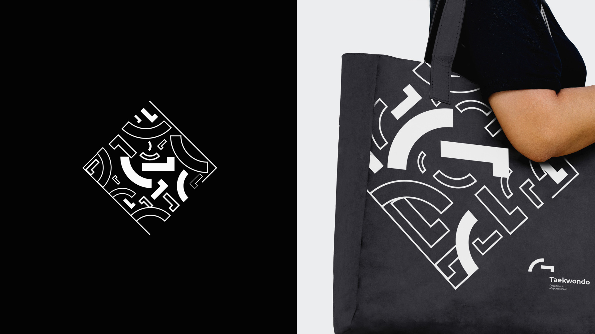
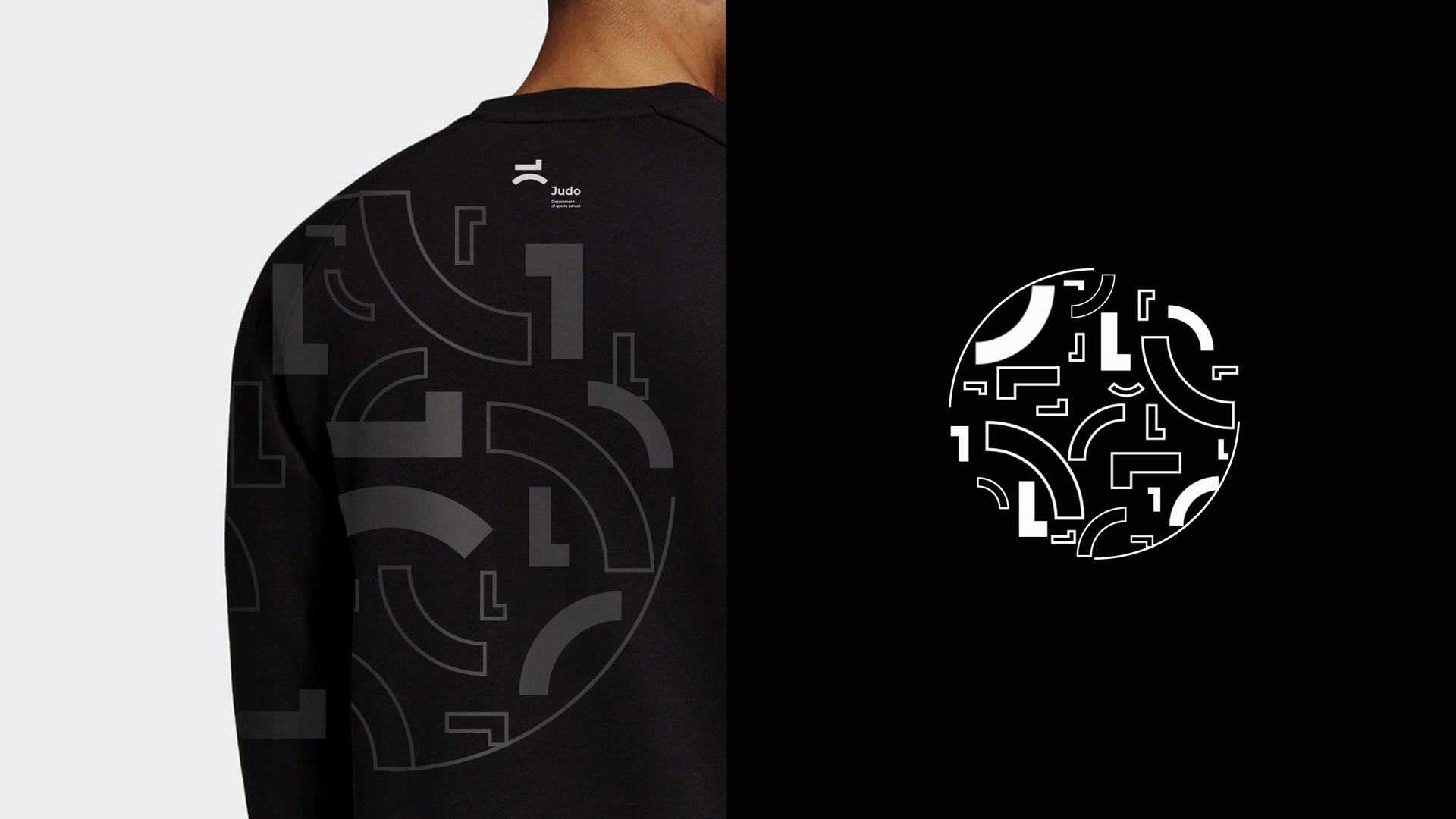
The concept of confrontation allows one to constantly expand the visual language with interesting combinations of new images (speed and peace, butterfly and bee, knight and samurai, etc.) in the design of advertising materials, social networks and branded merchandise.