Tashkent city branding
Клиент
Public Council of Tashkent
Рабочая группа
Client service: Elina Ibragimova
Art-Direction: Temur Sadi
Design: Stepan Litvinov, Aziz Yusupov, Anastasiya Tatarchenko, Rovshan Kidryachyov, Zokir Khalmatov, Mansur Nabiev
Video: Anvar Safaev, Azamat Abbasov
Animation: Adrian Ciszek, Stepan Litvinov, Timur Yeliseev
Music: Oscar Jalilov, Saidazim Kodirov
Задача
Situation & Challenge:
The Public Council of Tashkent announced an open competition for the development of the city logo & identity based on the city brand platform developed by the expert group.
It was necessary to create a positive image of Tashkent to improve its investment attractiveness, strengthen regional positions in Central Asia and create an atmosphere of a promising and favorable place for living, investing and visiting.
The main objective of the project is to eliminate the fragmented communications of the city both to internal and external audiences.
The brand platform was built around the concepts of home, family, heritage.
The competition commission for the development of the Tashkent logo included representatives of the Public Council, experts in the field of marketing, branding, and design.
Idea & Solution:
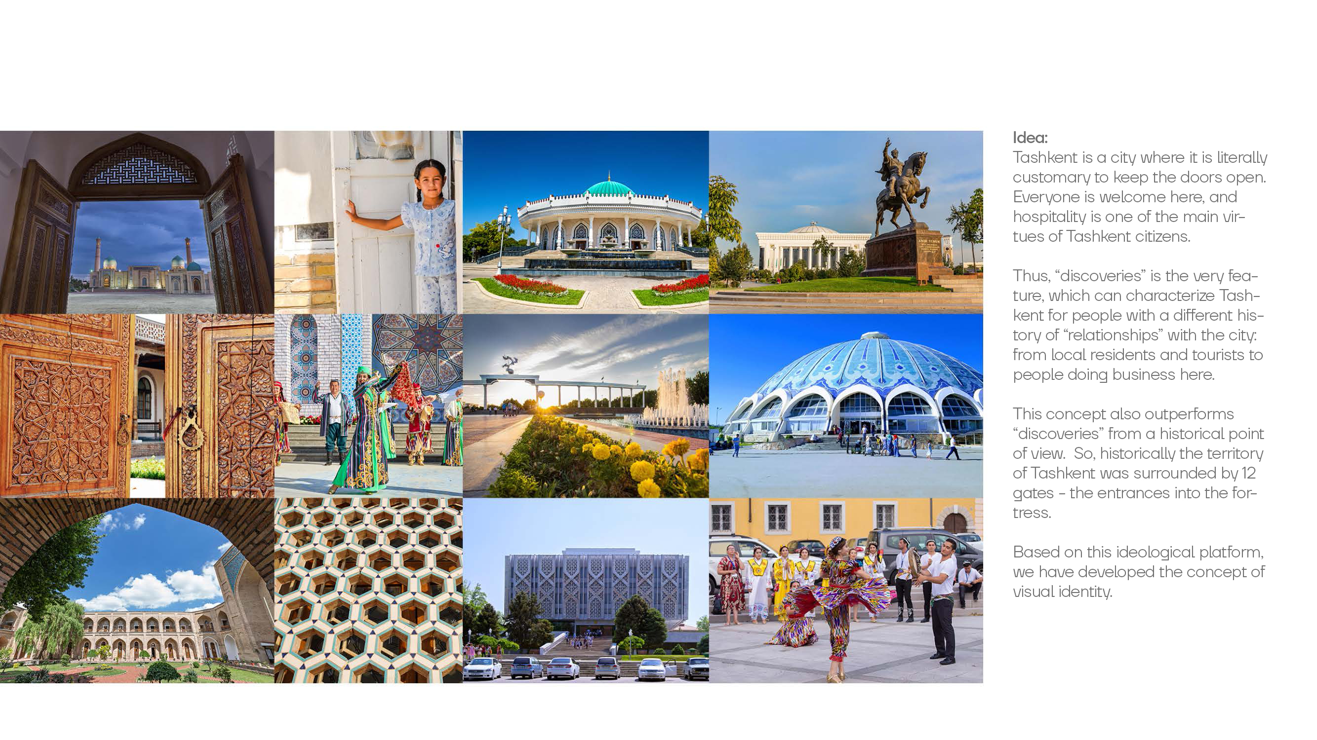
Tashkent is a city where it is literally customary to keep the doors open. Everyone is welcome here, and hospitality is one of the main virtues of Tashkent citizens.
Thus, “discoveries” is the very feature, which can characterize Tashkent for people with a different history of “relationships” with the city: from local residents and tourists to people doing business here.
This concept also outperforms “discoveries” from a historical point of view. So, historically the territory of Tashkent was surrounded by 12 gates - the entrances into the fortress.
Based on this ideological platform, we have developed the concept of visual style.
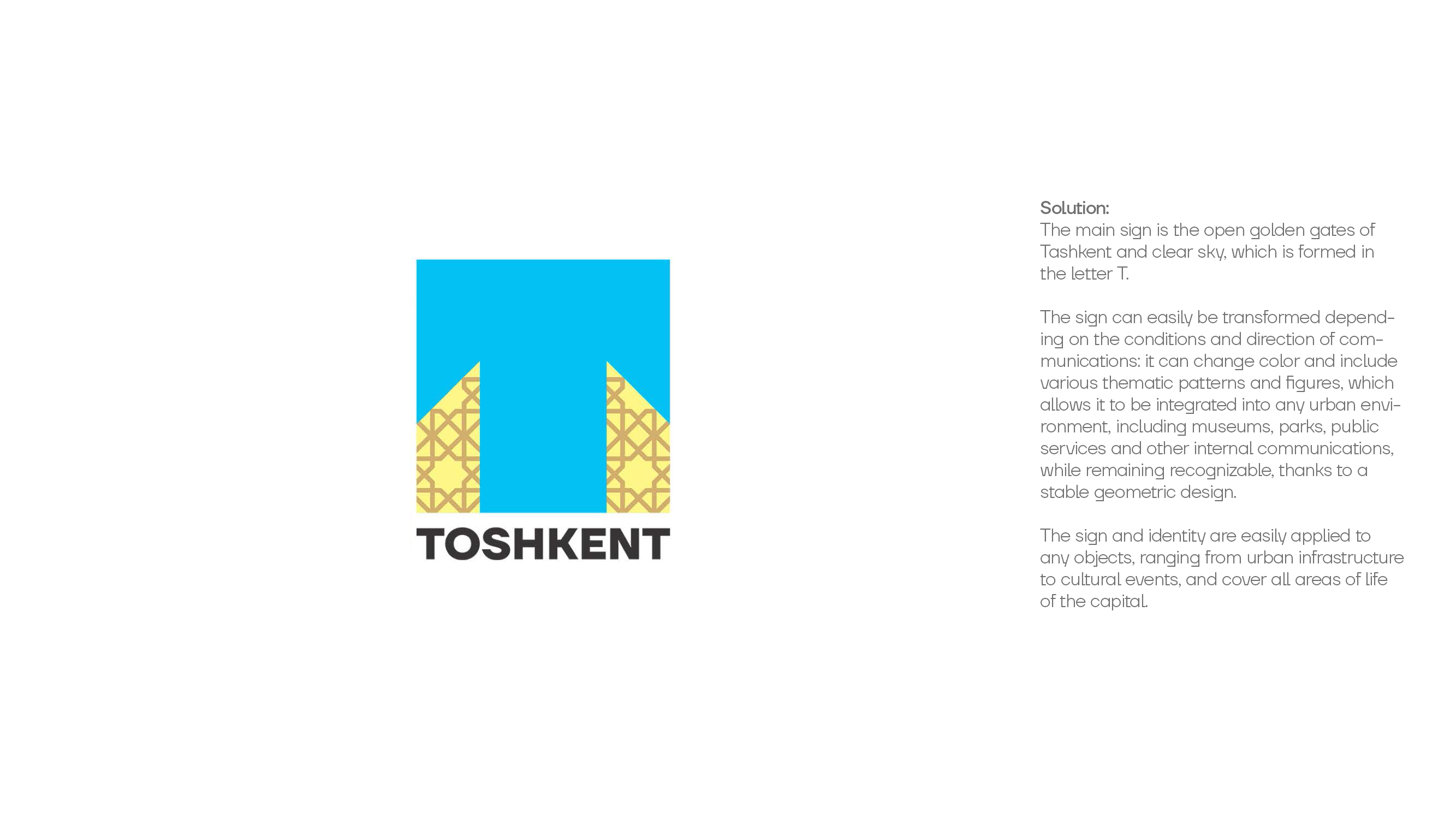
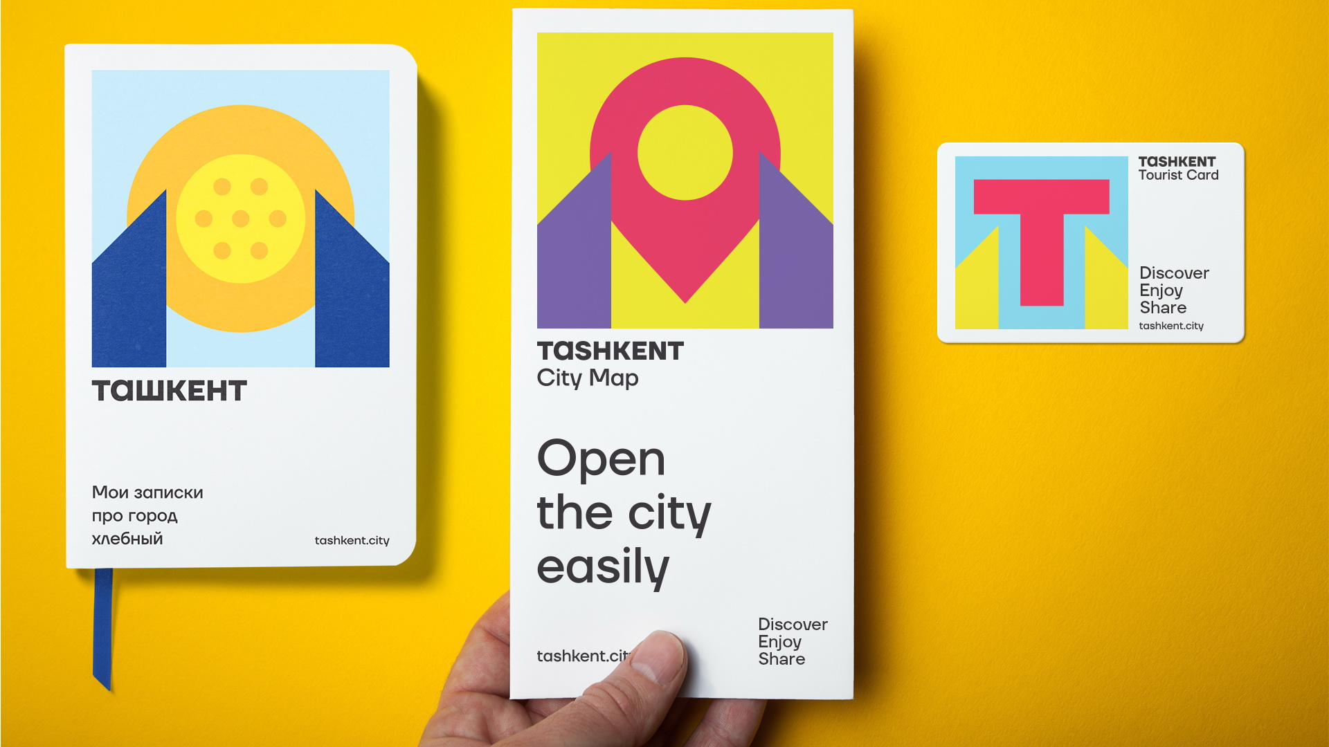
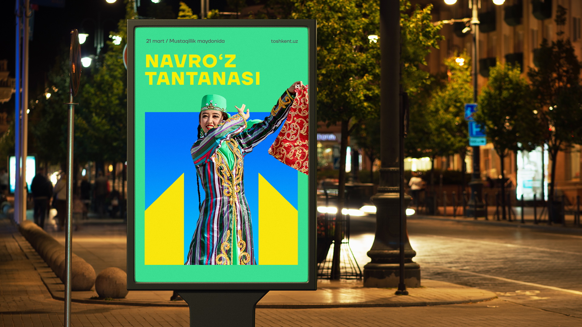
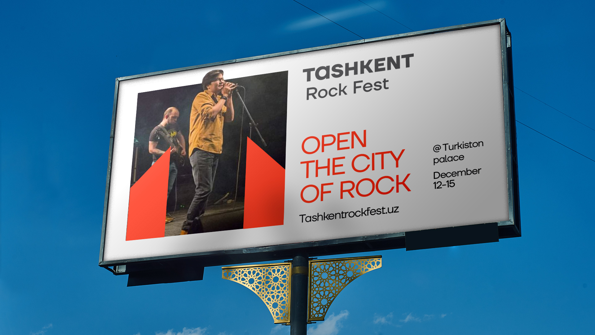
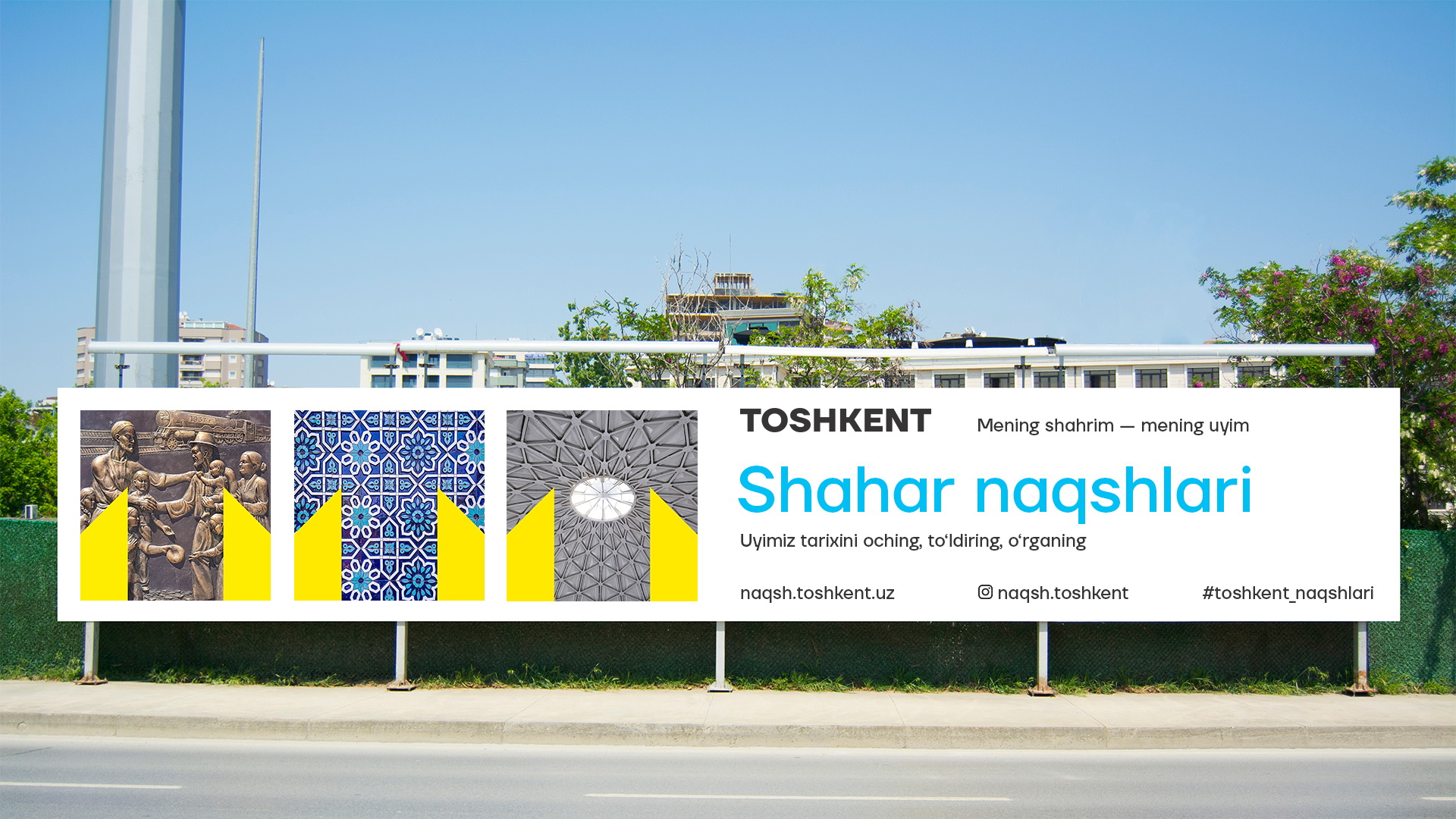
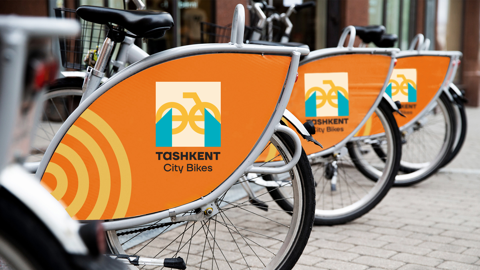
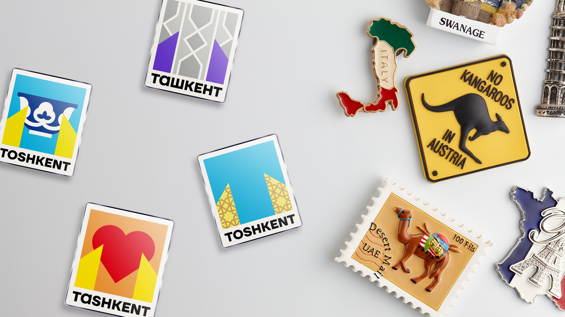
The main sign is the open golden gates of Tashkent and clear sky, which is formed in the letter T.
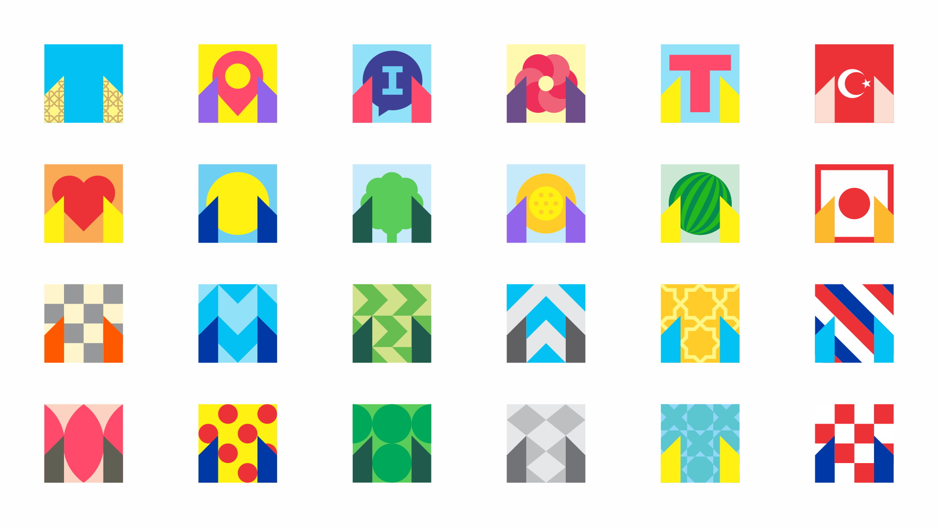
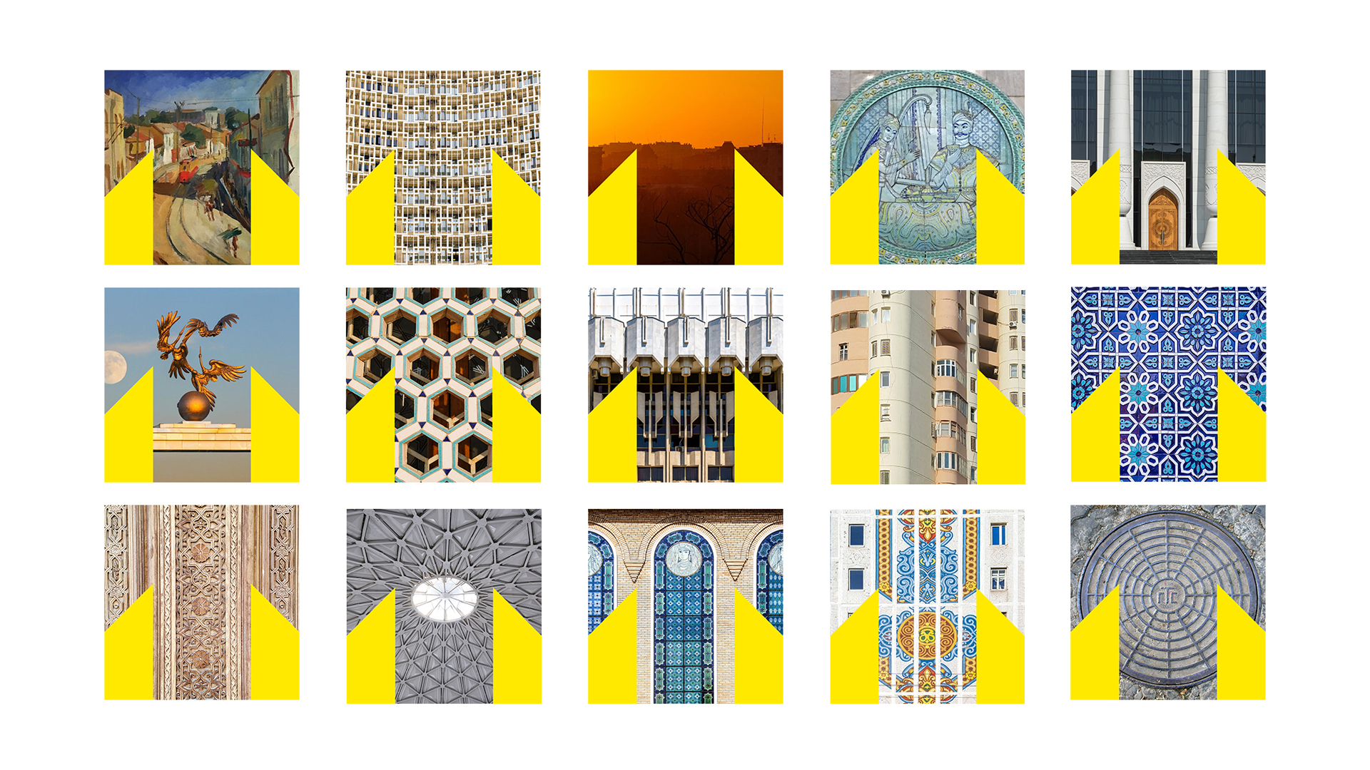
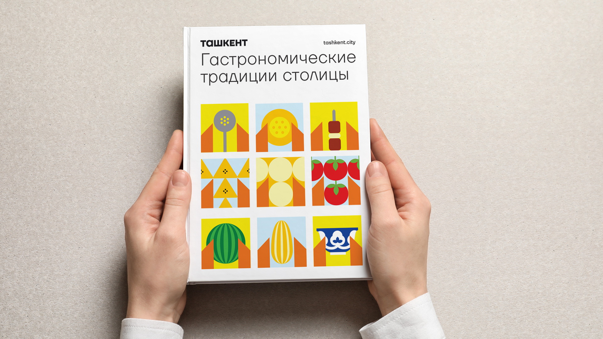
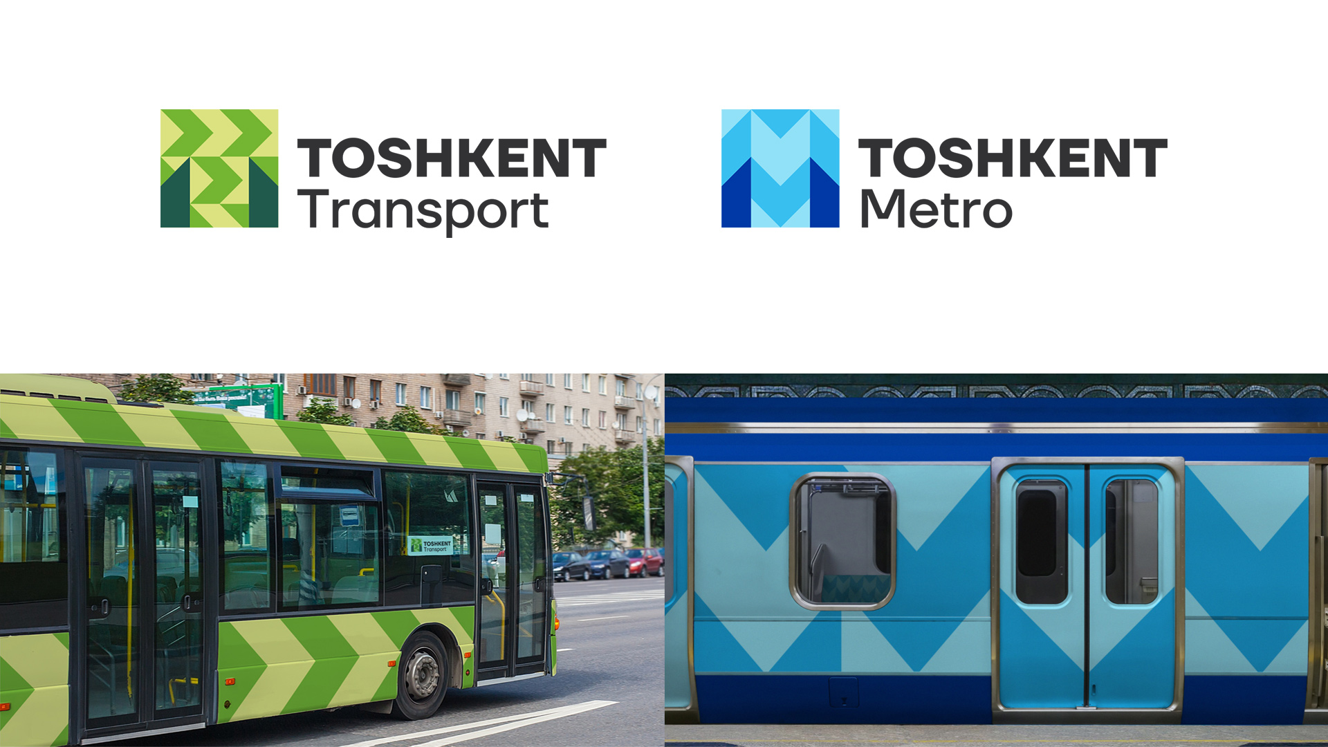
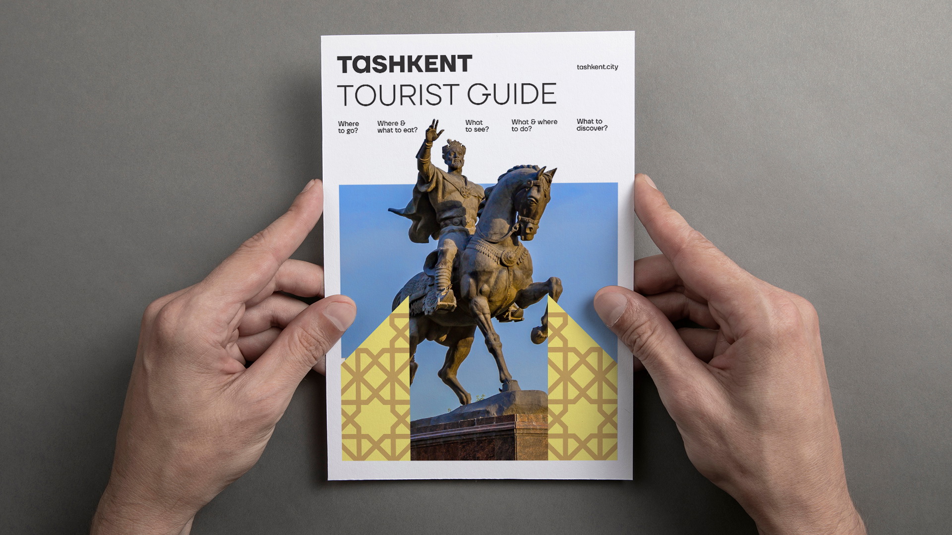
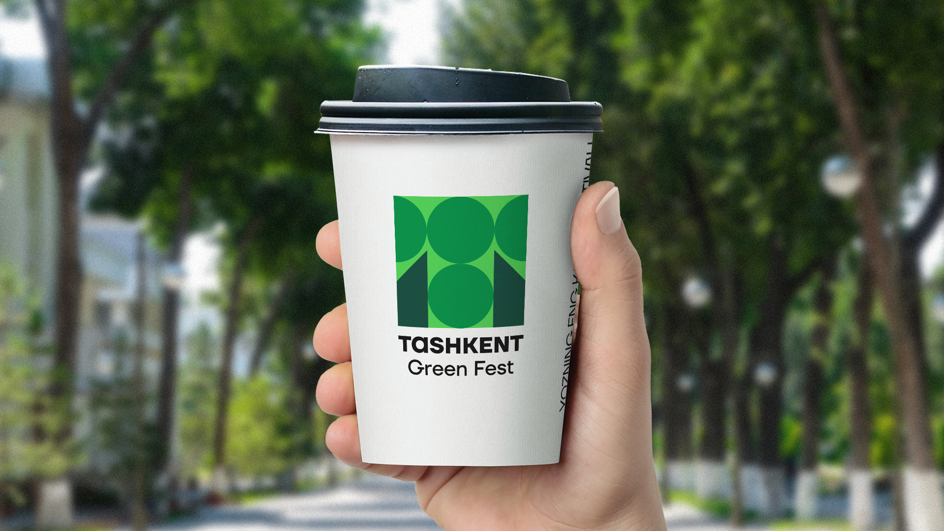
The sign can easily be transformed depending on the conditions and direction of communications: it can change color and include various thematic patterns and figures, which allows it to be integrated into any urban environment, including museums, parks, public services and other internal communications, while remaining recognizable, thanks to a stable geometric design.
The sign and identity are easily applied to any objects, ranging from urban infrastructure to cultural events, and cover all areas of life of the capital.
First results:
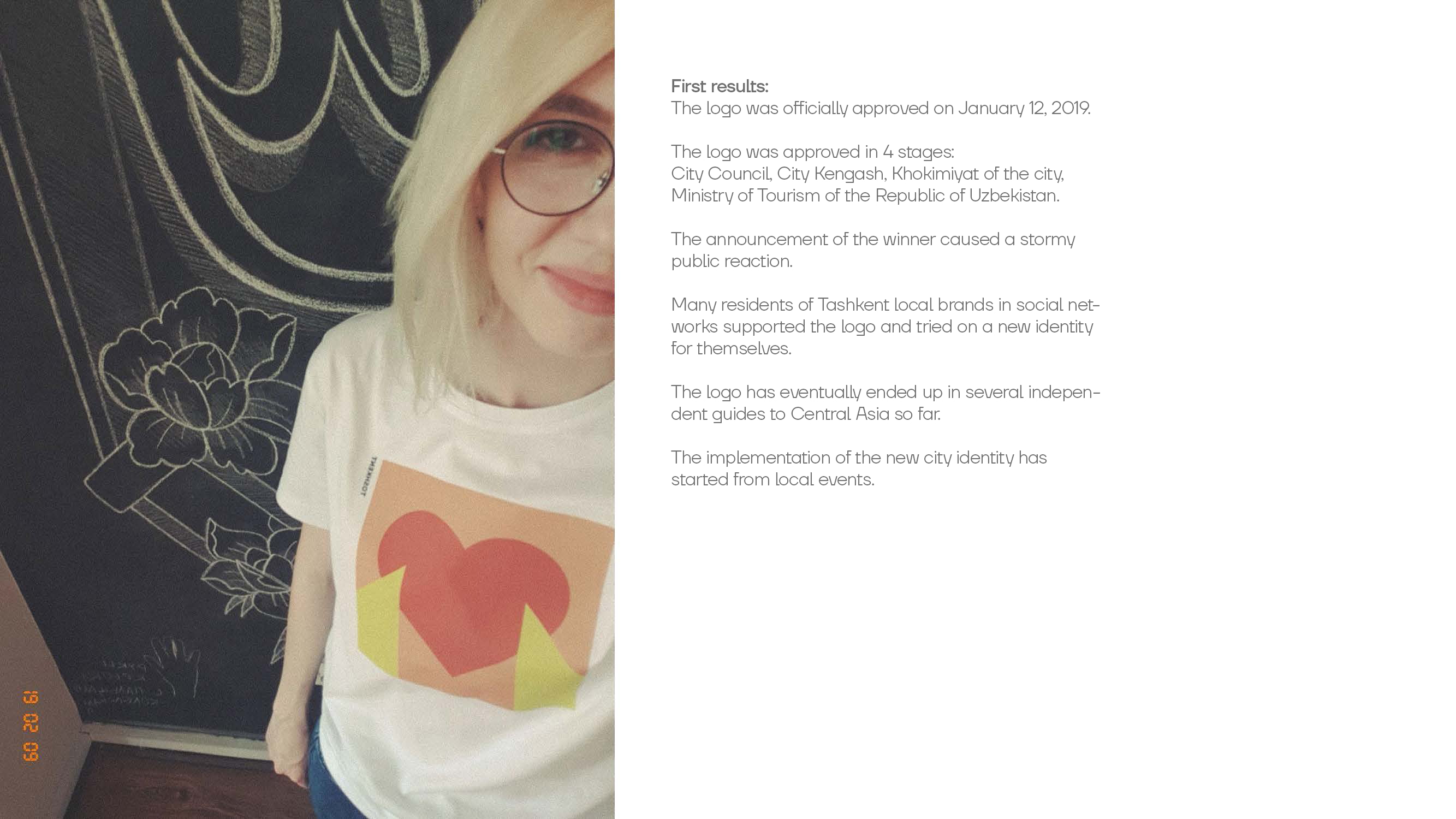
The logo was officially approved on January 12, 2019.
The logo was approved in 4 stages: City Council, City Kengash, Khokimiyat of the city, Ministry of Tourism of the Republic of Uzbekistan.
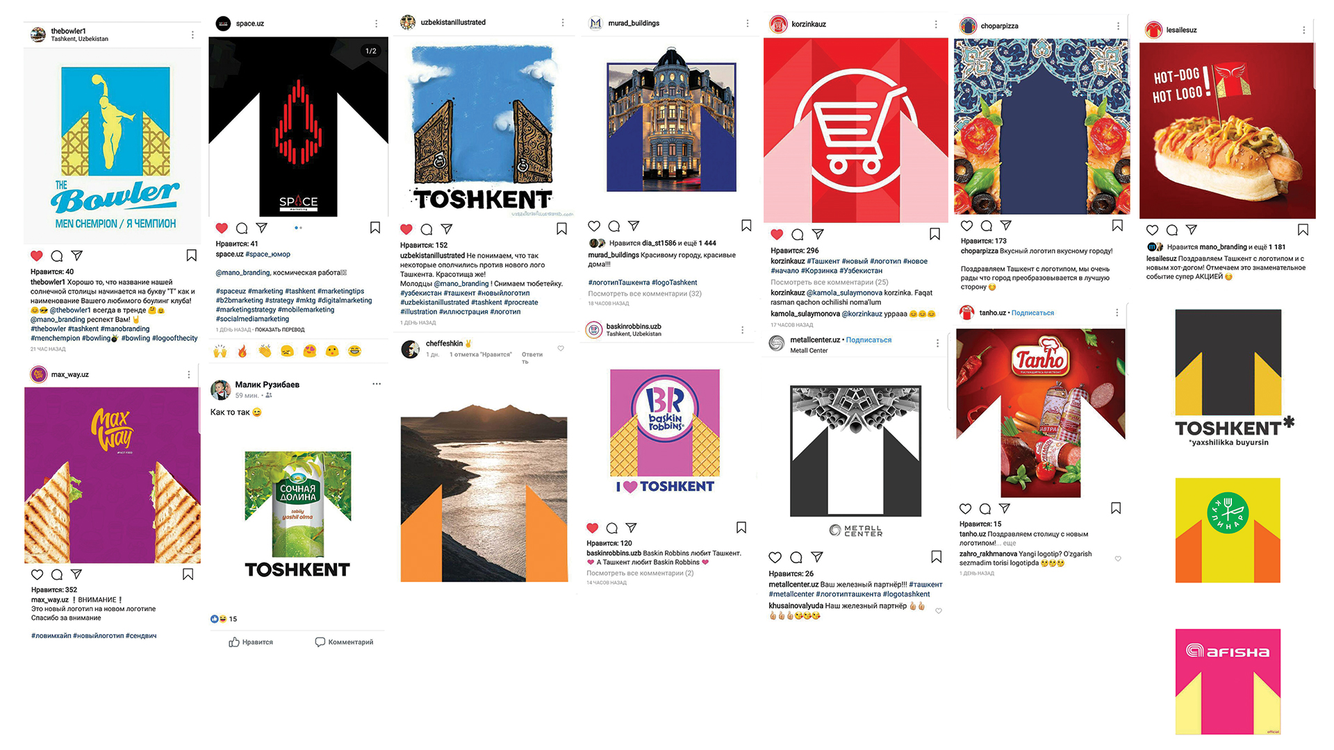
The announcement of the winner caused a stormy public reaction.
Many residents of Tashkent local brands in social networks supported the logo and tried on a new identity for themselves.
The logo has eventually ended up in several independent guides to Central Asia so far.
The implementation of the new city identity has started from local events.
