Клиент
Sports Master Data SIA
Рабочая группа
Client Service: Elina Ibragimova
Art-direction: Temur Sadi
Design: Stepan Litvinov, Mansur Nabiev
Video & Animation: Timur Yeliseev
Music: Tigerblood Jewel - Kodiak
Задача
Product & Challenge:
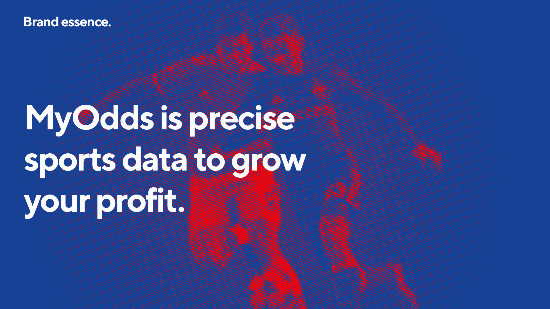
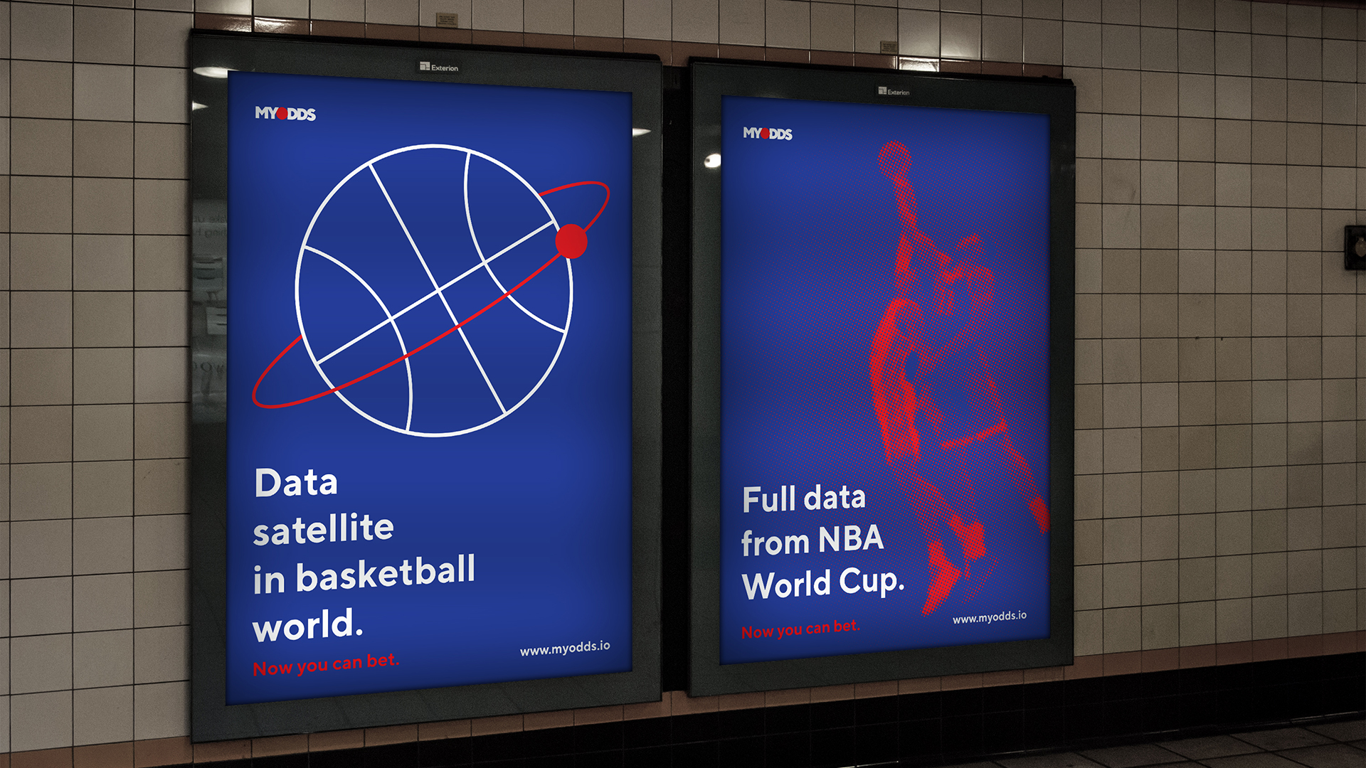
MyOdds is a SaaS B2B solution that provides the client with all the necessary data on sports, such as: fixtures (who plays, when, where), live data feed (online broadcast of games and sports events), scores (results of past games), as well as odds for bookmakers (what chances a team has for winning).
The Challenge was to create a brand that reflects the accuracy of the data collected, as well as to build associations with sports events as the source of this data.
Strategy:
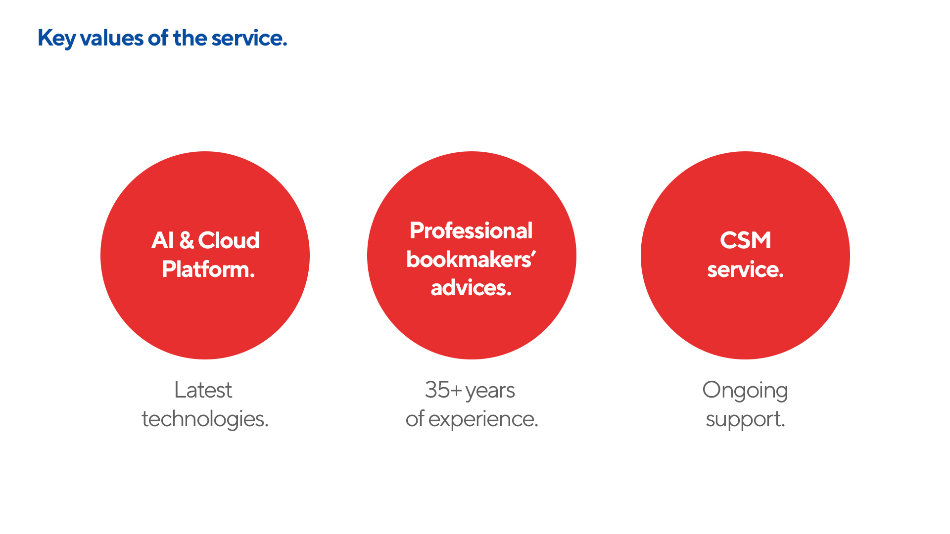
At the moment, MyOdds has the best technological base, service and is not inferior to competitors in the range of services provided, and offers the most accurate sports data for bets.
Best technology + best experience + best service = MyOdds.
MyOdds is precise sports data.
MyOdds’ mission is to help bookmakers grow their business.
Solution:
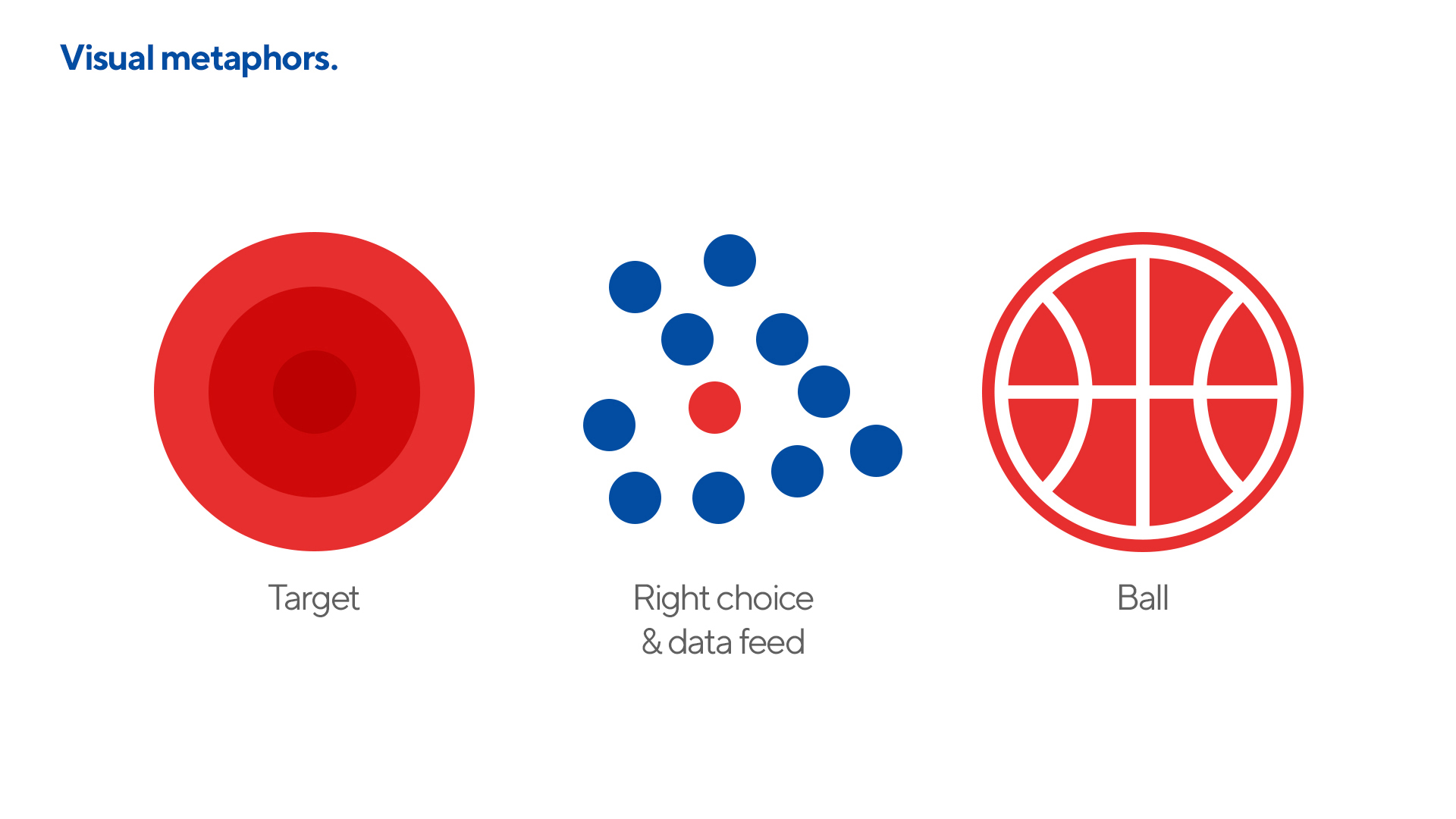
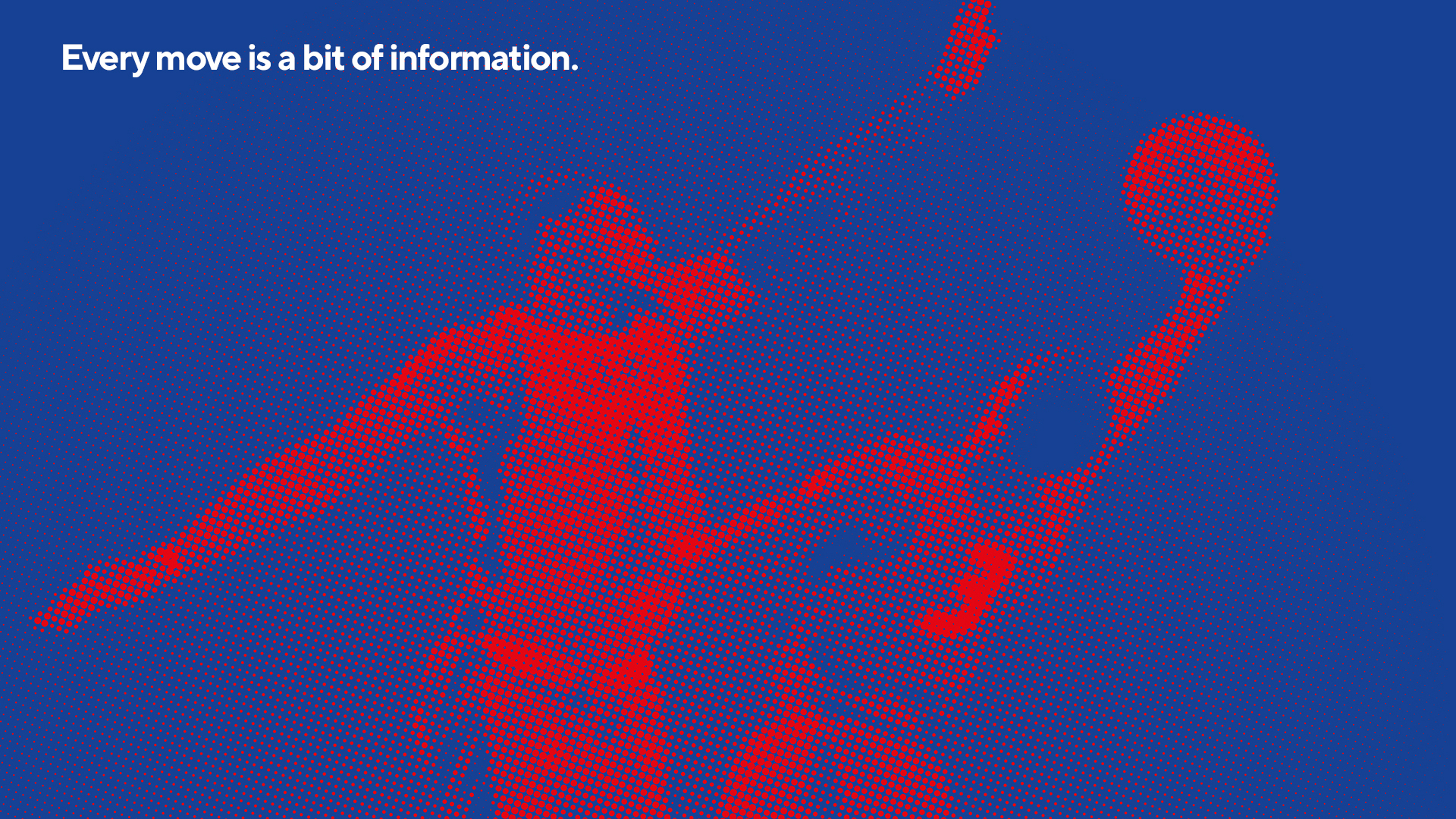
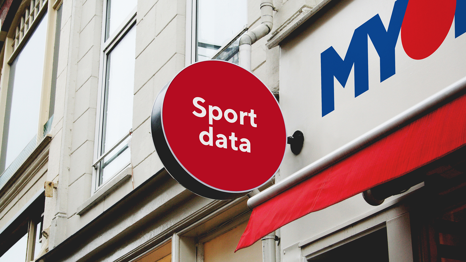
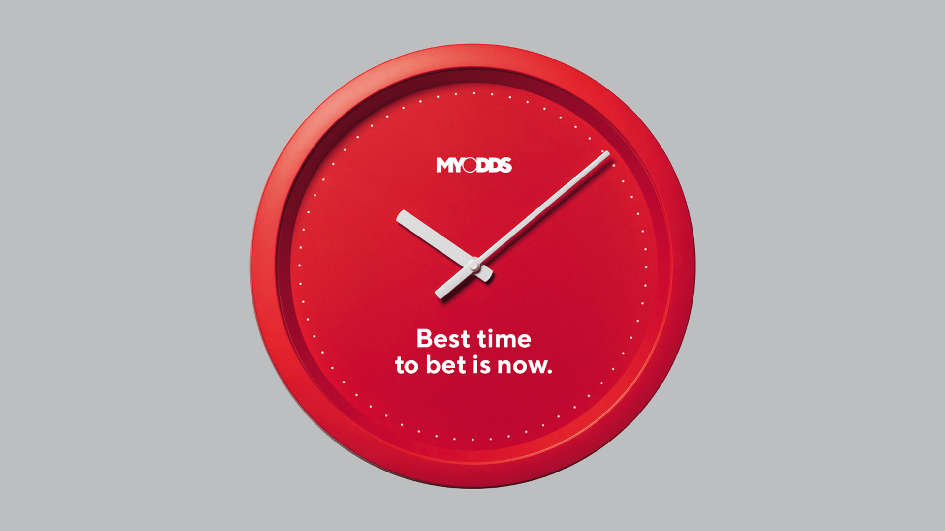
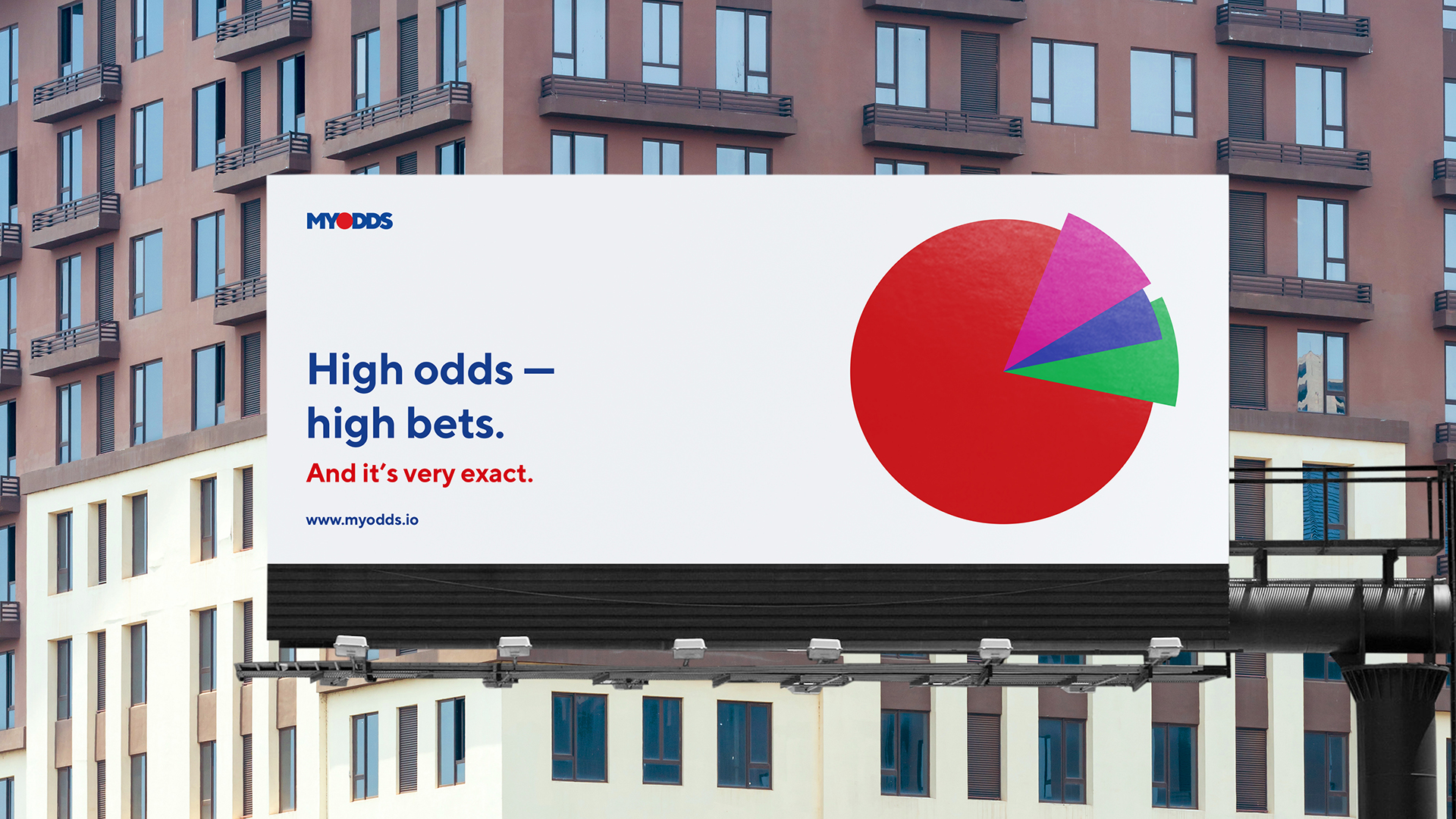
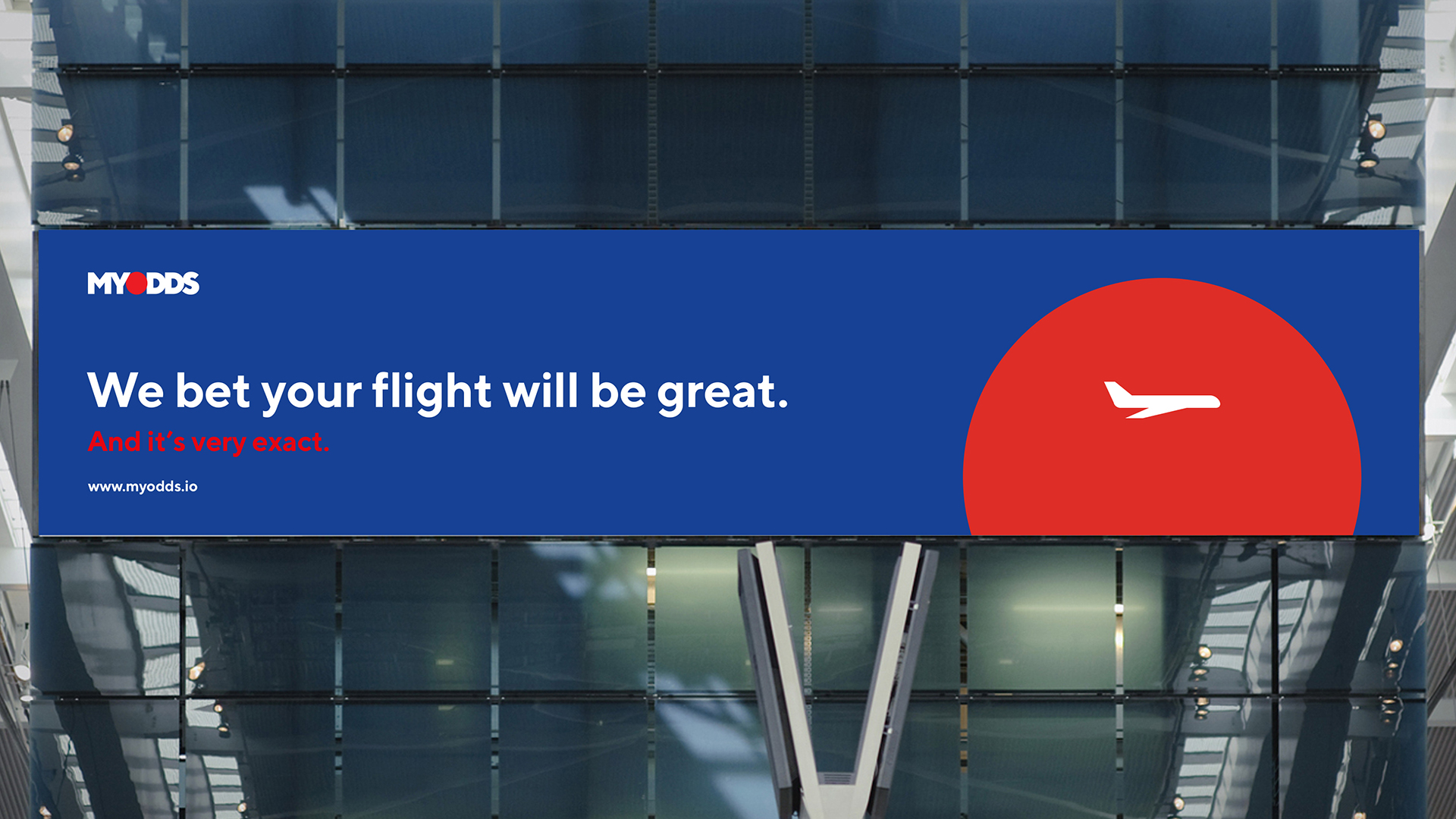
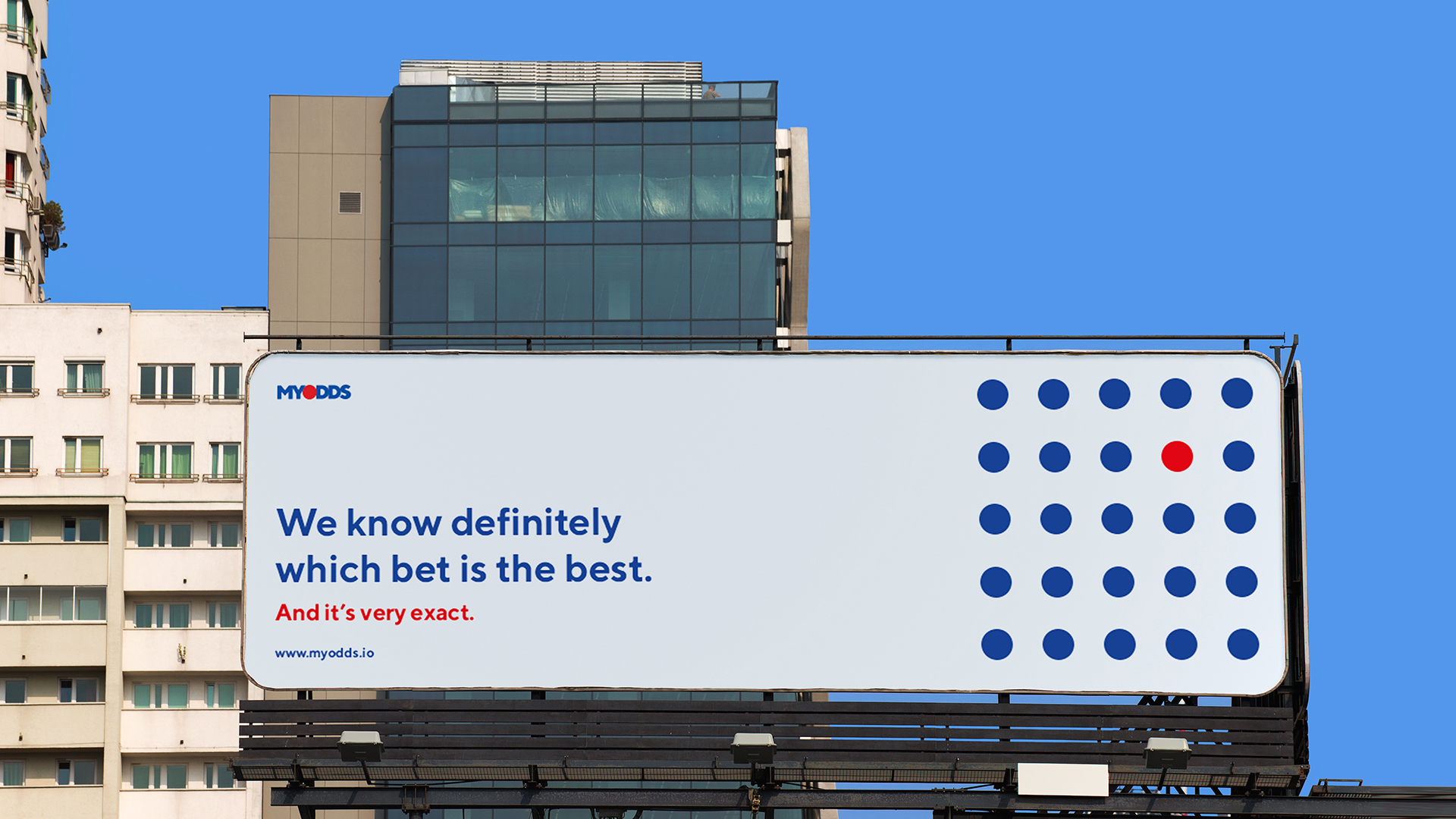
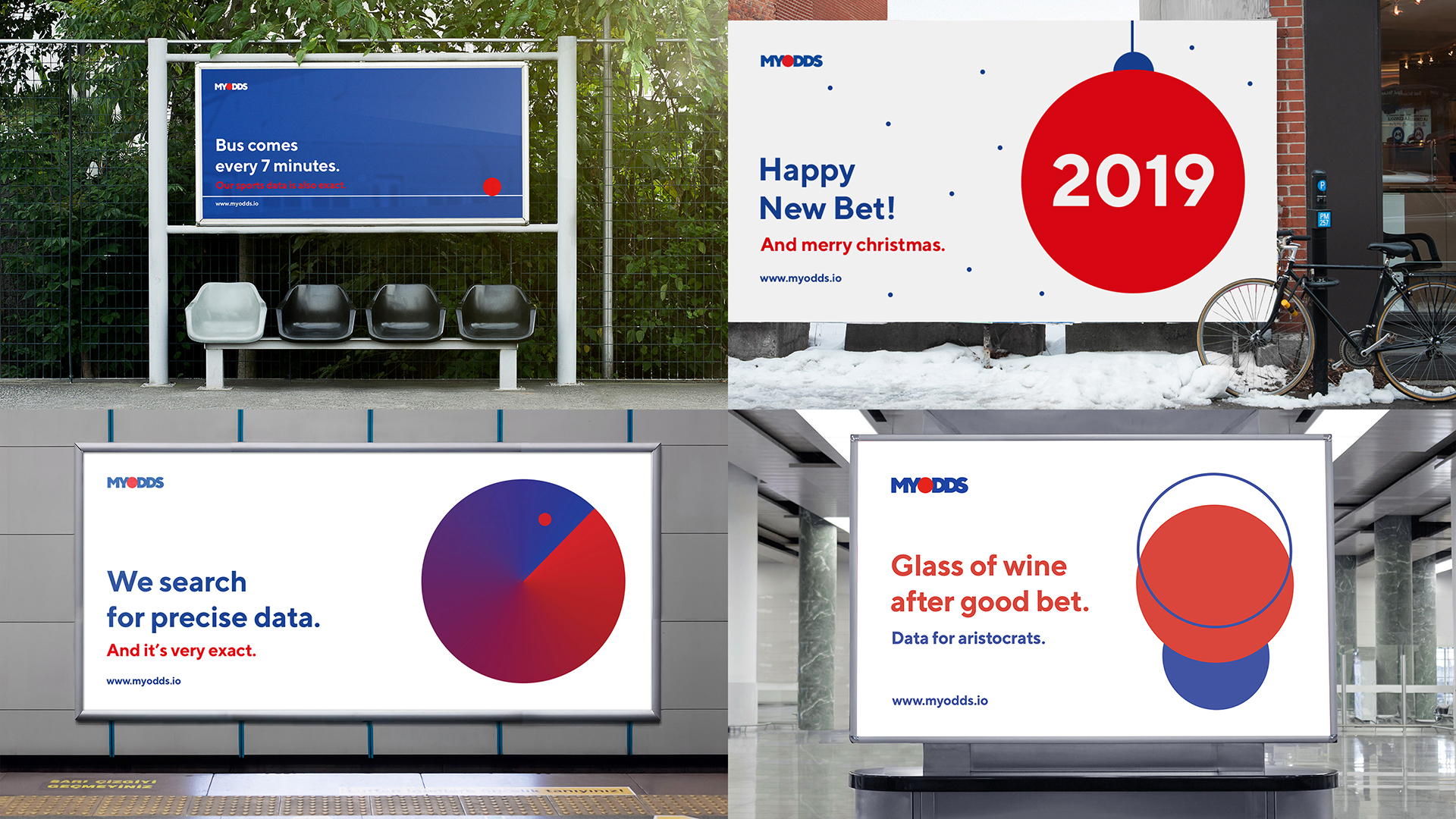
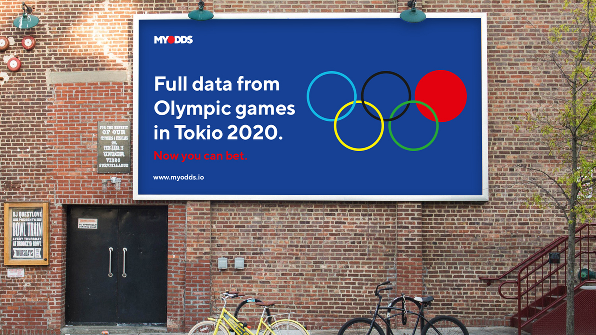
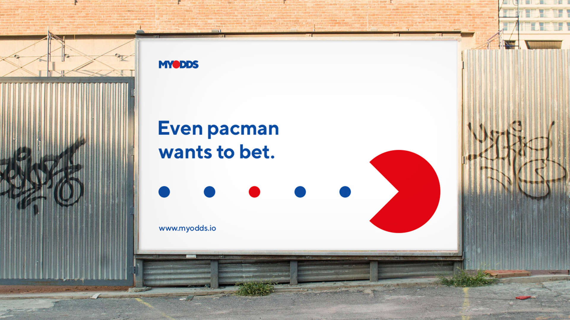
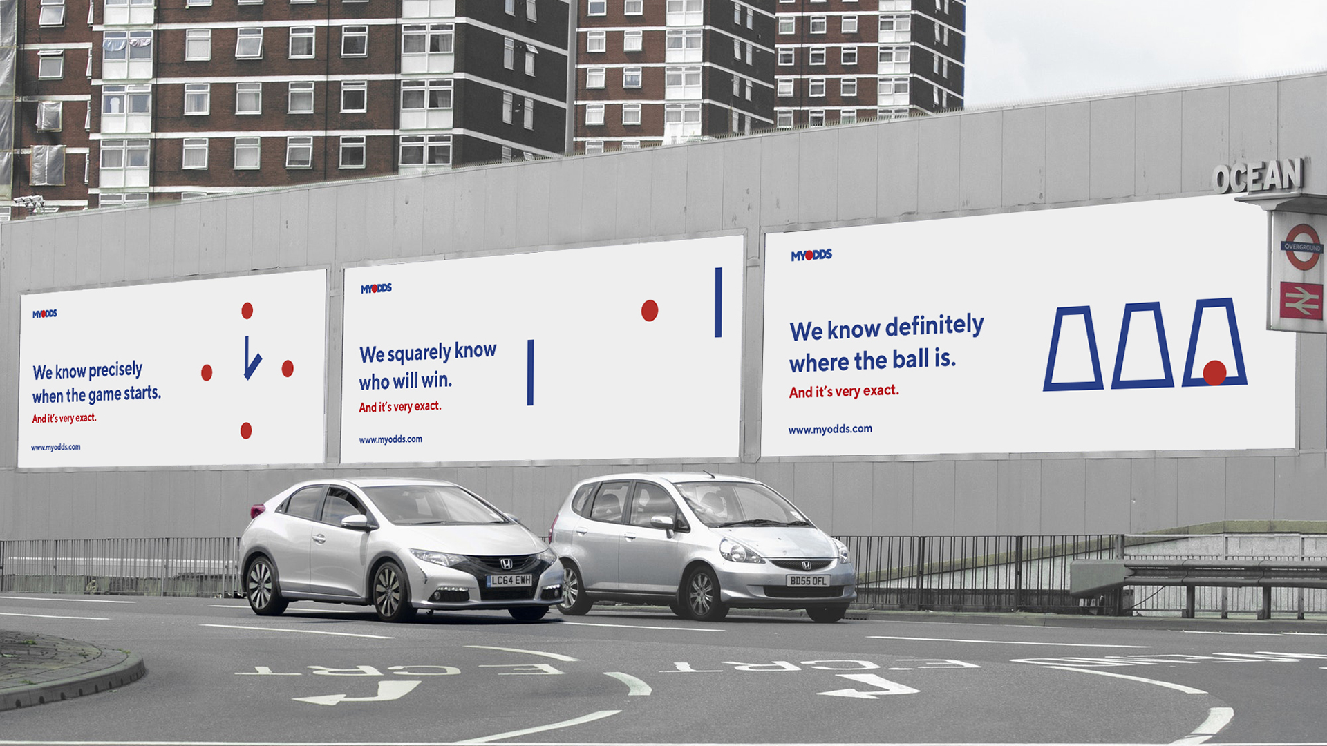
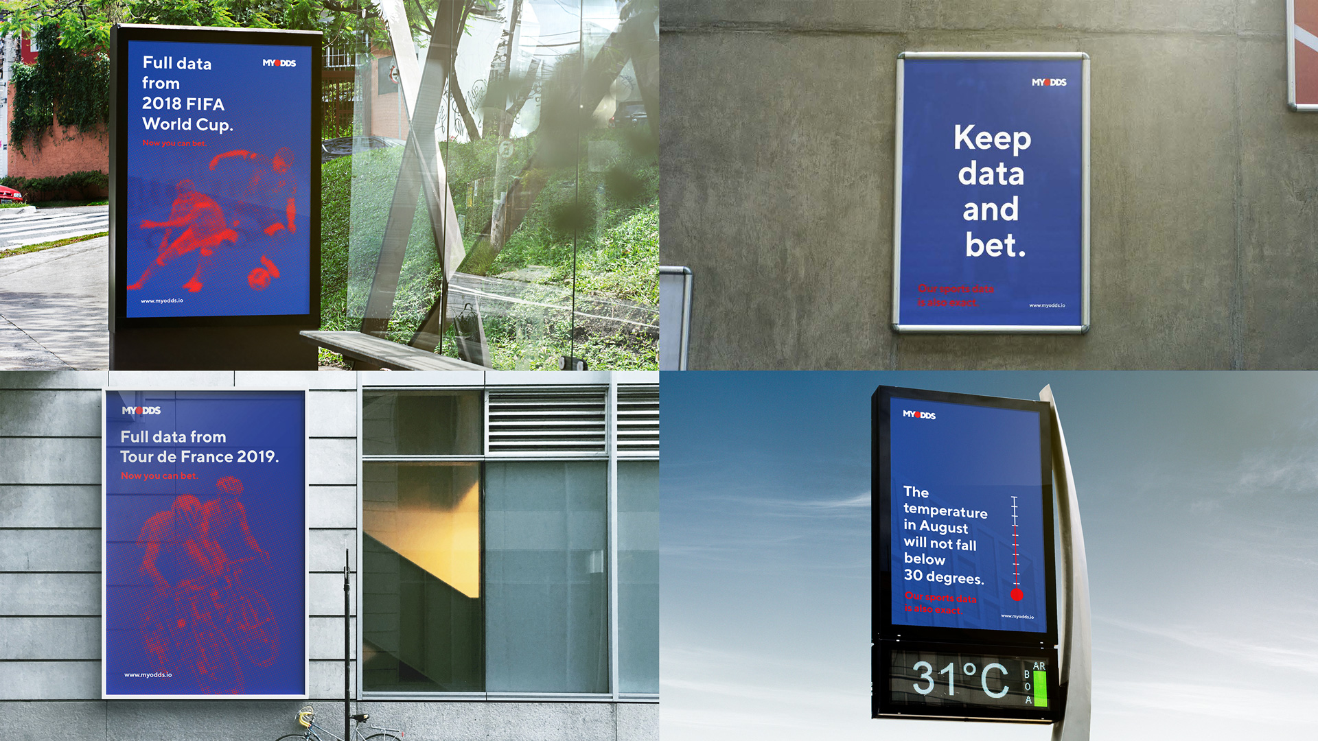
Many sports feature a ball as part of play. Also, in sports, the image of a circle is common. In addition, a dot is an image of a specific, accurate mark in an array of information. We have combined all these images in one symbol. A dot is data. A dot is a ball. A dot is a choice. A dot is the essence.
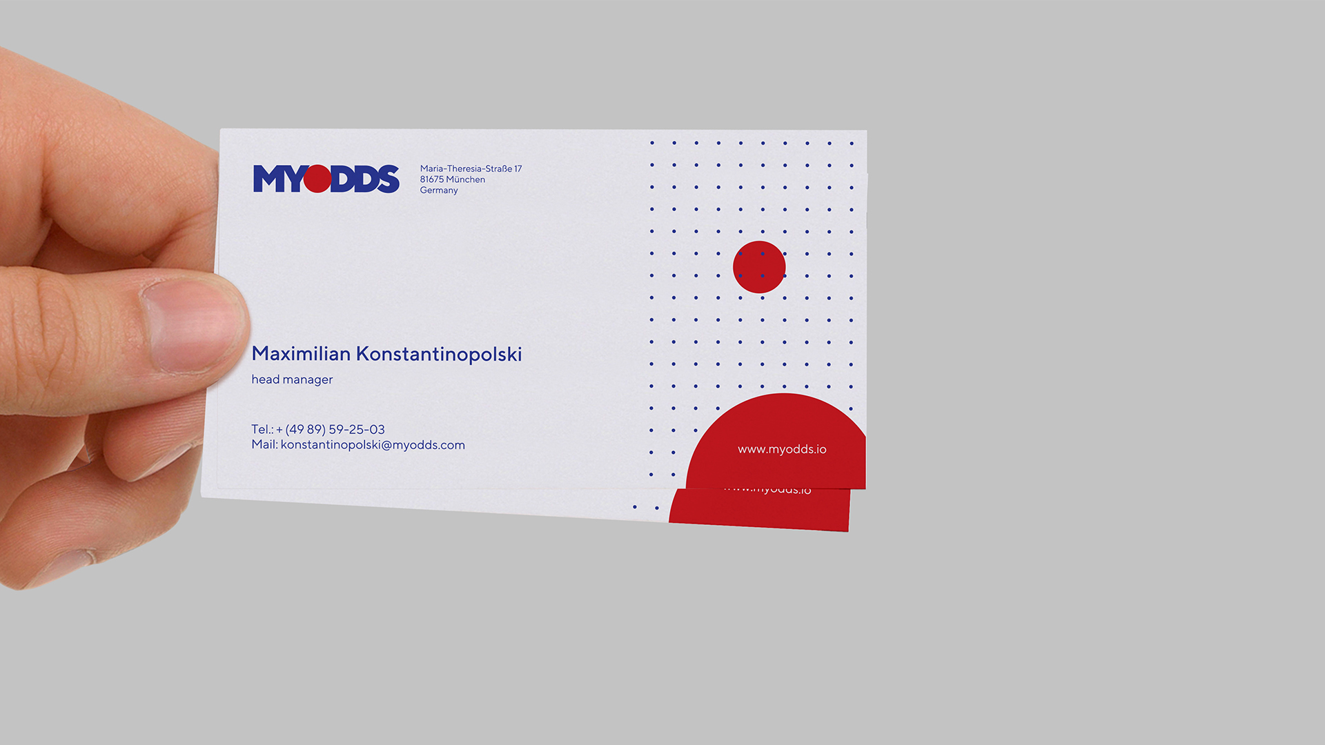
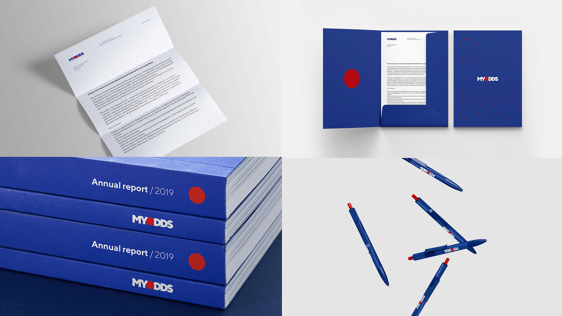
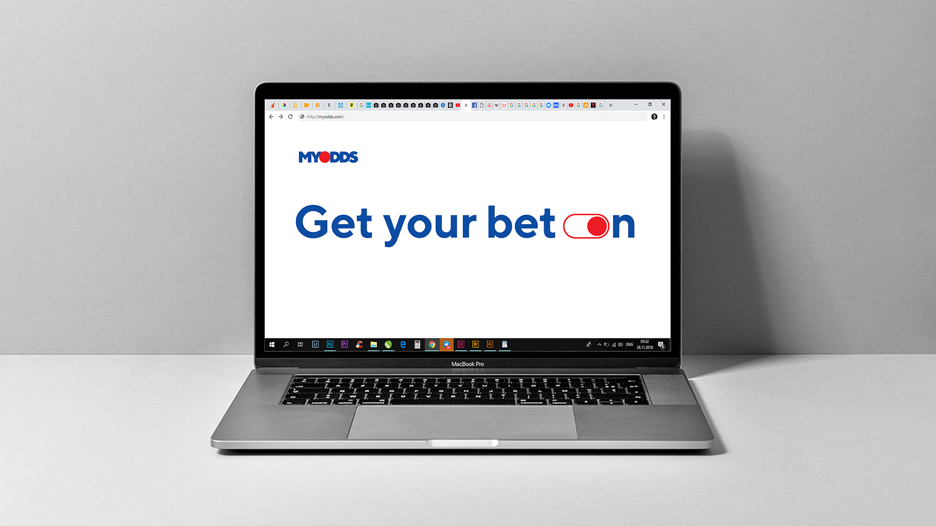
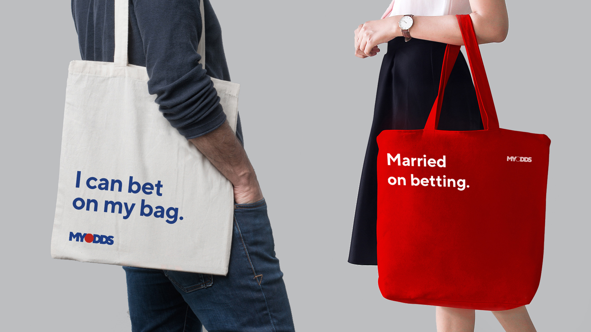
The resulting brand identity is based on the image of a dot in the logo, as a simple but recognizable symbol that is flexibly integrated into the construction of any graphic material. A dot is easily associated with data collection (a lot of dots forming an image), with sports images (a ball) and with a choice made (a marker characterizing the selected value in the total amount of information). To attract attention, contrasting and saturated colors have been used.