Kyrgyzaltyn redesign
Клиент
JSC "Kyrgyzaltyn"
Рабочая группа
Agency: I-Media Creative Bureau
Managing Director - Turarbek Omuraliev
Creative Director - Nargiza Kulataeva
Art Director - Nurbek Nasyranbekov
Designer- Kanat Karapashov
Client - JSC "Kyrgyzaltyn"
Press secretary - Aijana Nurmahanova
Задача
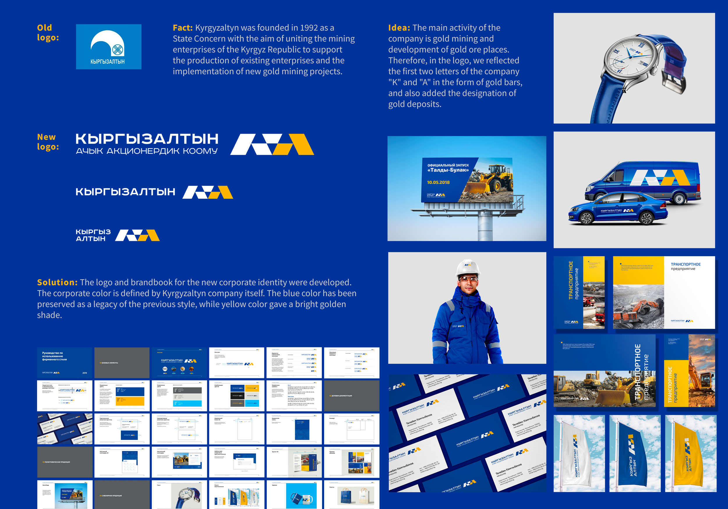
Fact: Kyrgyzaltyn was founded in 1992 as a State Concern with the aim of uniting the mining enterprises of the Kyrgyz Republic to support the production of existing enterprises and the implementation of new gold mining projects.
Tasks: Over 26 years, the company's operations have increased and the company has been transformed into a holding company. The new board decided to conduct the first rebranding in the entire history of it.
Idea: The core business of the company is gold mining and development of gold ore places. Therefore, in the logo, we reflected the first two letters of the company "K" and "A" in the form of gold bars, and also added the designation of gold deposits.
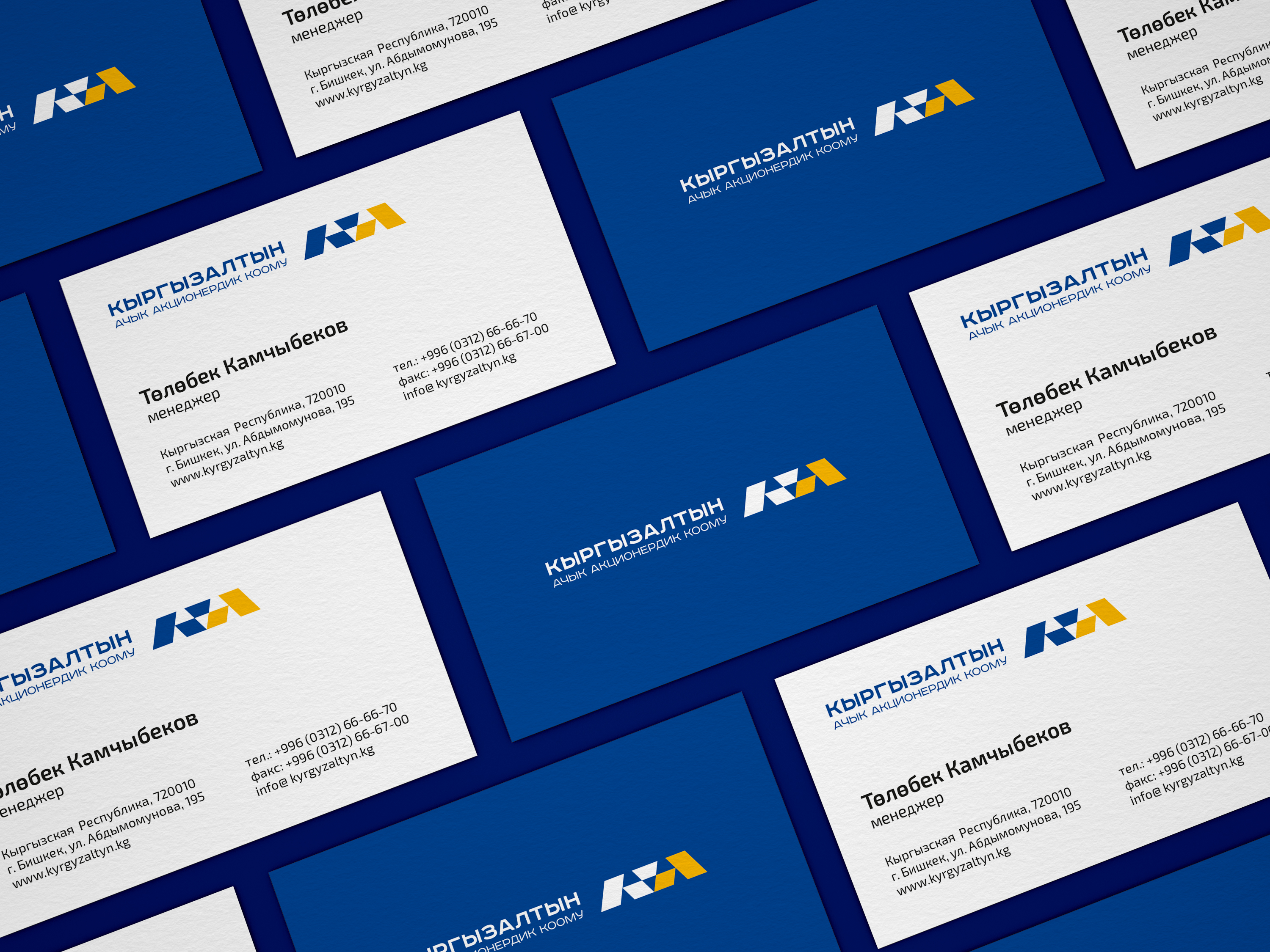
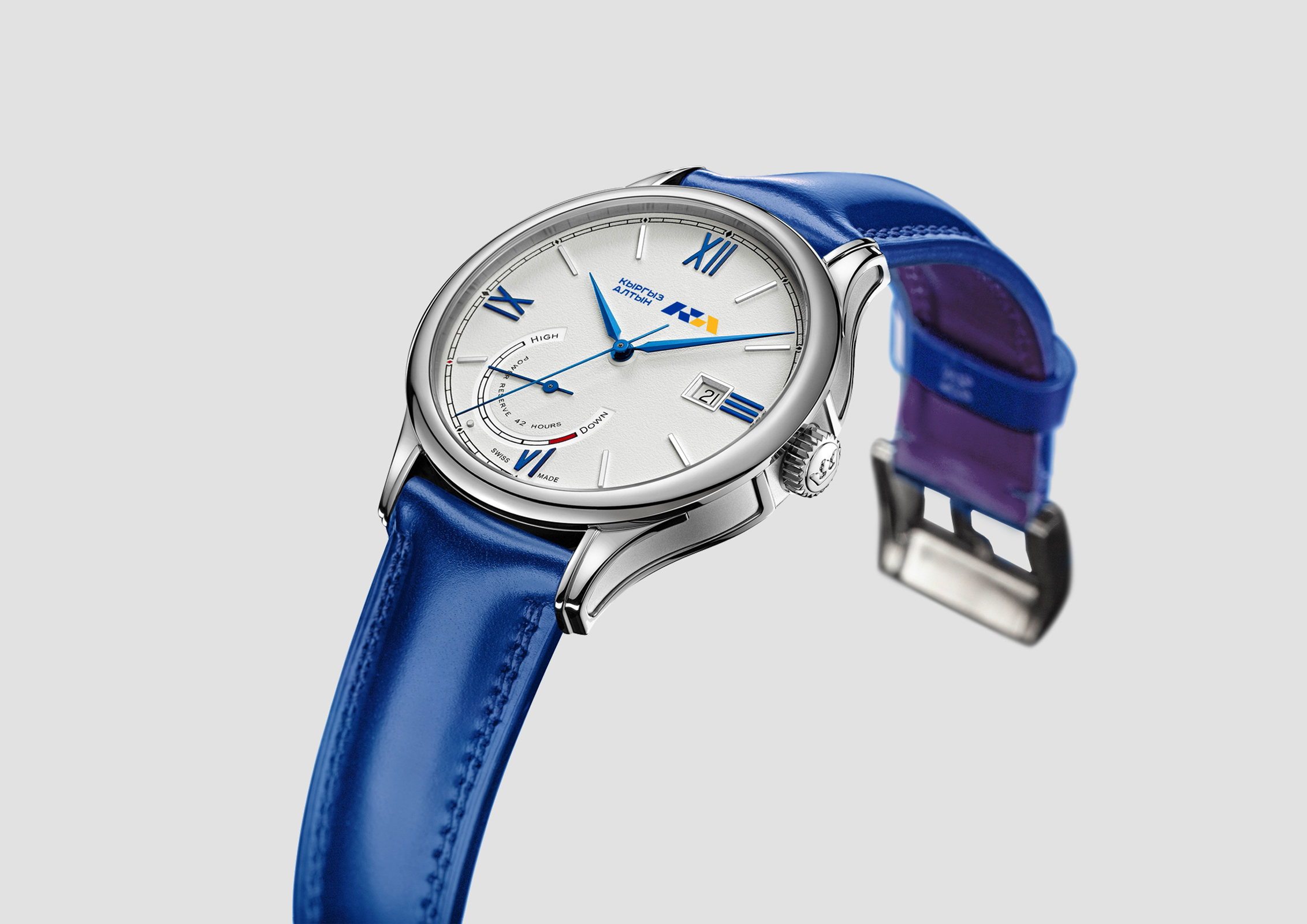
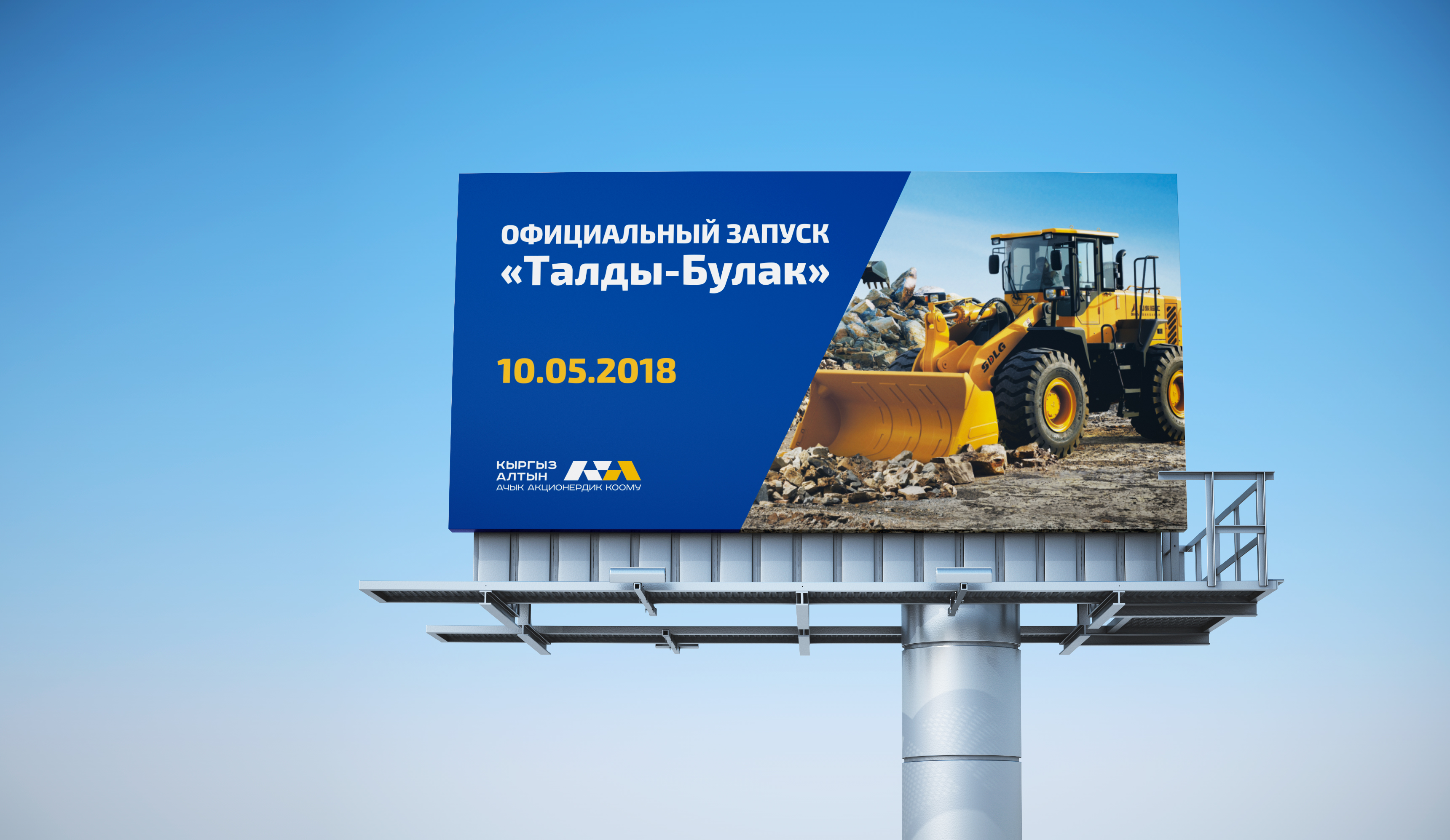
Solution: The logo and brandbook for the new corporate identity were developed. The corporate color is defined by Kyrgyzaltyn company itself. The blue color has been preserved as a legacy of the previous style, while yellow color gave a bright shade.


