Branding of Rabita Bank
Клиент
Rabita Bank
Рабочая группа
Creative Director: Jeykhun Imanov
Project Manager: Sima Jabbarova
Art Director: Jamal Aliyev
Designer: Jamal Aliyev, Ruslan Fazlulov
Задача
Background and task:
Rabita Bank is one of the oldest banks in the country. The task was to develop positioning, logotype and corporate identity.
Execution:
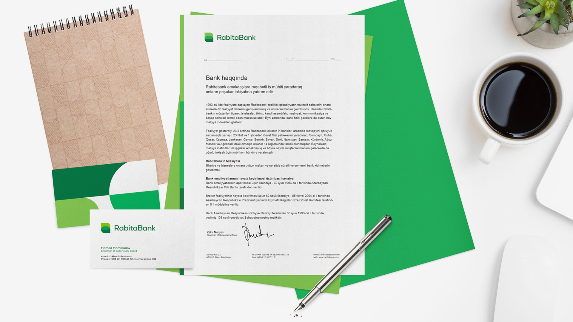
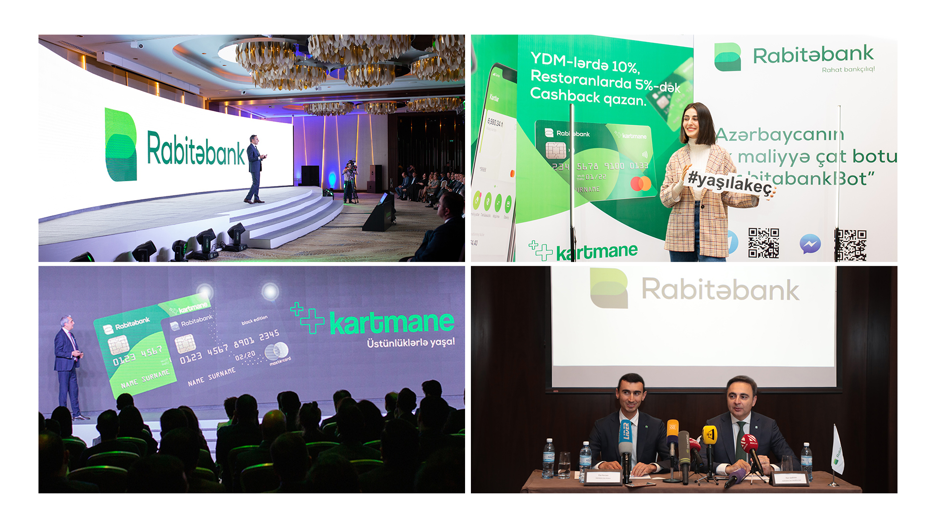
Together with the bank team, we developed a strategy. Based on it, we came up with the character and appearance of the brand. We created a logotype, corporate identity and guidelines.
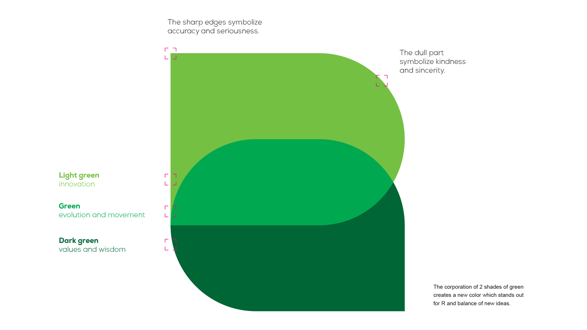
In many languages, "Rabita" means "connection," "relationship." The colors and shapes of the new logotype are combined to create a kind of connection. Forms merging create the letters "R" and "B" at the same time.
As a result of research, we found that green is free on the market and at the same time it corresponds to a stable and reliable image of the bank. Green stands for development, wisdom, innovation and values.
In conclusion, we've got dynamic and modern identity.