Rebranding "Poytaxt Bank"
Клиент
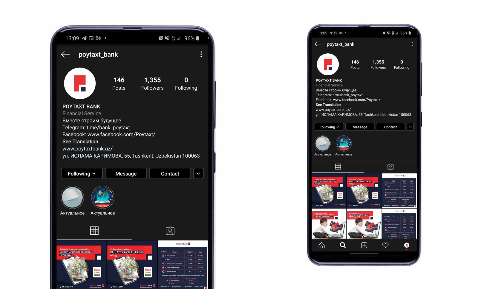
"Poytaxt Bank" joint-stock company
Рабочая группа
Founder and CEO: Normurod Khasanov
Design director: Normurod Khasanov
Graphic Designer: Elvira Khamraeva
Digital marketer: Muhammad Rasulov
Marketer: Kamila Ekhalkina
Web developer: Jahongir Anvarov
Задача
- Situation:
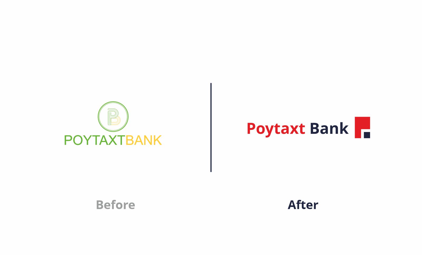
The bank had an unrecognizable logo and corporate identity, Additionally, the bank had no brand platform which also caused wrong positioning and segmenting in the finance market in Tashkent. When we conducted a survey within people near the bank, we found that almost 64% of people did not notice the bank, and this caused the loss of potential customers. In addition, it affected the decline in sales for almost a year.
- Solution:
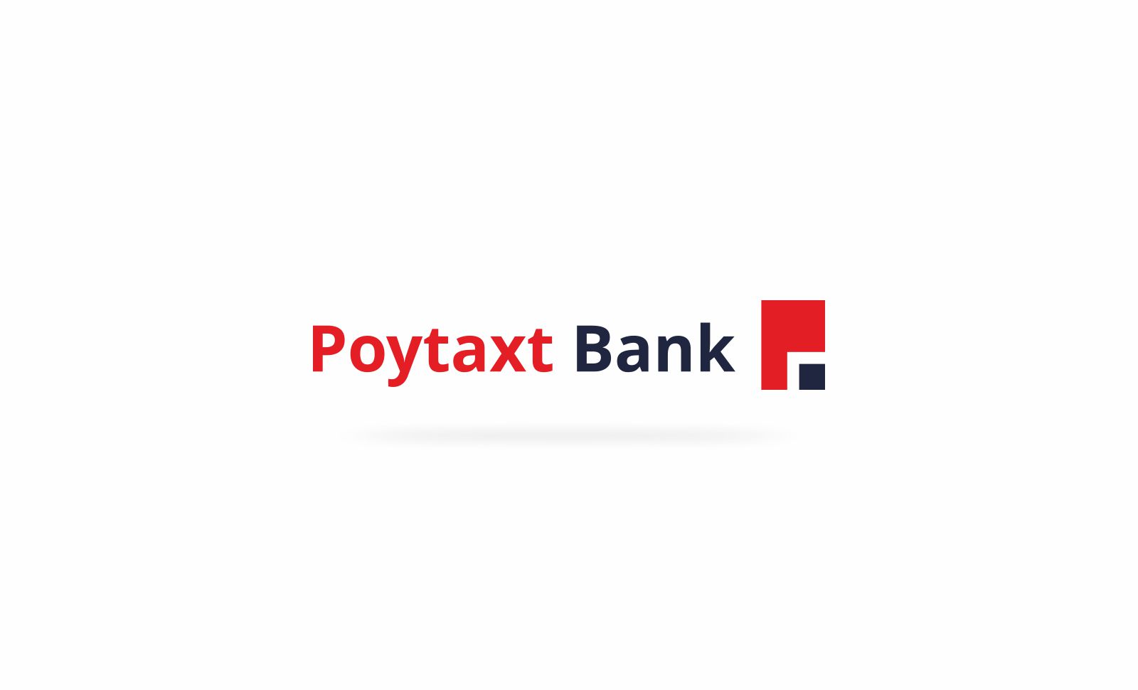
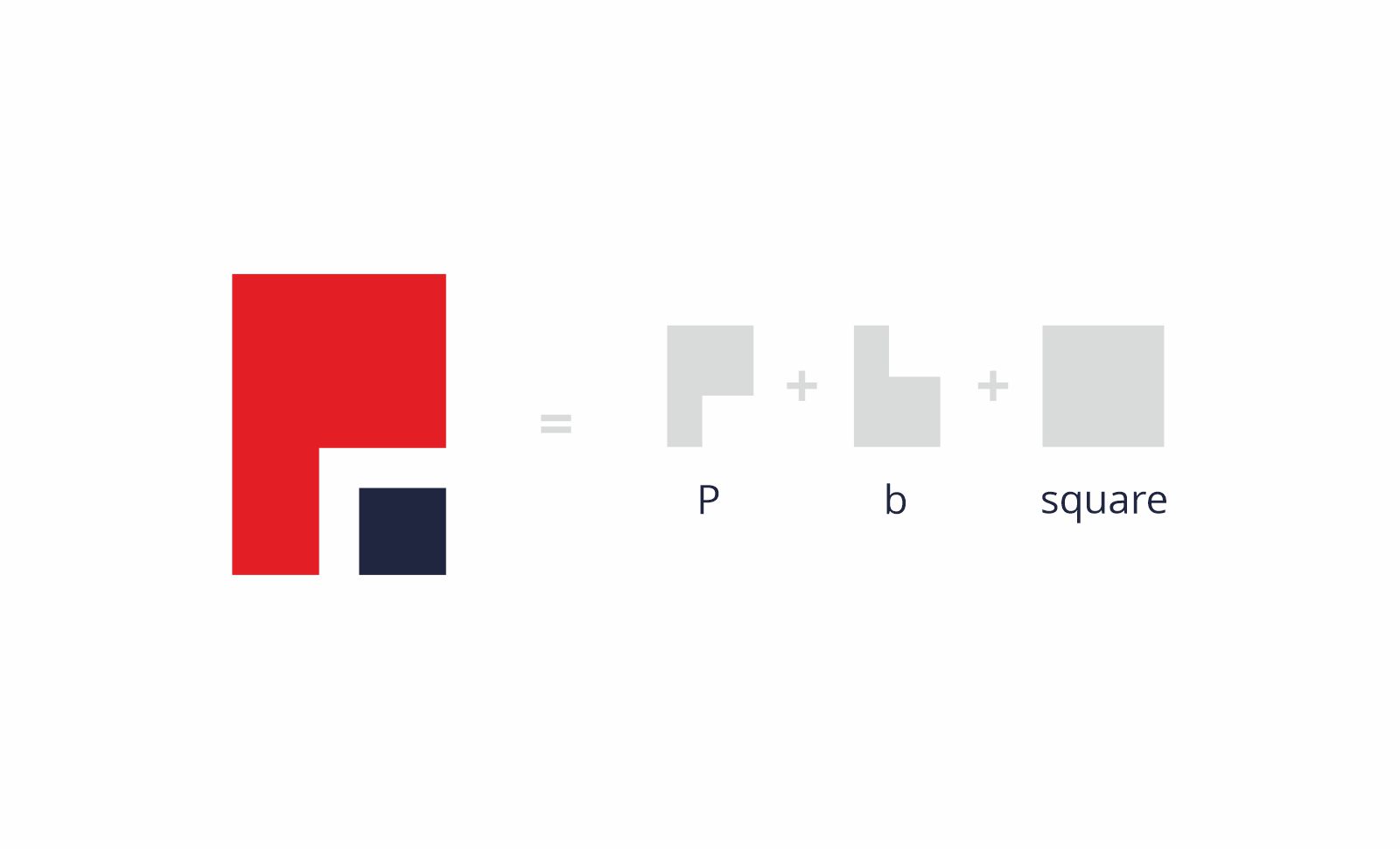
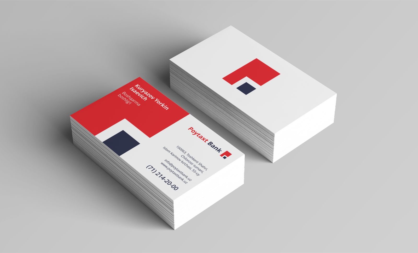
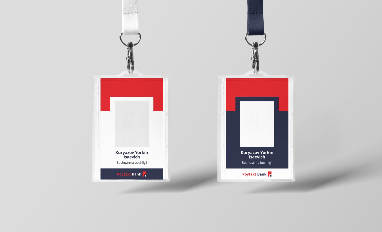
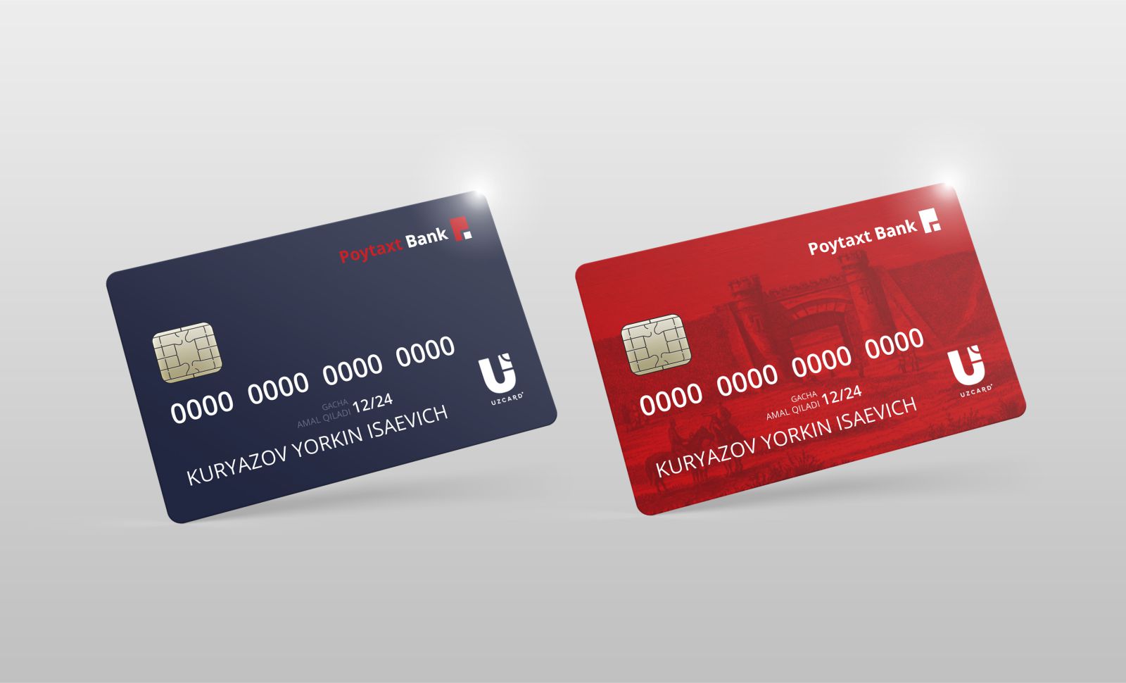
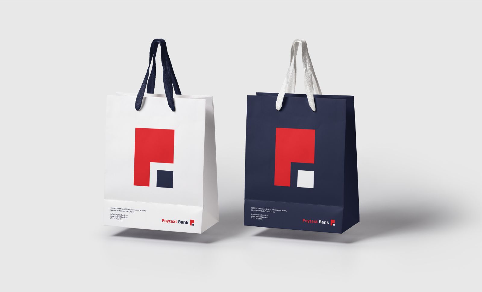
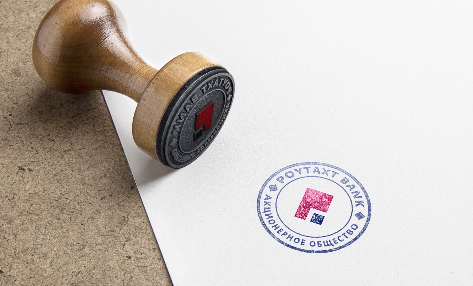
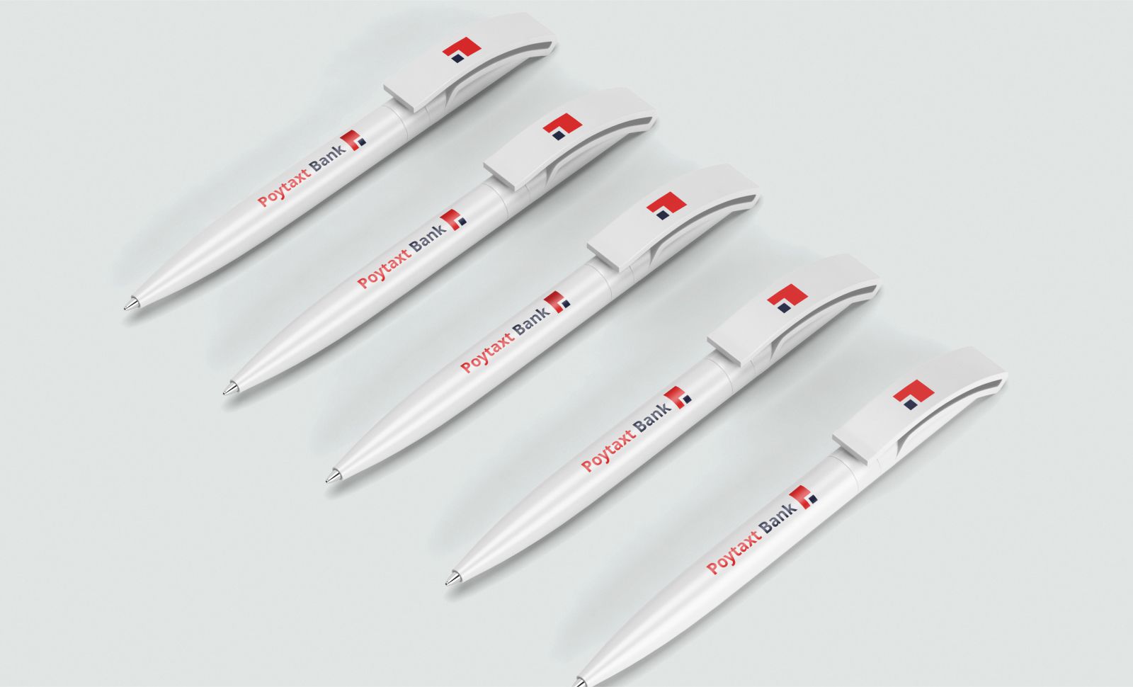
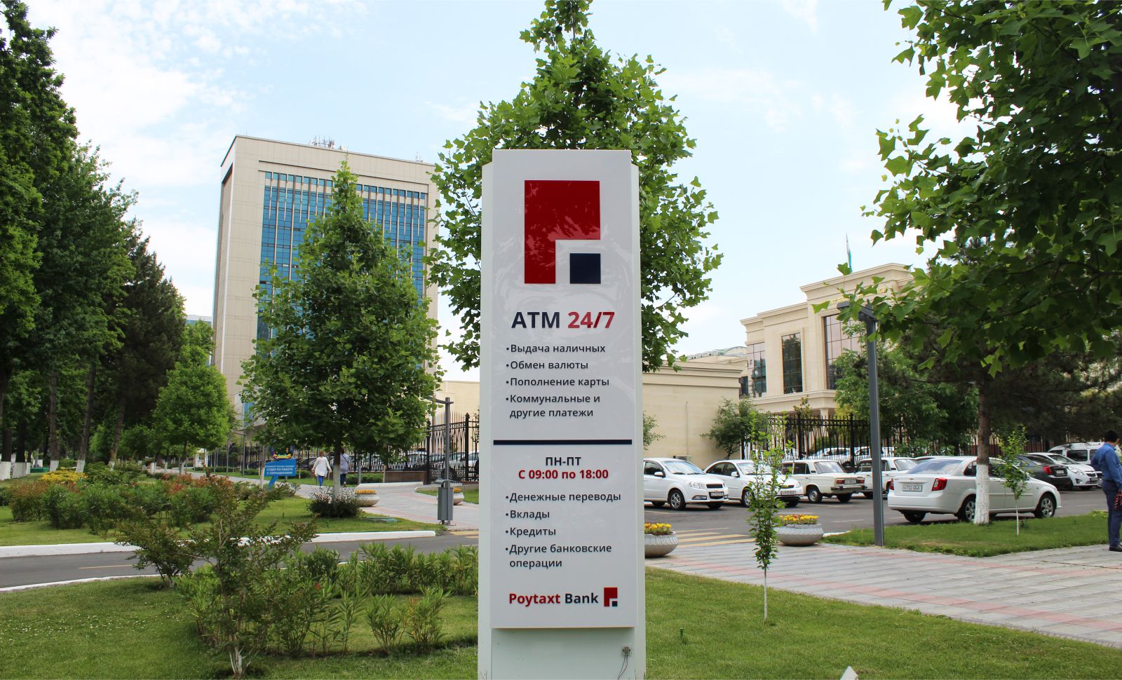
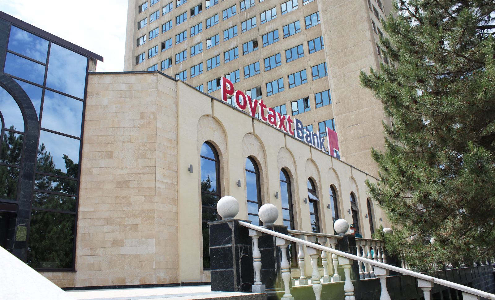
First of all, we have developed a brand platform. And we did not change the name but we changed the color and logo in order to create a new image of the bank which can be trustable and recognizable to clients. The logo represents the word "P" and "B" taken from the first word of the name of the bank. Moreover, the shape of the "square" represents the symbol of 4 directions (west, east, north, and south) which means the bank has no barriers to opportunities throughout the world. The shape of the "square" is associated with bank positioning.
- Result:
After the rebranding process, the bank's total sales have increased two times more compared to the previous year. And brand awareness is significantly increased.