Holy Deer Bar
Клиент
Holy Deer Bar
Рабочая группа
CSD: Elina Ibragimova
Design Director: Temur Sadi
Designer: Stepan Litvinov
Задача
Objective:
To attract expats, tourists and especially locals.
Task:
- To develop a brand complex for a cafe / bar in Tbilisi,
- to develop verbal and visual brand identity.
What we have:
Premises in the old town (the historical center of the city, very much loved by tourists). The bar is located in a residential area on the way to the Funicular (one of the important sights of Tbilisi). There are a lot of hotels and apartments around, tourists and expats love to stay in this area.
The essence is a new culture of recreation (new for Tbilisi and familiar to tourists and expats).
Insight: The Georgians are already tired of their national cuisine, they want to correspond to the world trends - they are very receptive to everything new, with a pronounced hedonistic vector.
Decision:
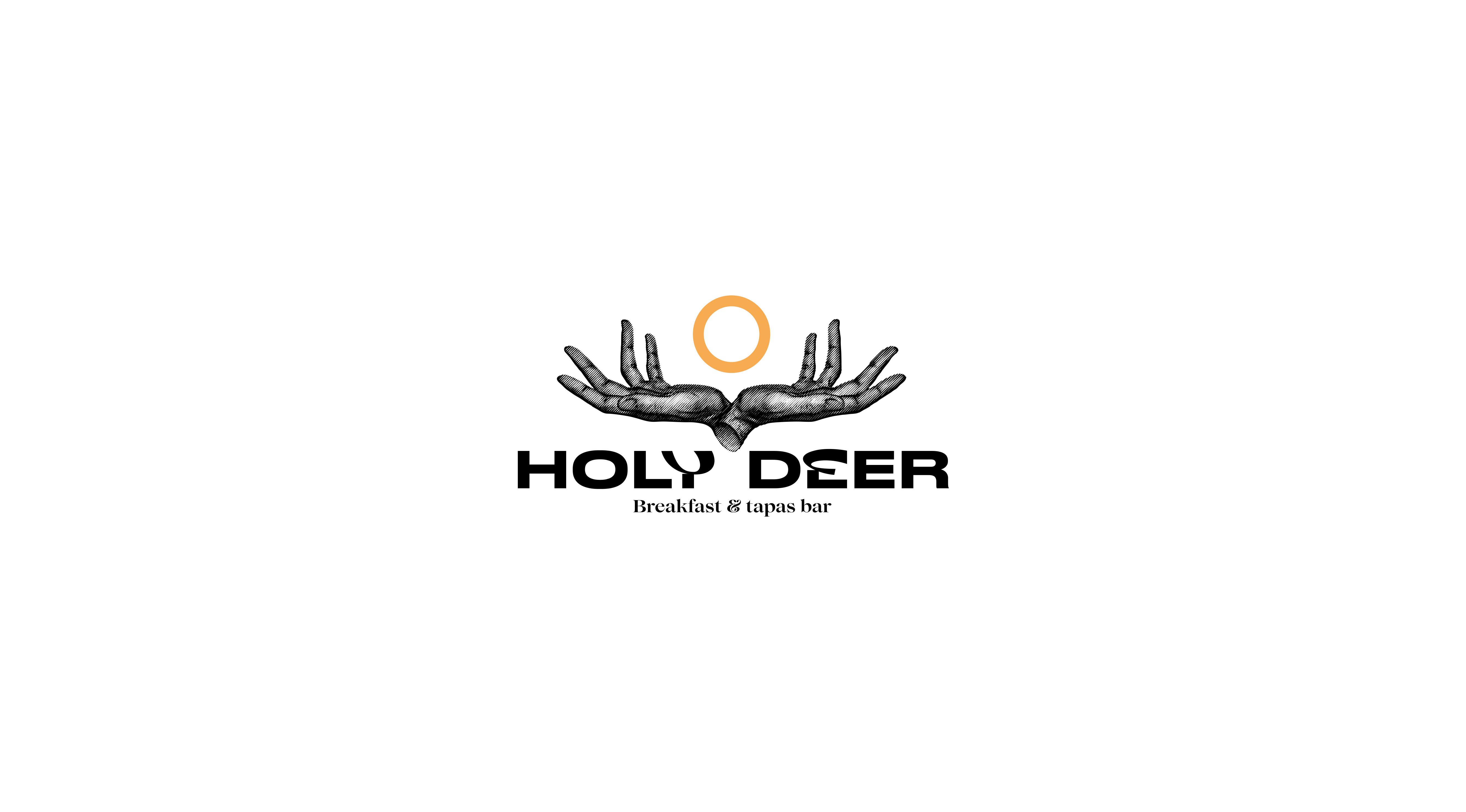
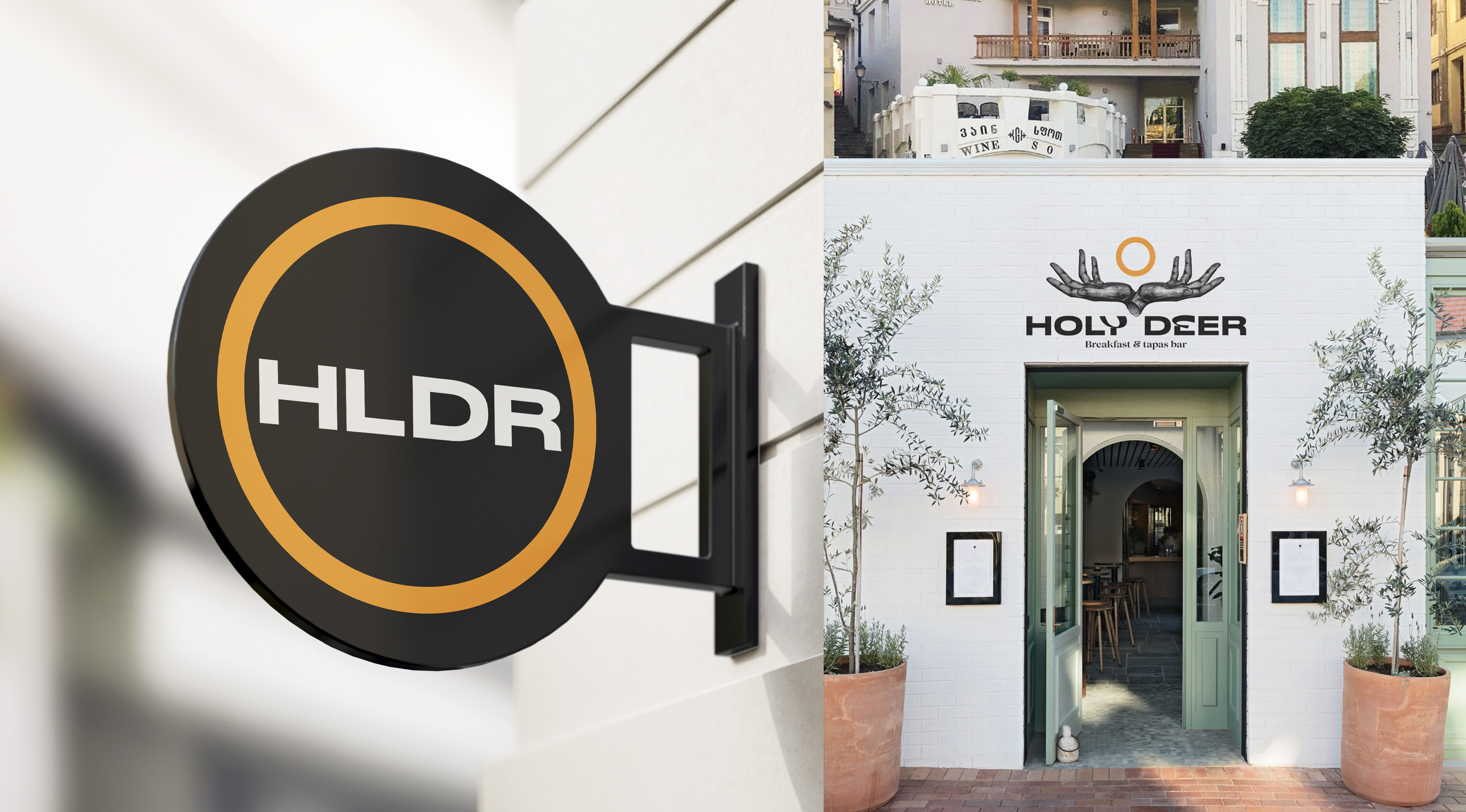
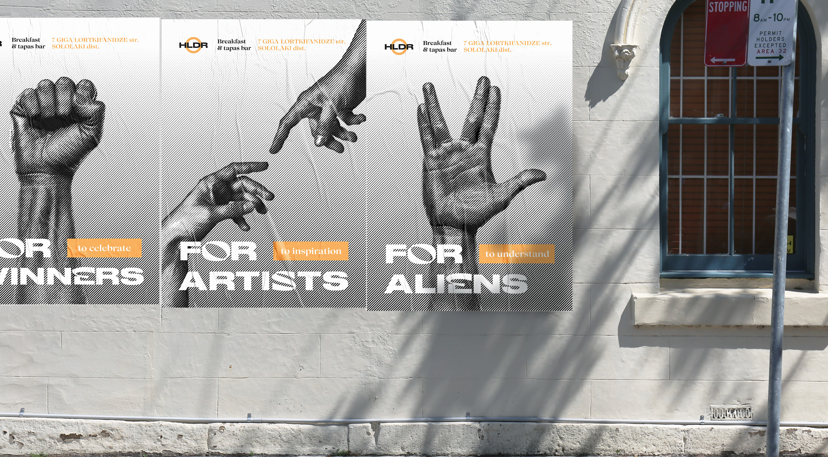
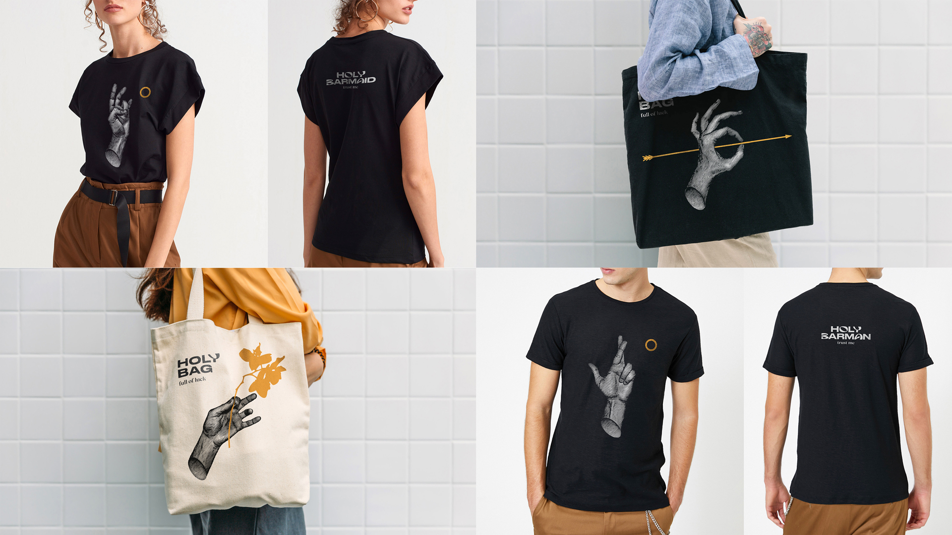
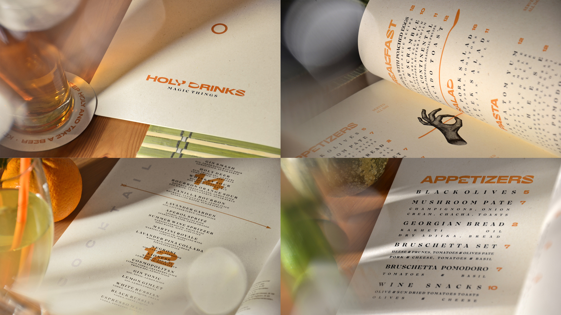
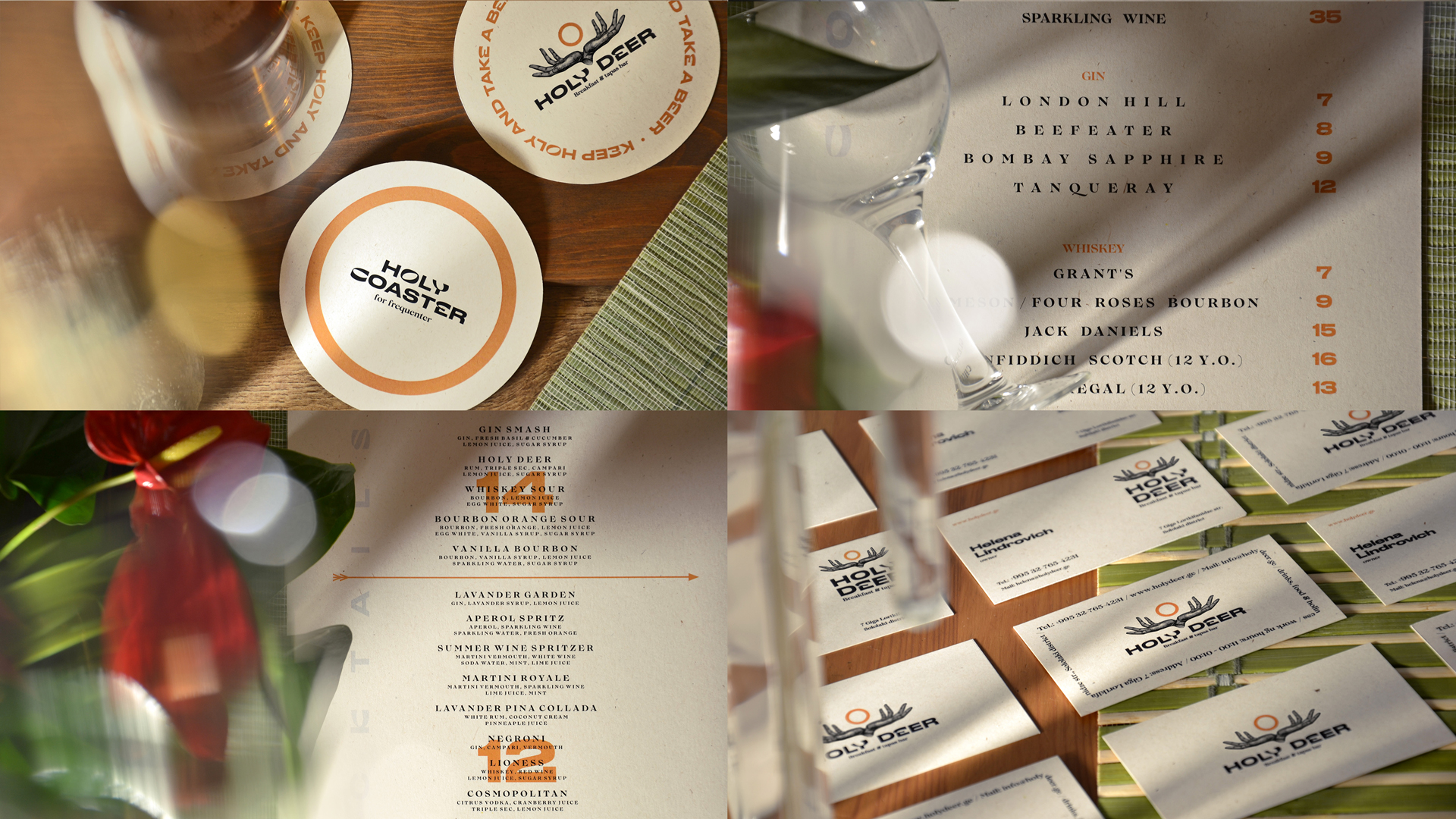
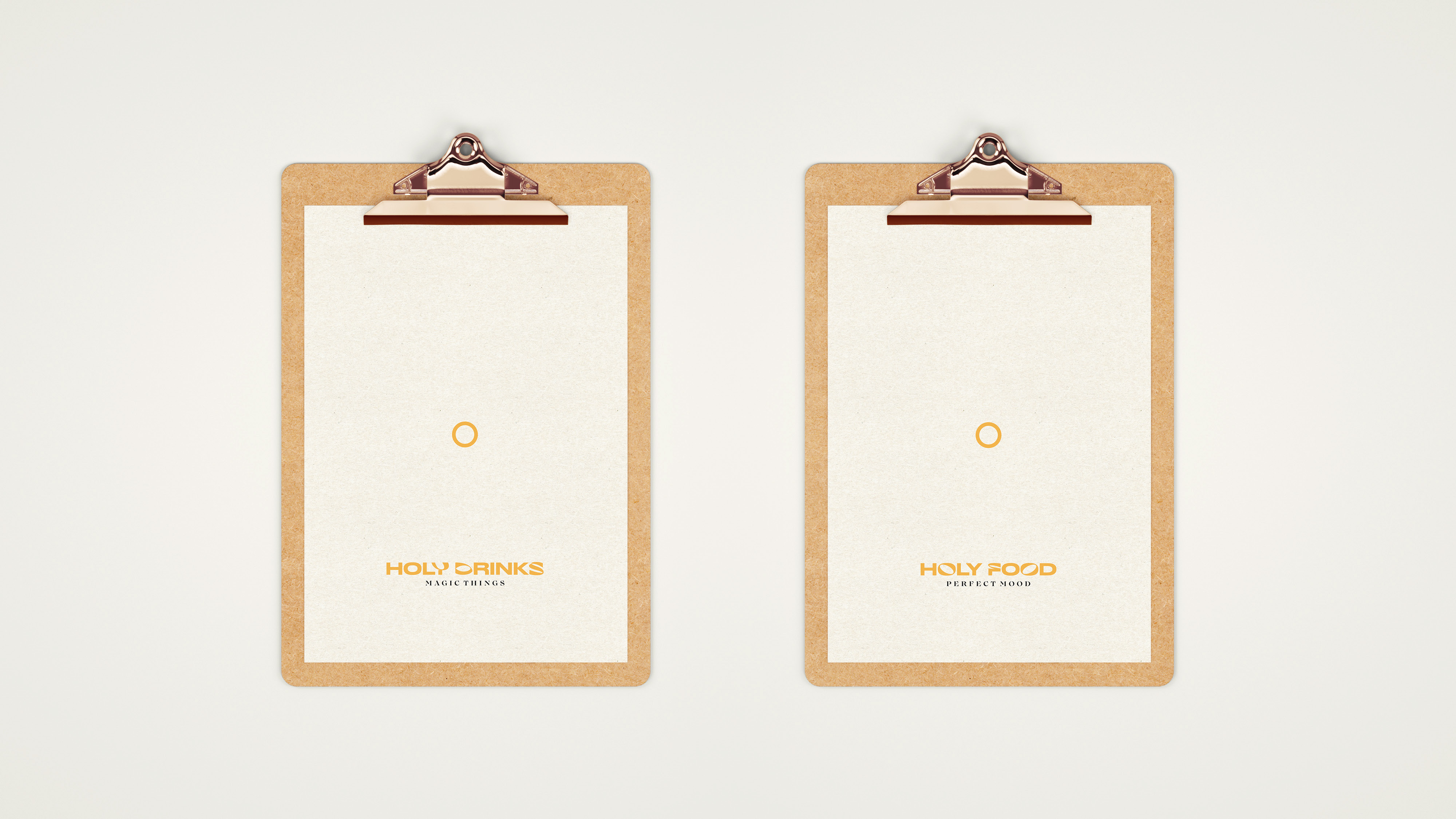
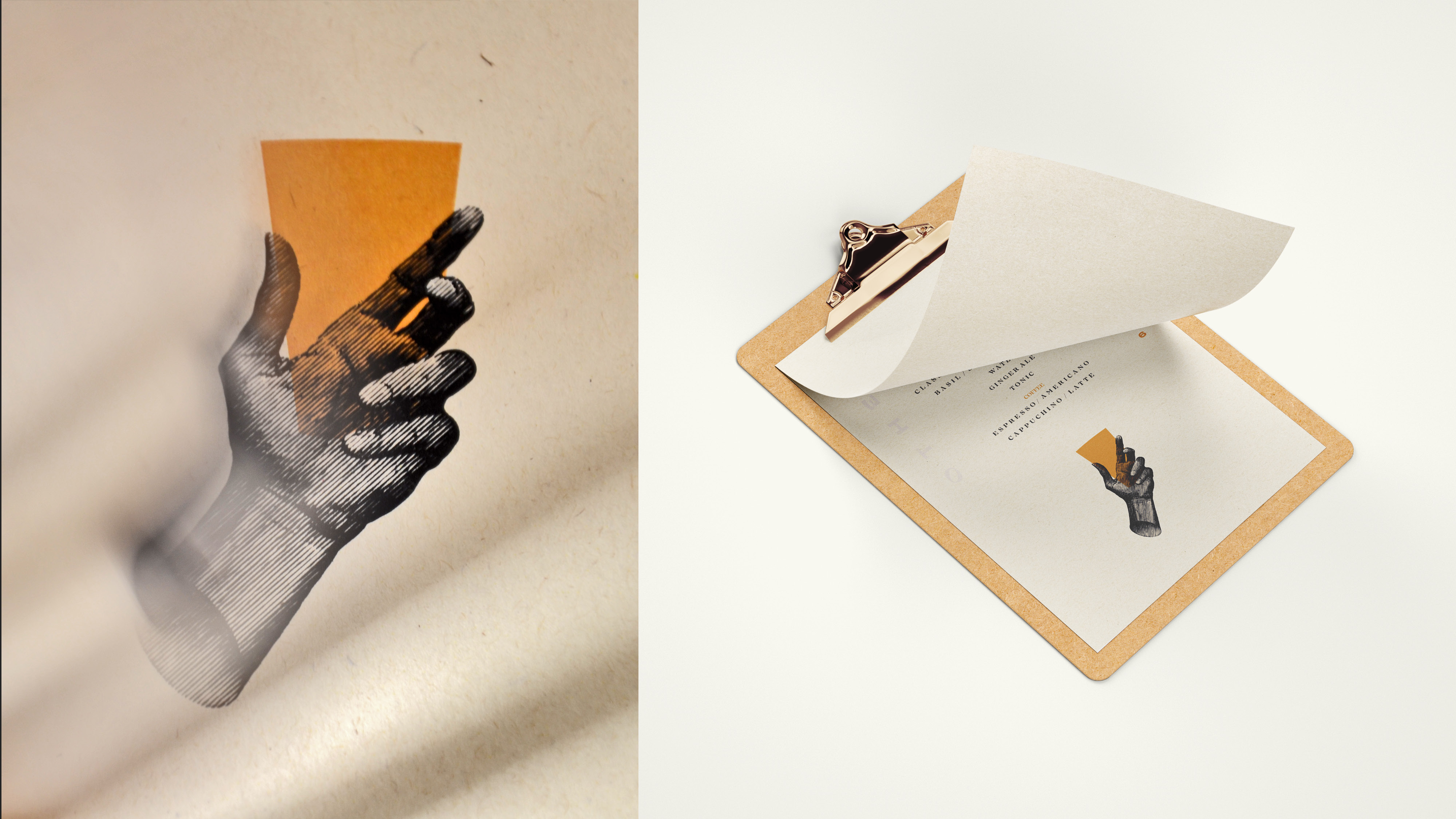
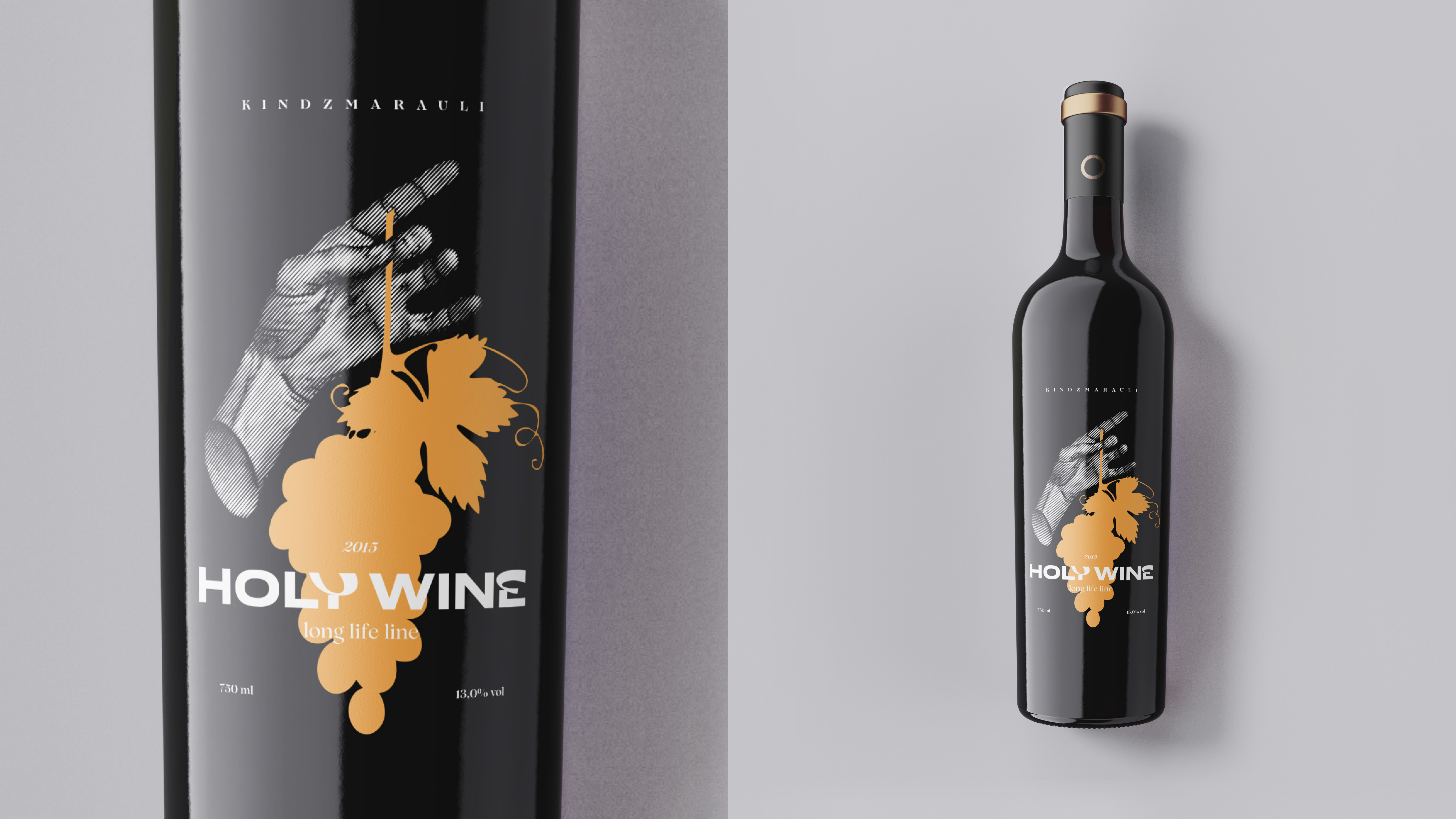
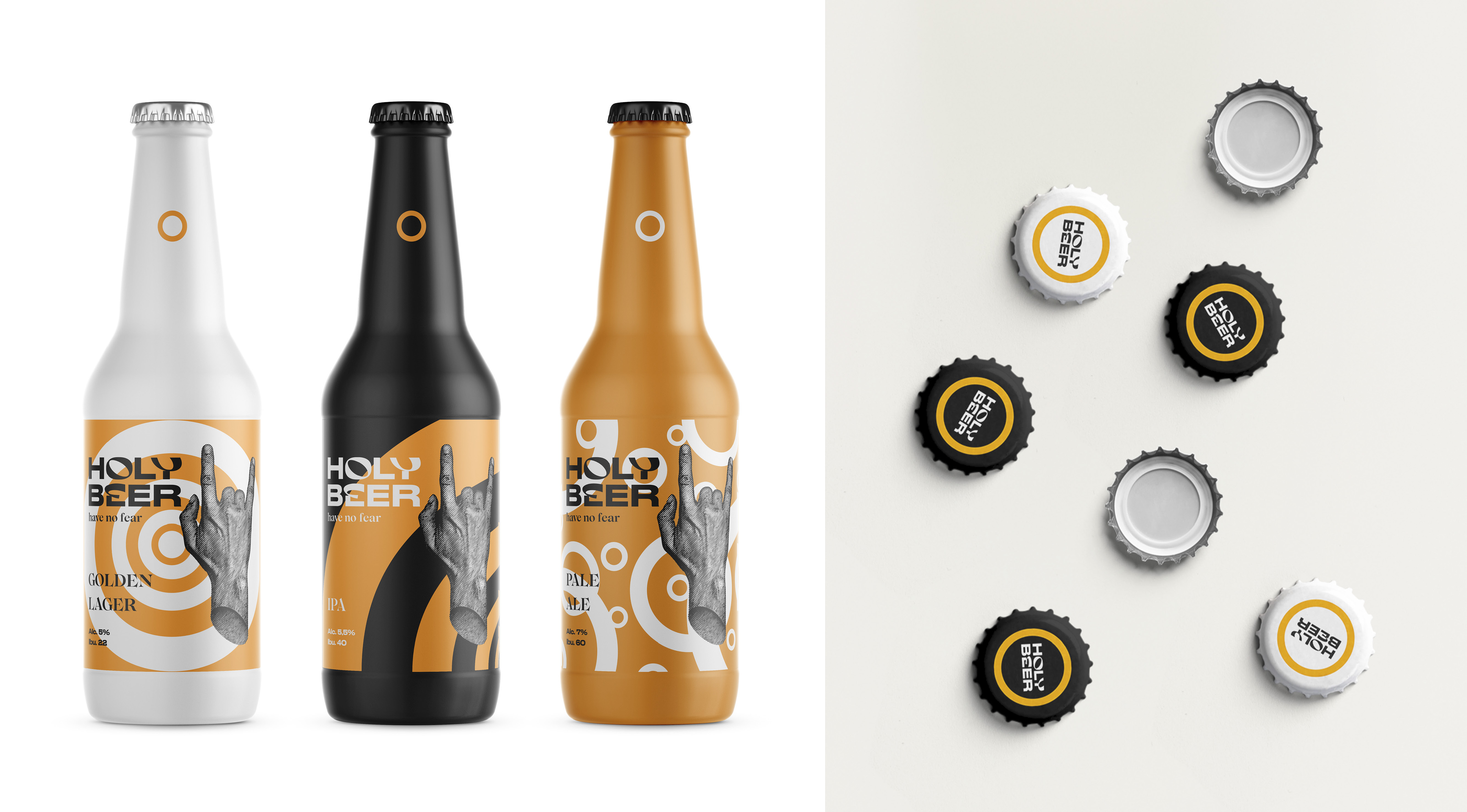
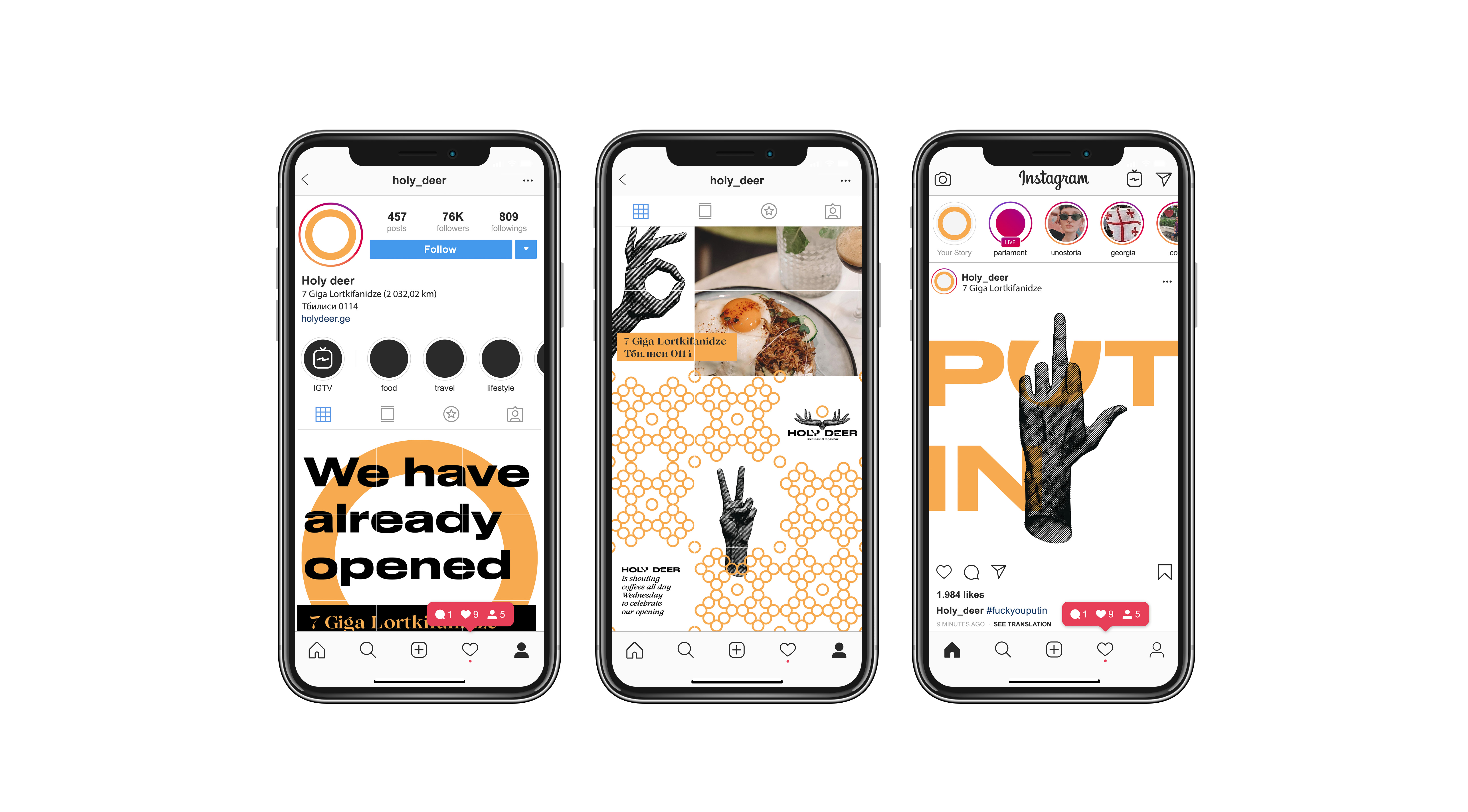
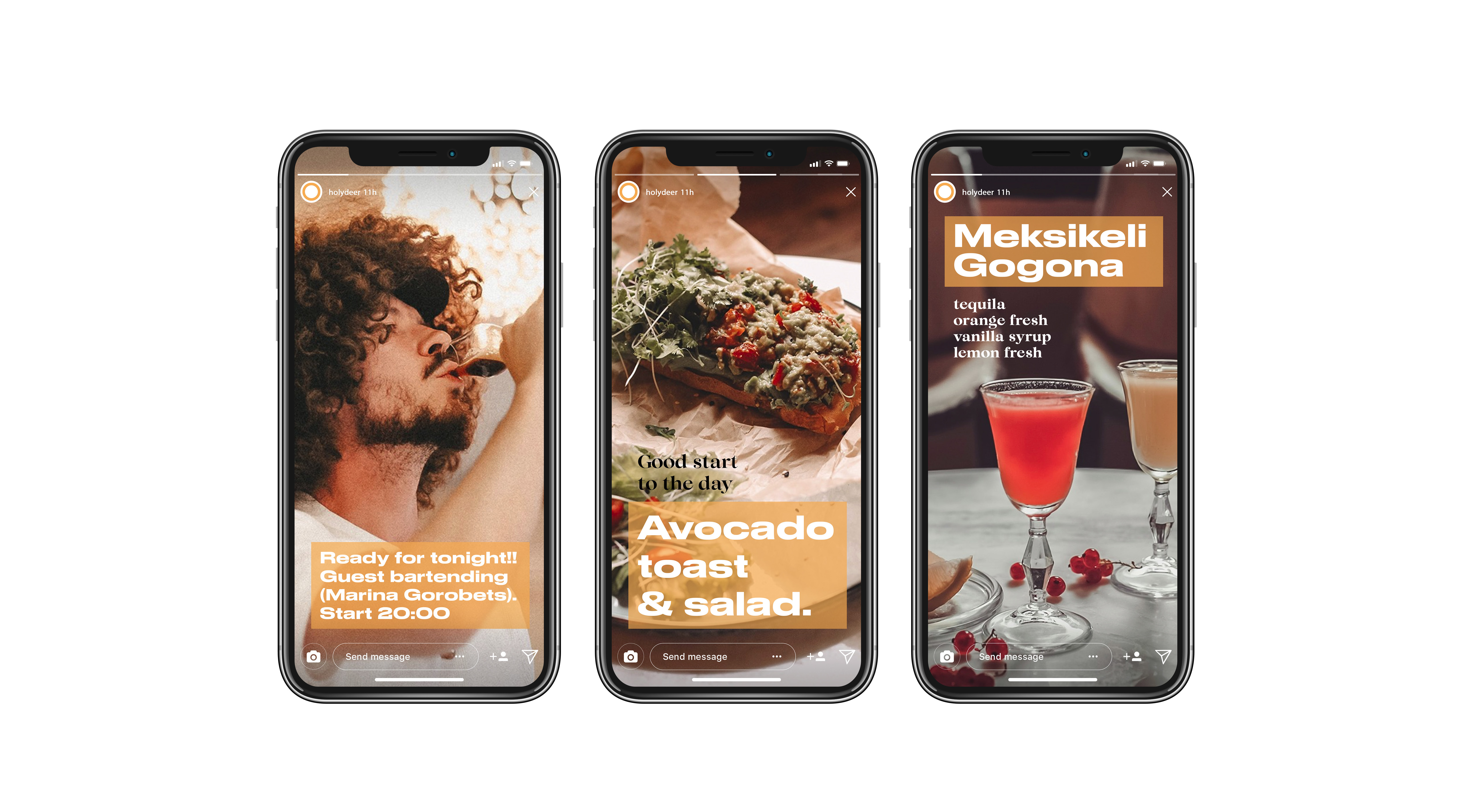
The name Holy deer appeared due to the legend according to which a deer is the symbol of the city of Tbilisi. The main image that we use in graphics is the symbol of the hand: the hand of a saint, the Creator. The hands create all the dishes and drinks that are distributed with the same hands. In addition, hands are a mean of communication when you speak different languages. To emphasize the authenticity of the establishment, we have diluted the modern grotesque with hand-made letters.
Result:
Unique and responsive style. Intricate engravings intersect with simple geometric graphics.
