Клиент
Cheese Paradise
Рабочая группа
CSD: Alina Mirzaeva
Account Manager: Anna Kim
Creative Director: Farrukh Sharipov
Art Director: Tamila Mirzaeva
Designers: Kristina Popova, Timur Aitov
Задача
Problem:
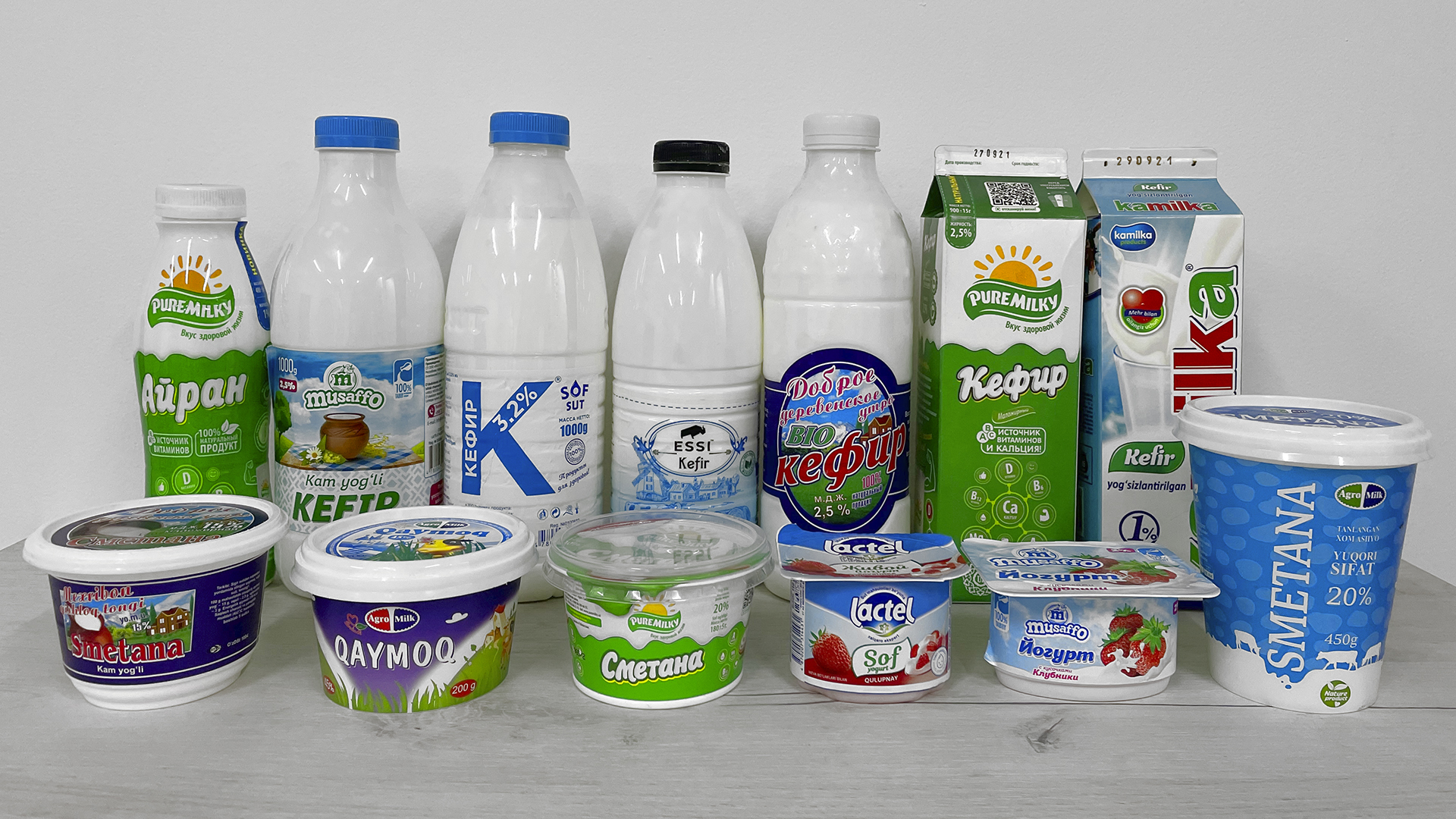
There are more than 200 producers of dairy products in Uzbekistan. Despite the abundance of choice, all packages look similar: prevalence of blue and green colors, perfect fruits and milk drops, minimalistic design. When it comes to design, most producers in Uzbekistan tend to imitate Western competitors. In the eyes of the consumer, however, such packaging is nearly indistinguishable and does not evoke any associations or warm feelings.
Situation:
Uzbekistan has long been famous for its hardworking people. They are the main reason behind the developed agricultural industry that makes up 20% of GDP.
Even in the nineties, the market for dairy products was not yet so developed. For generations, people were used to buying milk directly from farmers. For this purpose, farmers would come to large districts on certain days of the week, and large queues of buyers would line up. To the consumer, farm dairy products were a sign of quality and naturalness.
Solution:
SARA produces dairy products by purchasing milk from farmers, thus supporting small businesses.
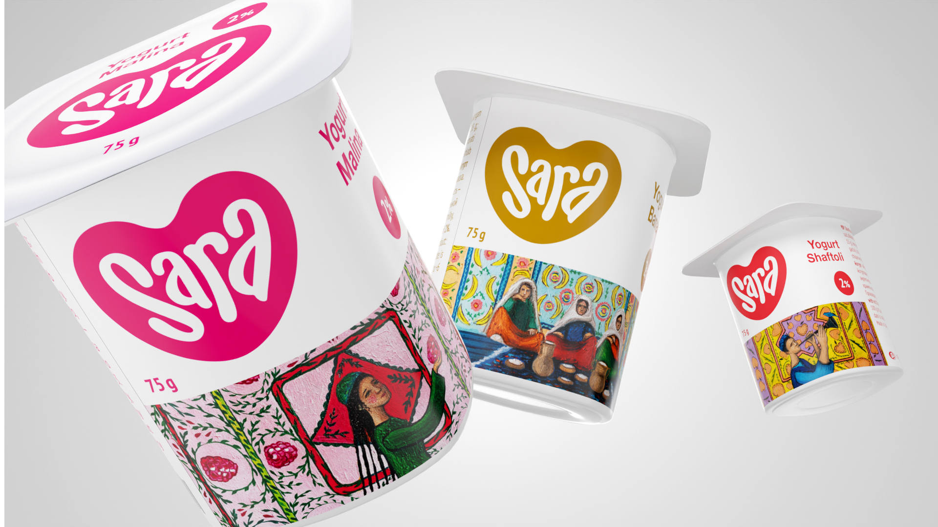
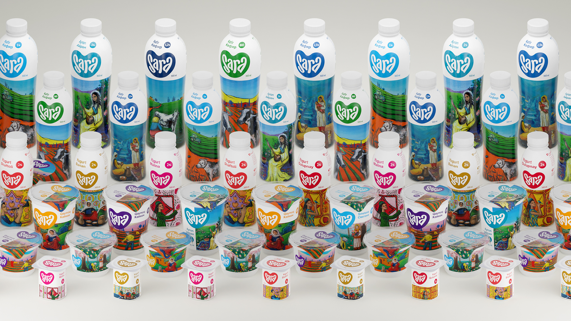
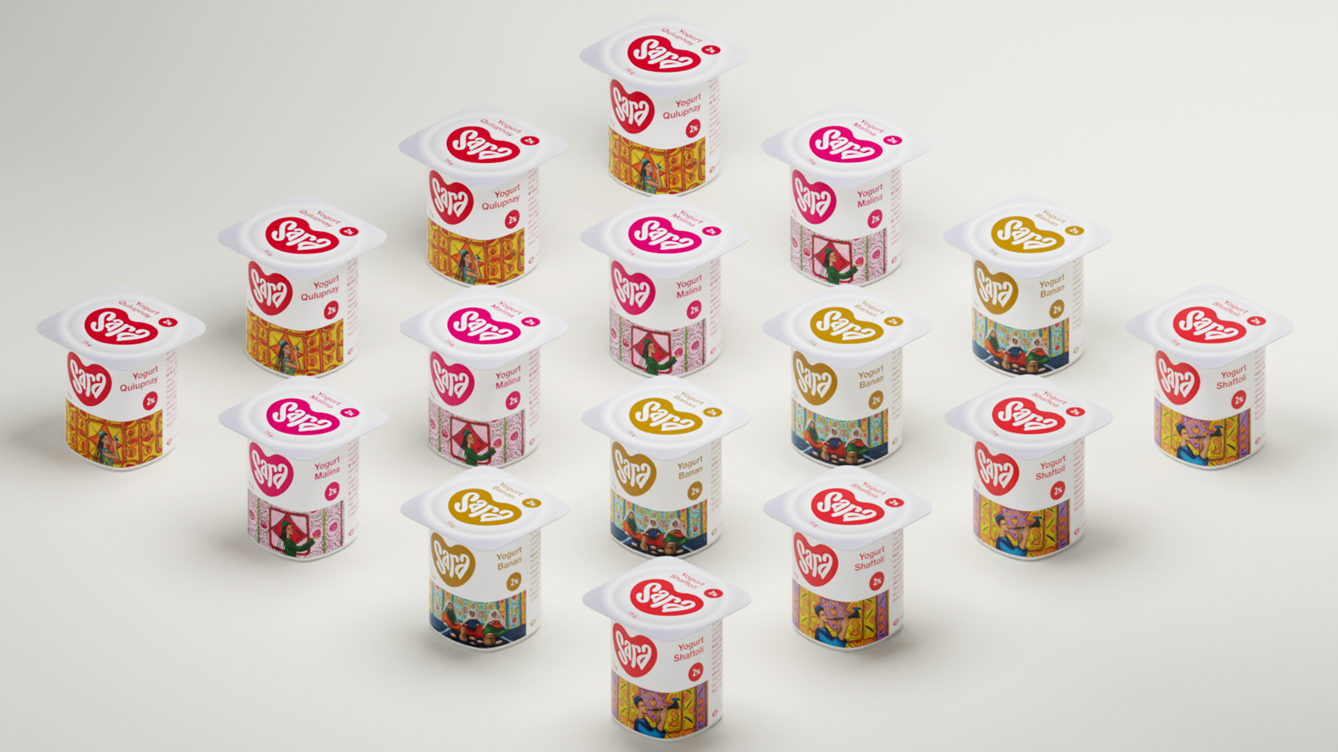
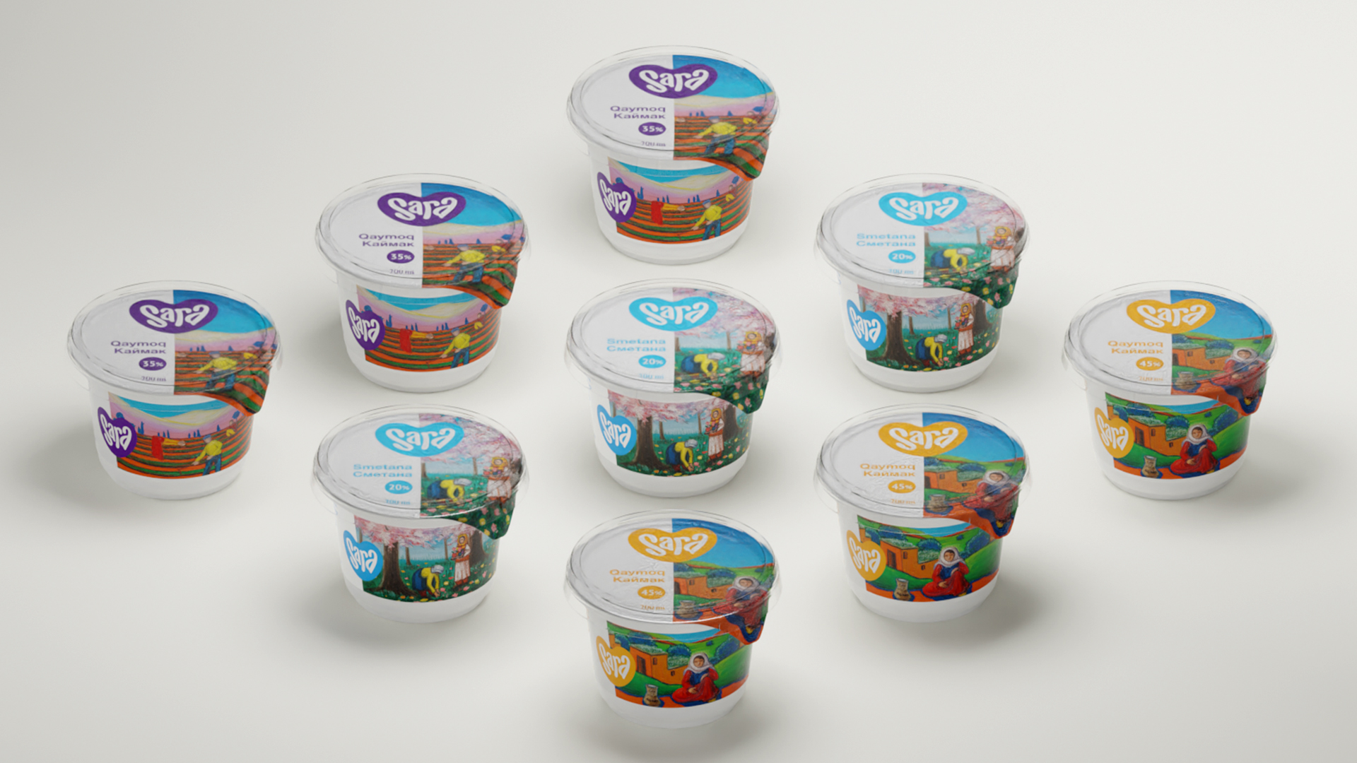
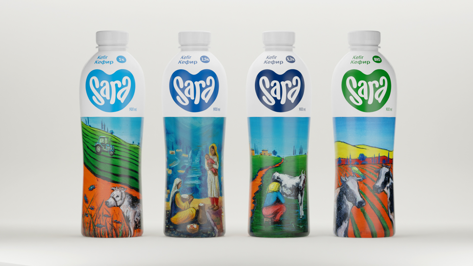
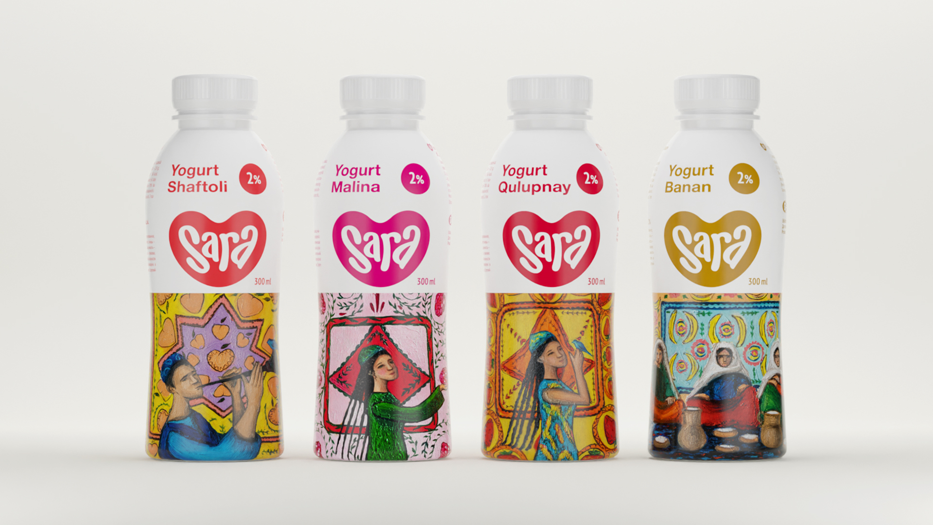
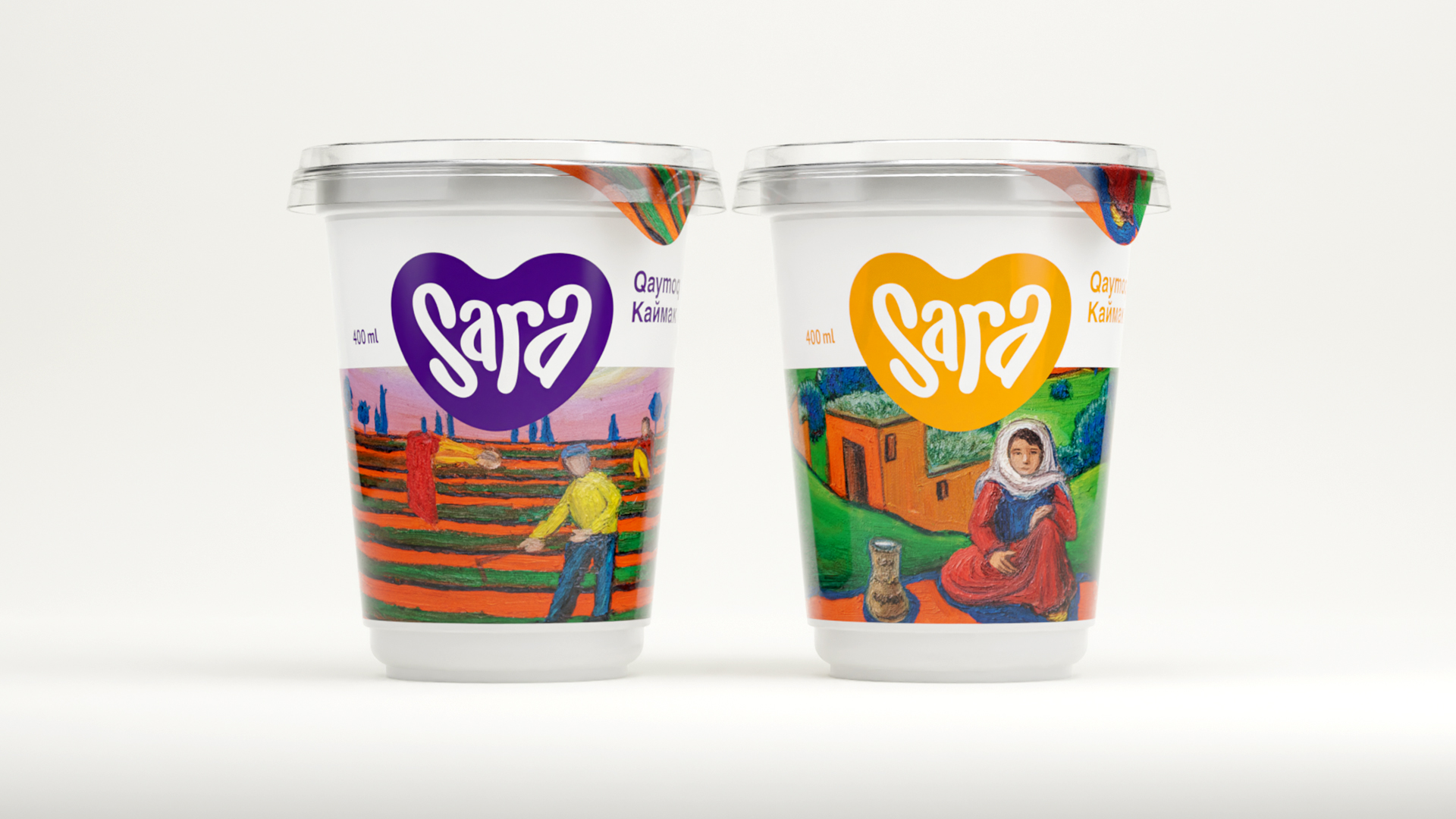
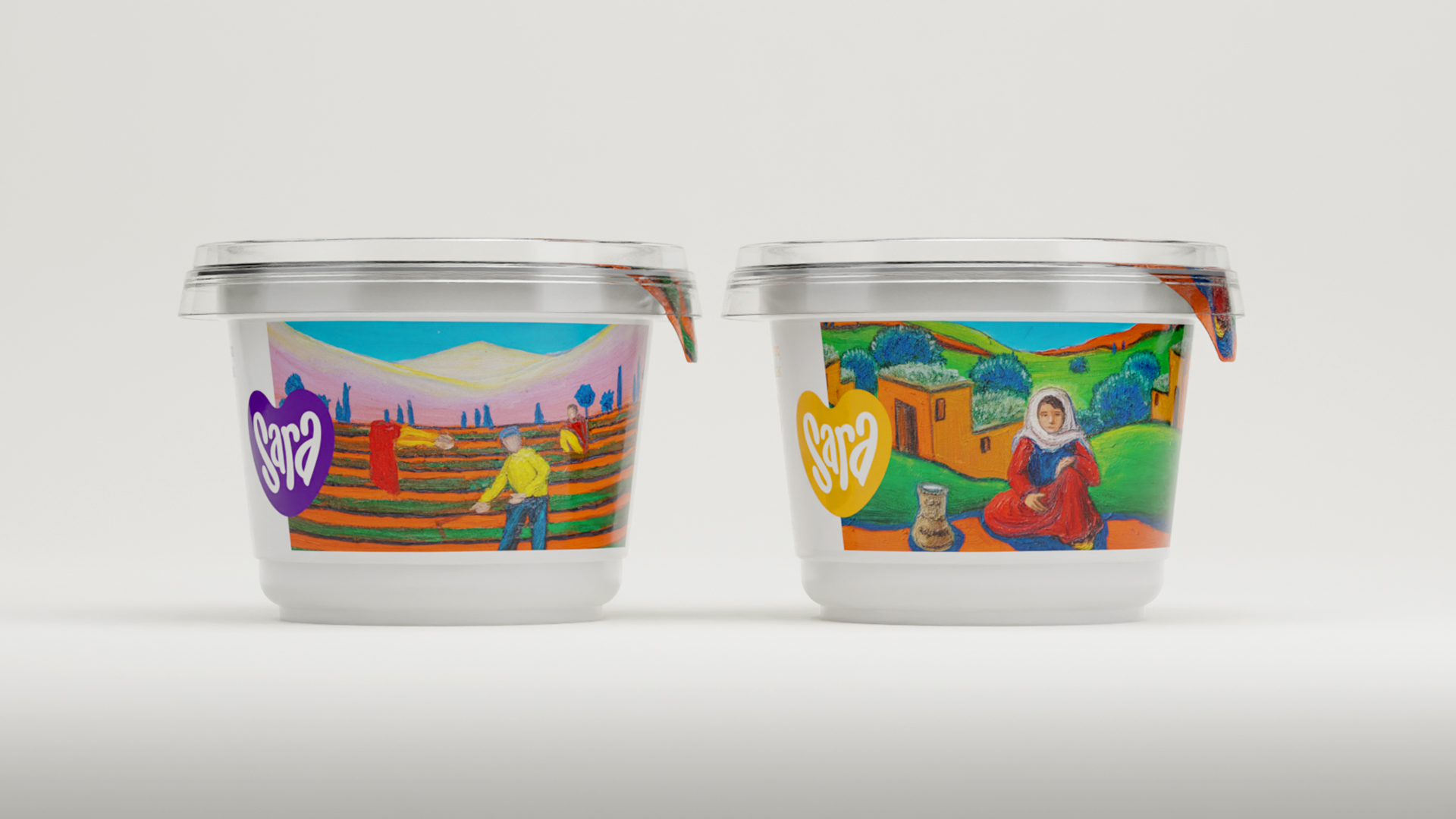
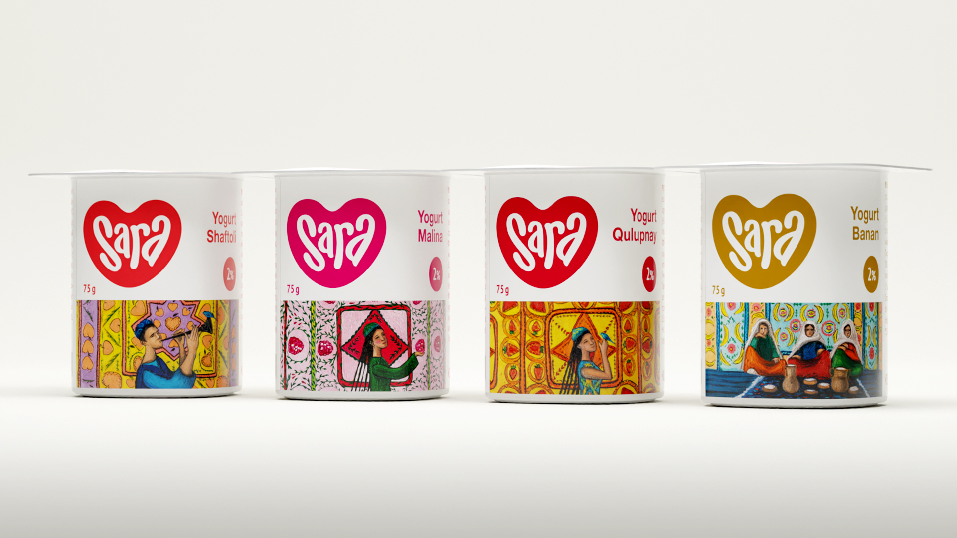
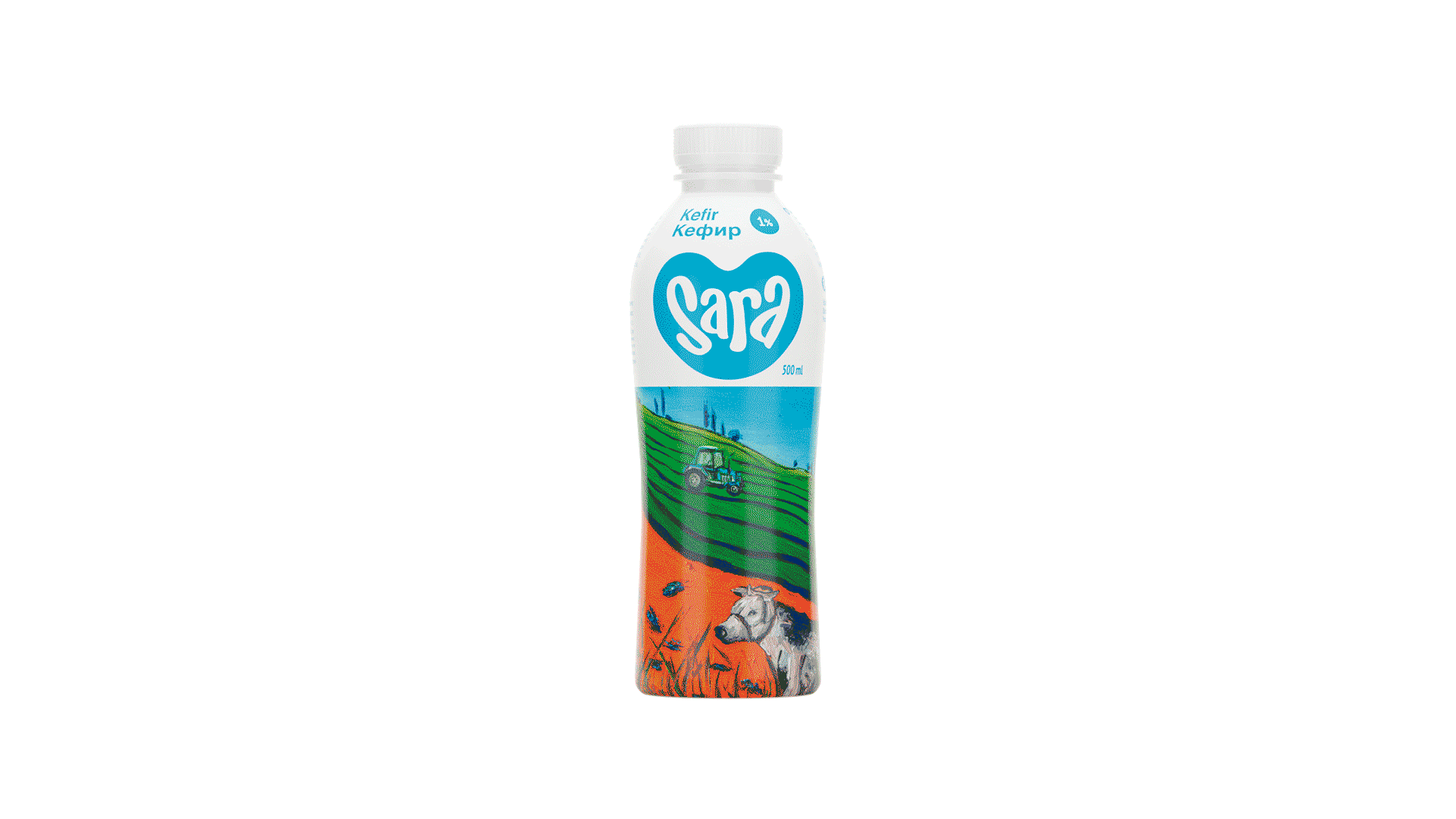
In developing our package identity, we decided not to replicate the usual abstract design or patterns, but to show the rural life of farmers familiar to every Uzbekistani. This is a tribute to the industrious people who make milk for our products with their own hands, day in and day out.
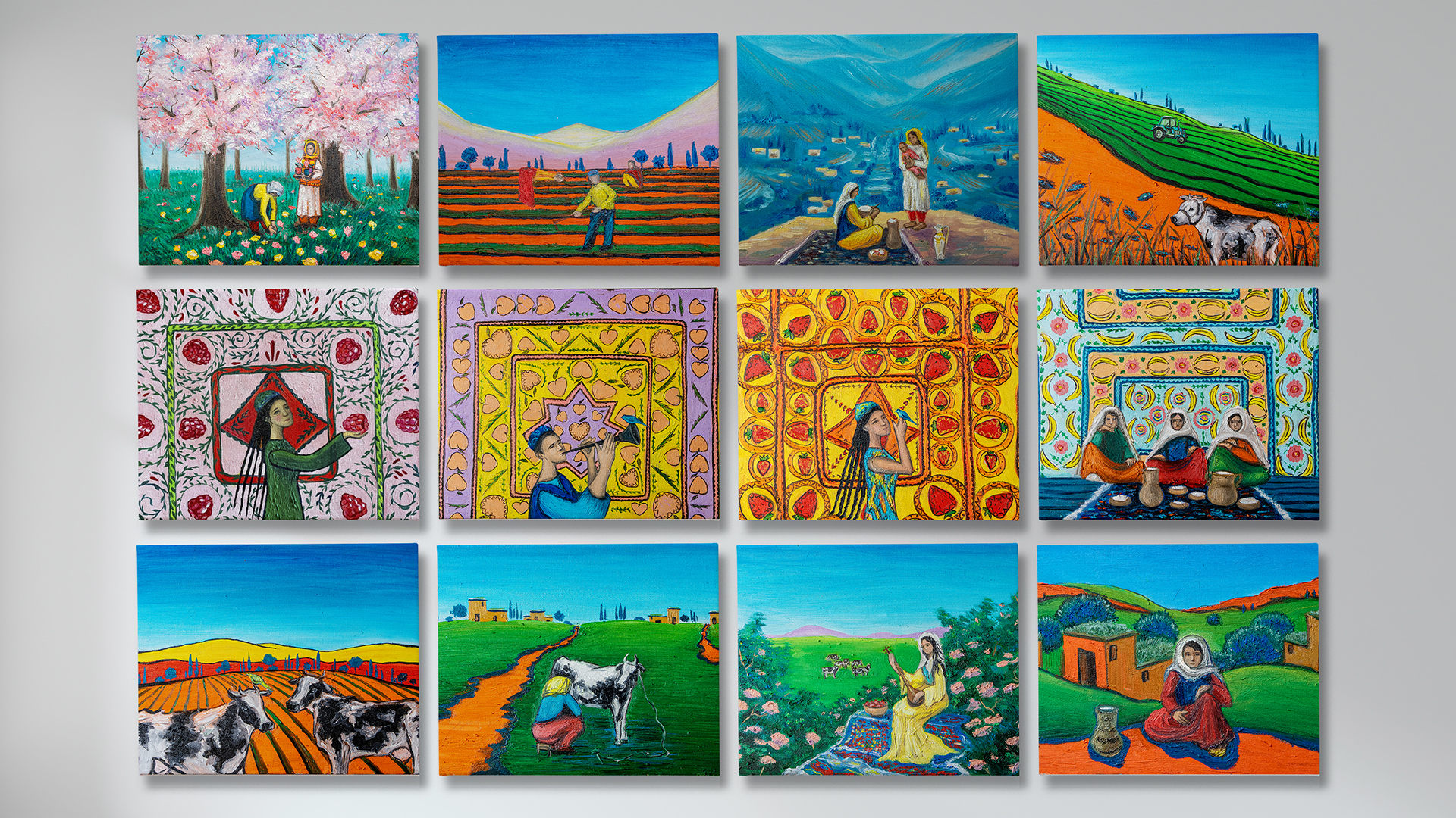
So we created 12 paintings depicting the usual life of hardworking people in detail. Pastoral images, people in national clothes combined with products and flavors create vivid images with color contrasts. Thanks to the paintings, the display shelf turns into a gallery of fine art.
Result:
These 12 paintings formed the basis of the identity. We did not overload the package with unnecessary elements and icons in order to emphasize the illustrations. The white space serves as a mat. SARA's packaging identity is about people who work with bare hands to bring milk to the ordinary people. The stories so familiar to every local evoke an emotional response and give rise to the right association of quality and naturalness of the product which, in turn, creates trust in the brand. Thus, the design of these packages does not imitate other manufacturers, and strongly distinguishes the brand's products on the dairy shelf.