Branding of Qaragandy Region
Клиент
SEC Saryarka
Рабочая группа
Creative director – Bakhytzhan Salikhov
Art Director – Olga Cheglakova
Art Director – Gulim Almabayeva
Project Manager – Elena Utyasheva
Account Manager – Svetlana Coi
Задача
THE PROBLEM
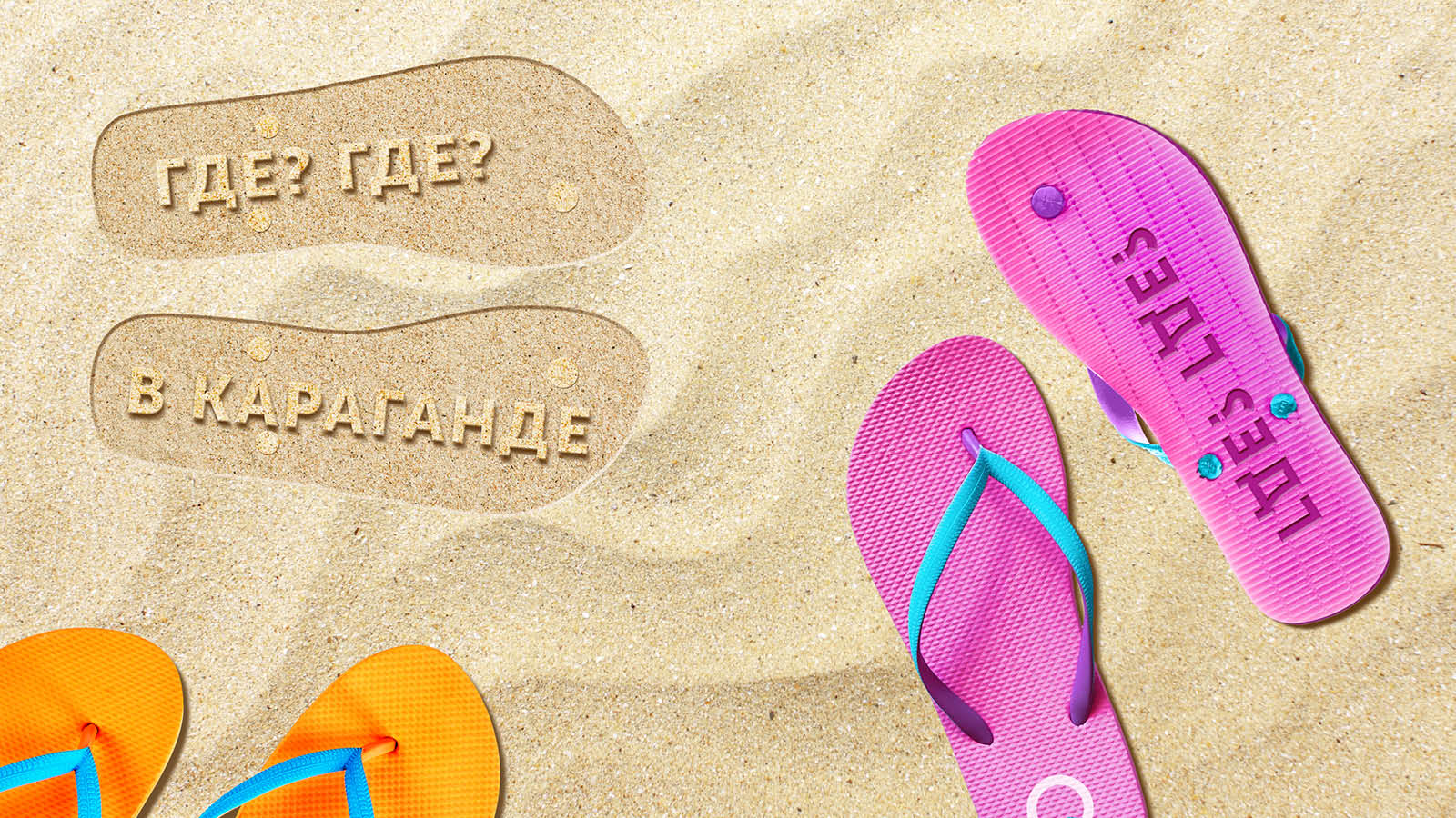
The largest region of the country: a territory where the “point of inaccessibility” is located (you can google to learn what this means), where there are huge basins in which you cannot swim(1), because they are coal basins, a region that is well-known throughout the CIS thanks to the rhymed answer to the question “Where-where?”(2), does not have its own logo. It has a coat of arms, but does not have a logo!
THE TASK
Create a concise, attractive, modern and easy-to-use logo and brand book under a quasi-public order as a private initiative, absolutely free of charge.
THE SOLUTION
Having been impressed by the film The Shape of Water (“Your jellied fish is one nasty thing”), the creative team came up with the “The Shapes of QARAGANDY REGION” concept!
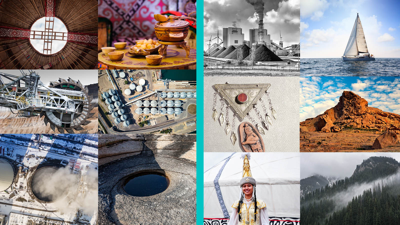
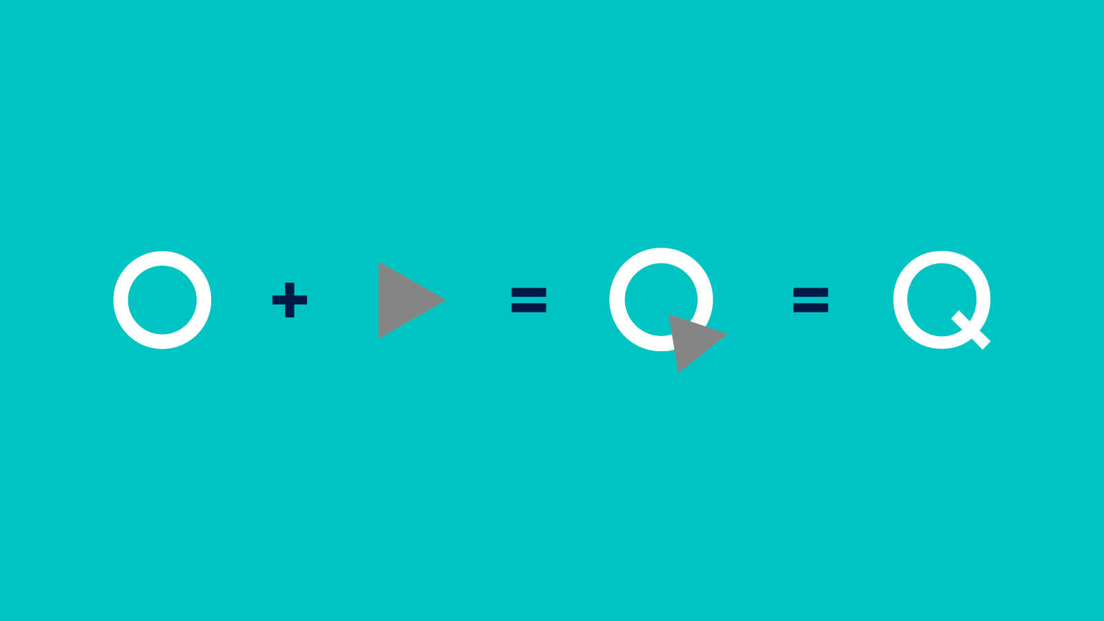
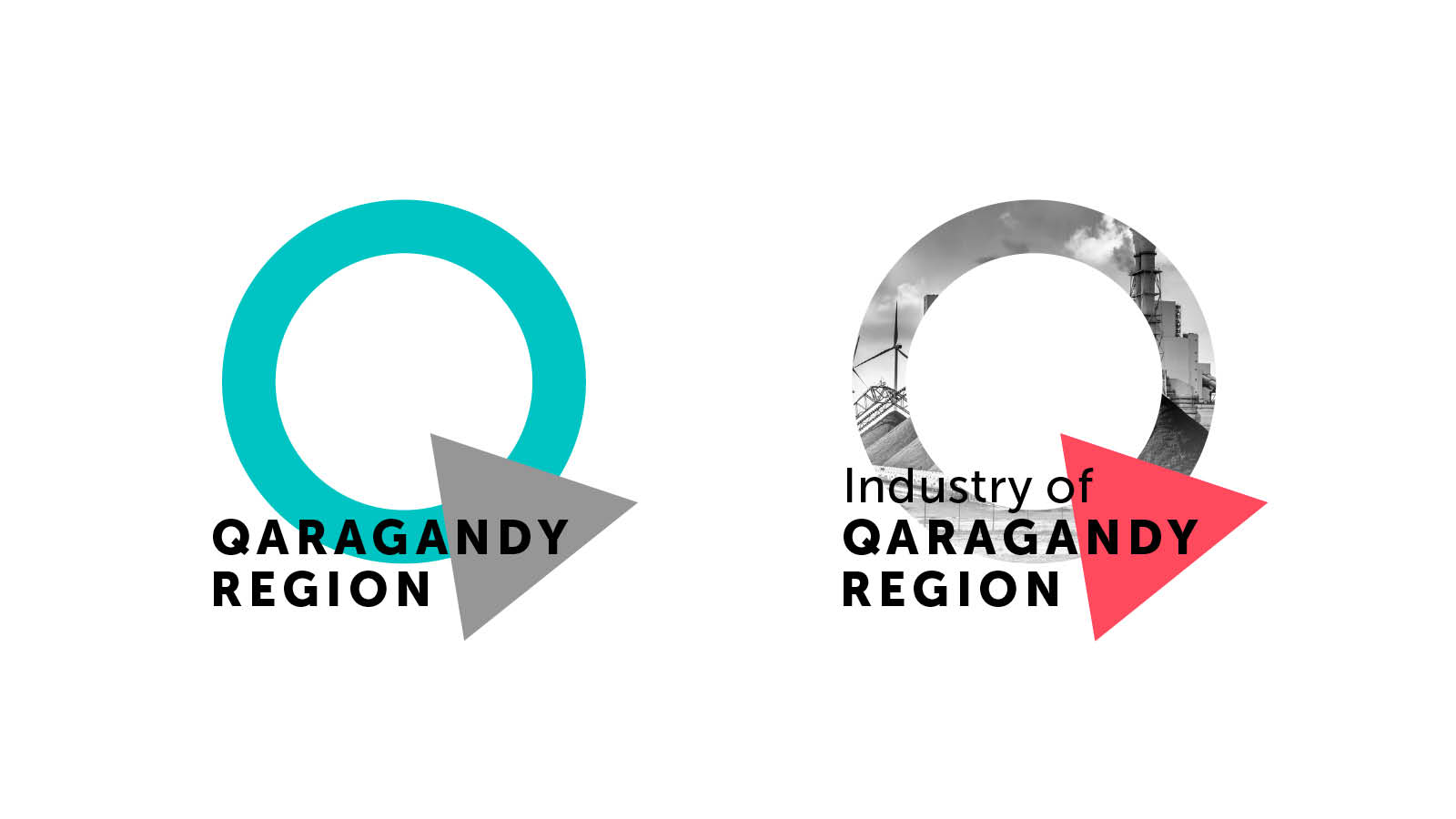
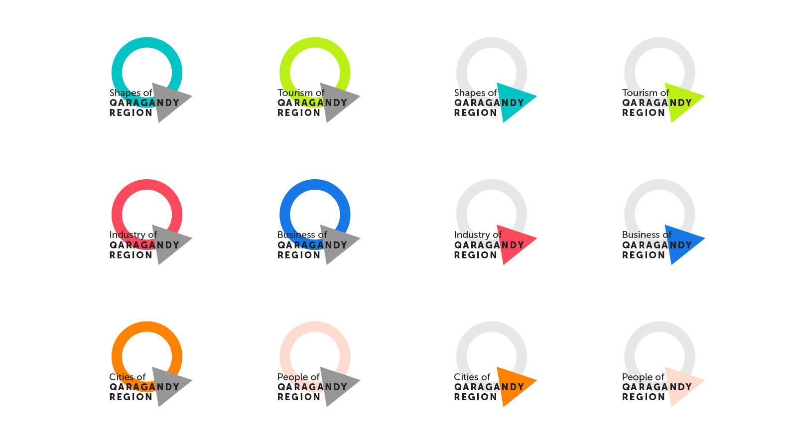
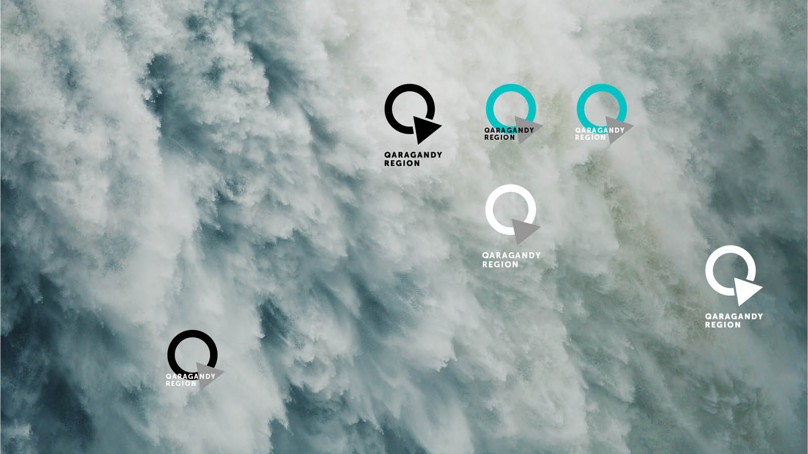
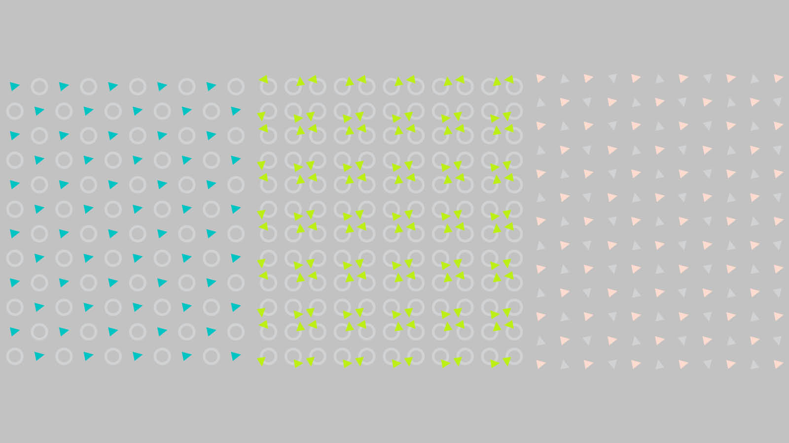
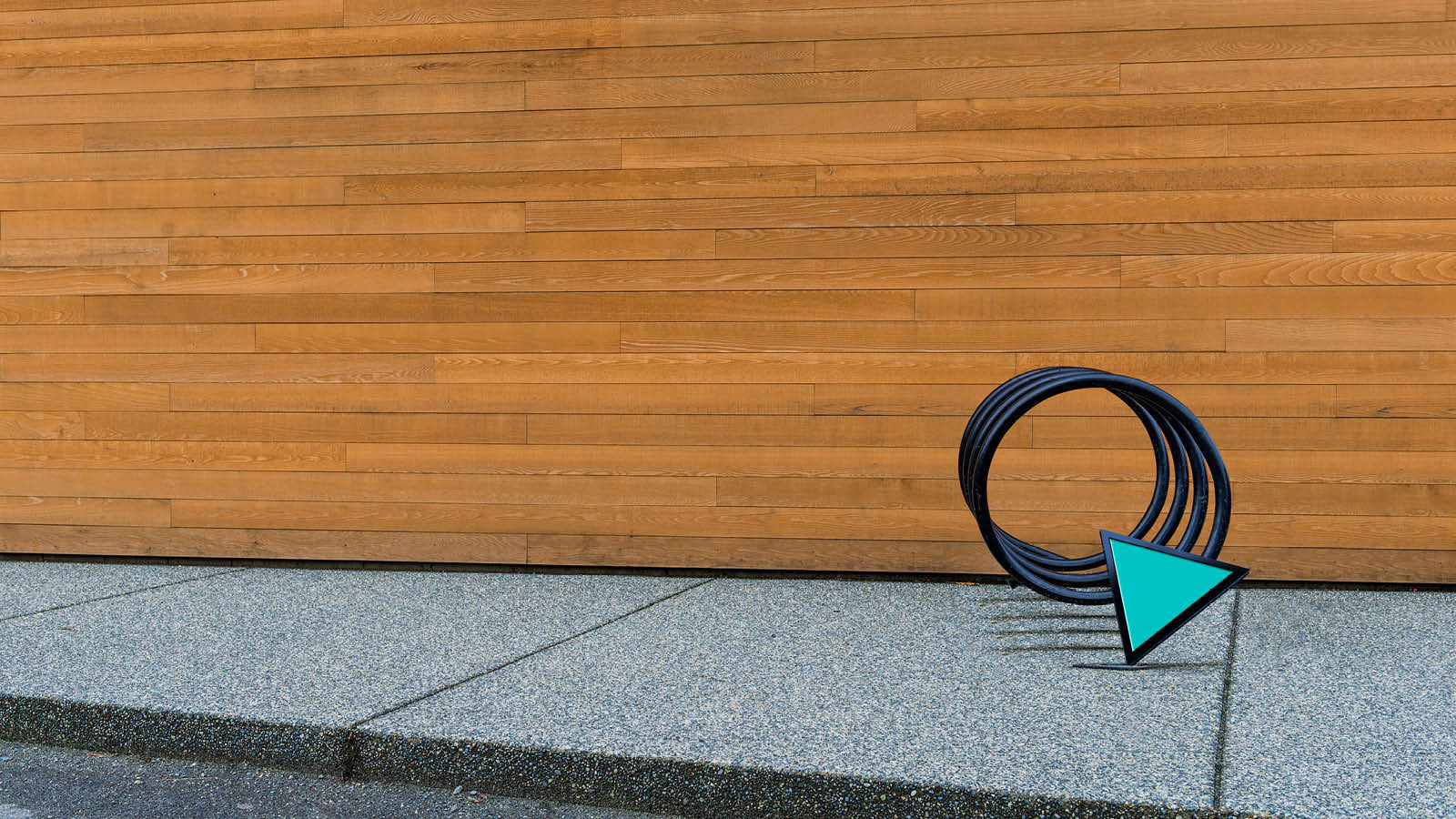
According to the concept, the Karaganda Region could be characterized by three shapes - circle, triangle and rectangle.
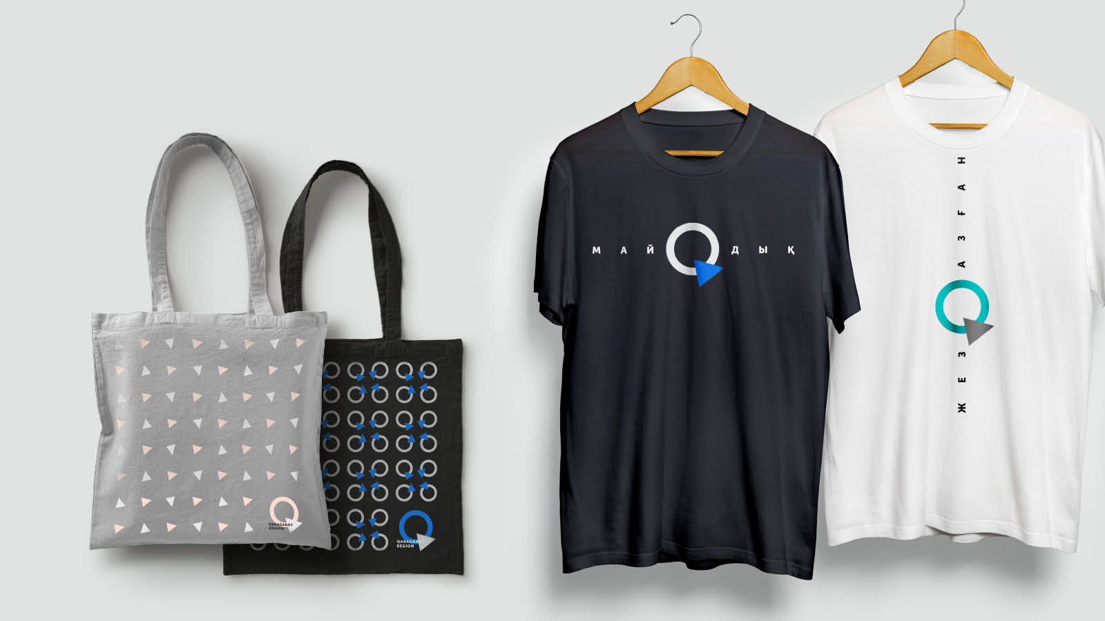
The shape of the circle is associated with a shanyrak(3), a yurt(4), the world, the Kazakh word “Ainalaiyn”! The triangle is one of the most ancient and most universal symbols. The sacral meaning of the figure three - three zhuzes(5) (үш жүз), three bies(6) (үш би), three virtues (үш қасиет) and much more are ingrained into the Kazakh culture as a whole. The rectangle appears only as part of the promotion campaign.
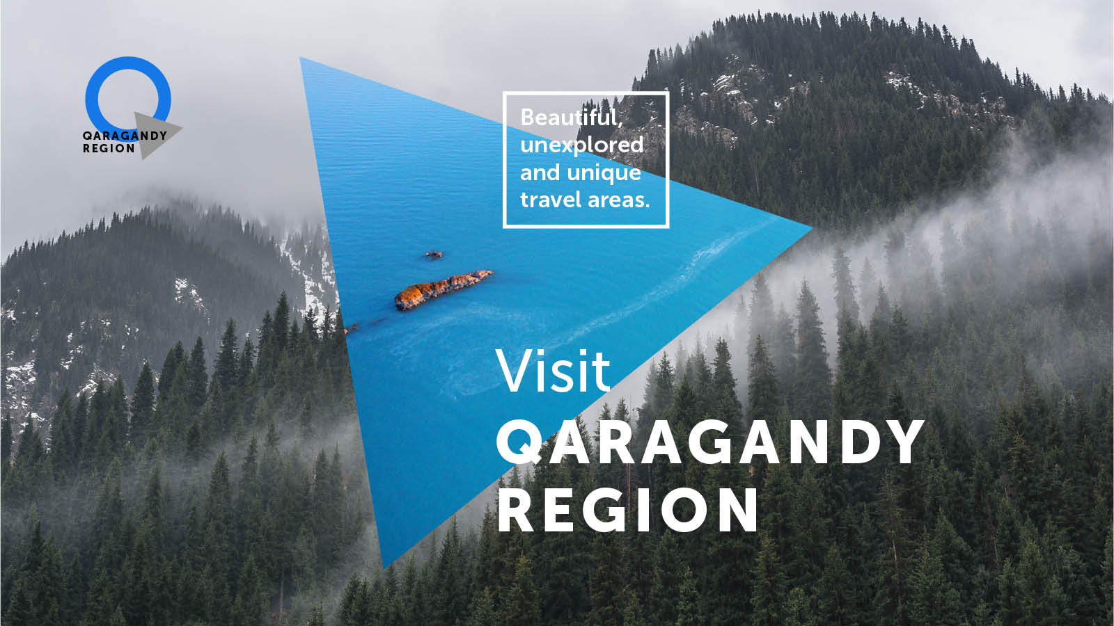
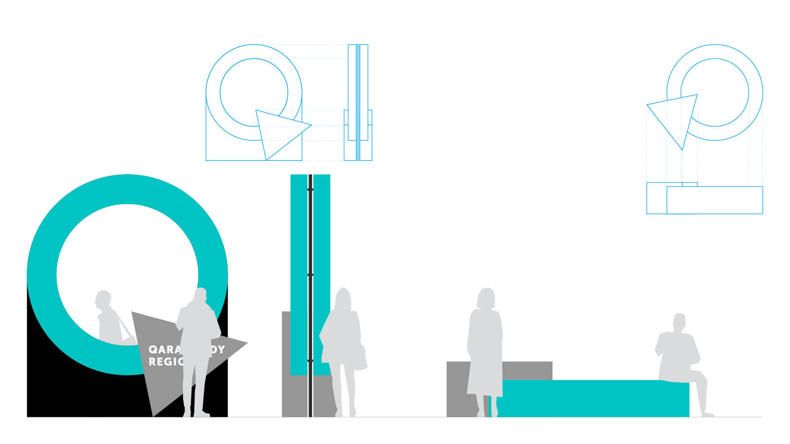
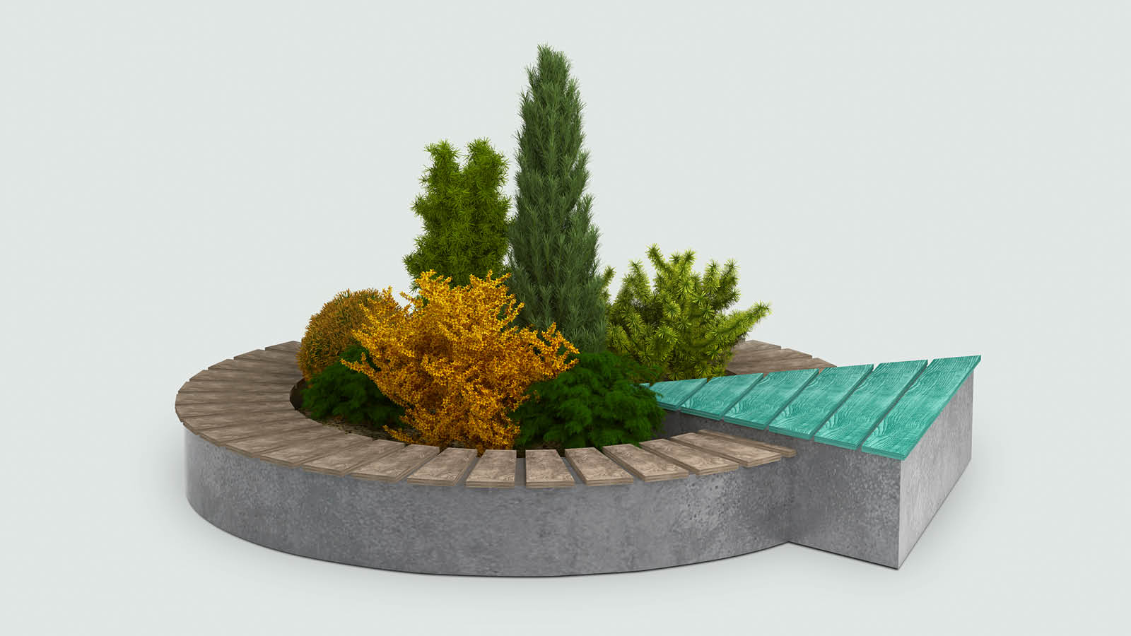
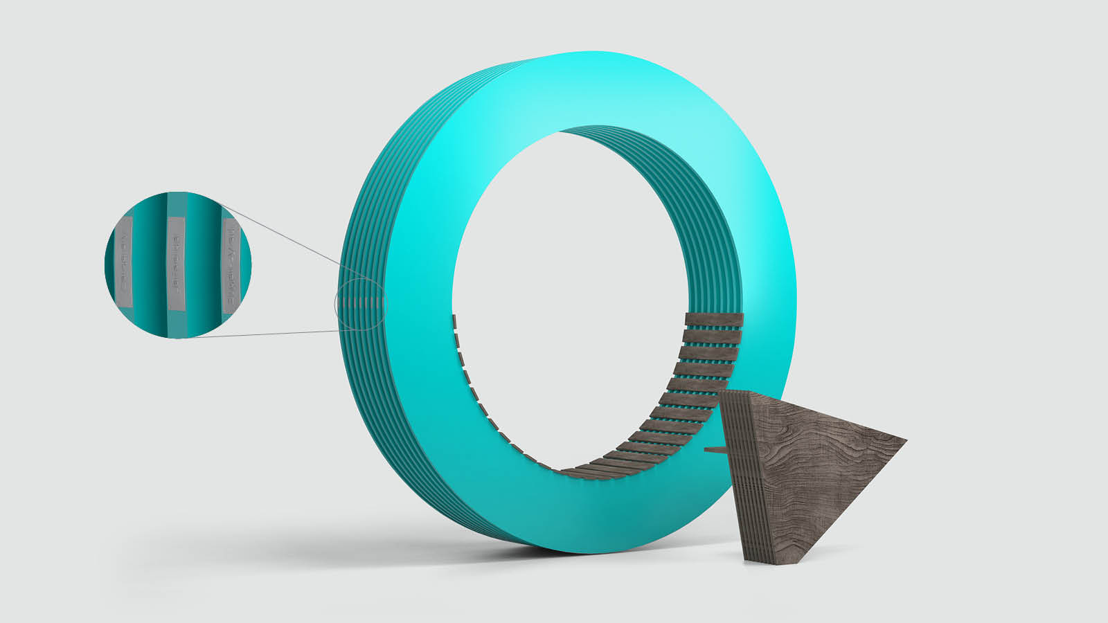
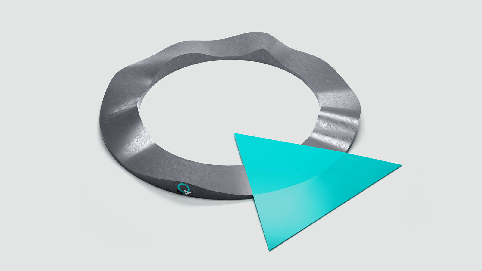
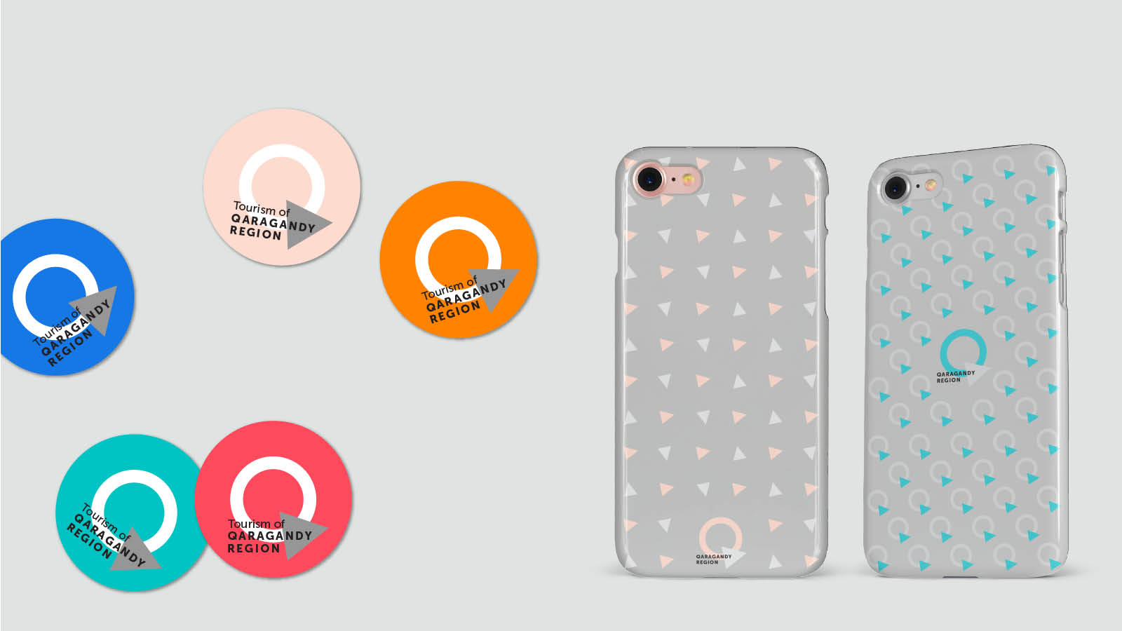
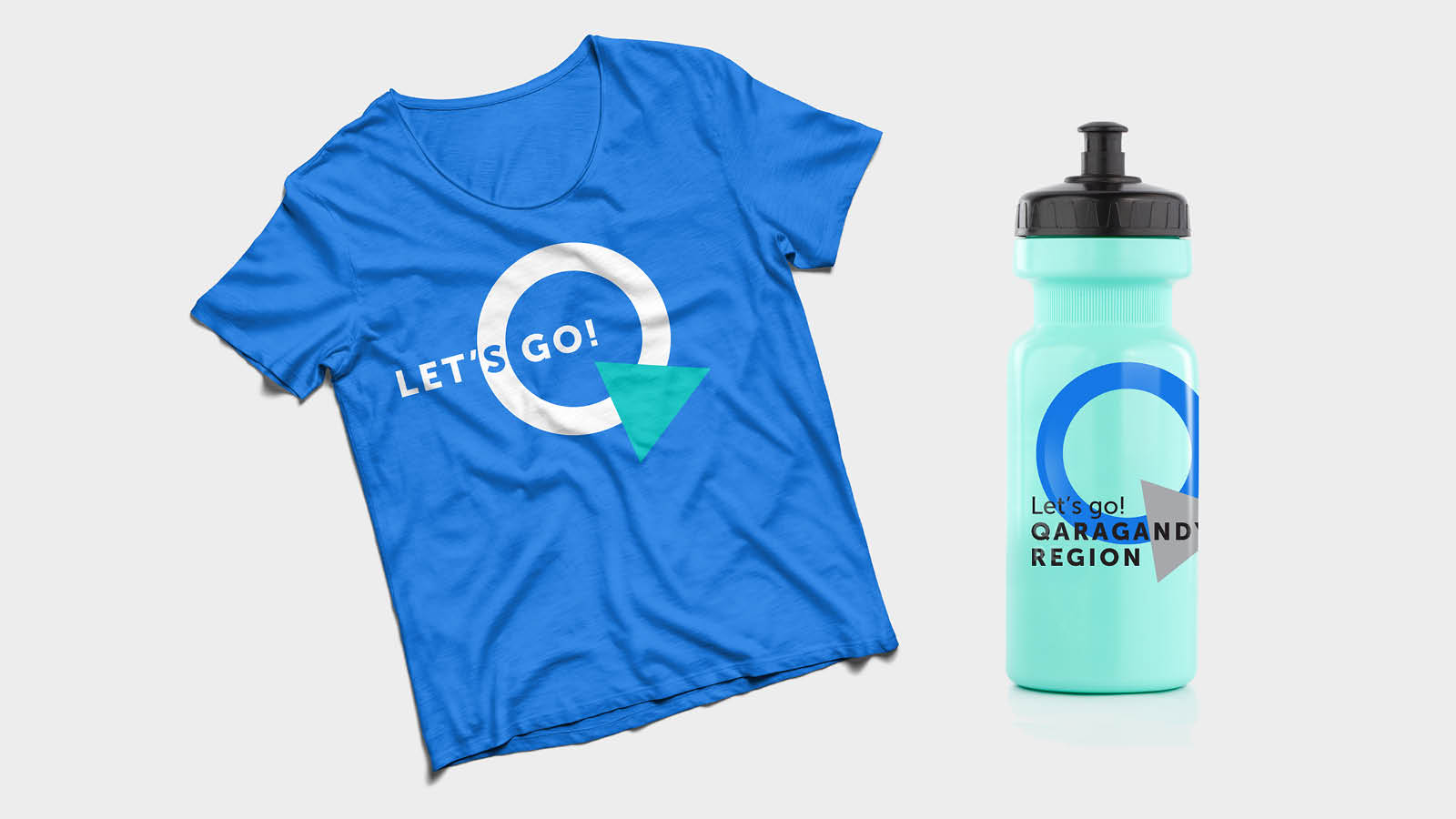
The circle and the triangle became the main components, we composed a “Q” symbol out of them, which is the first letter of the region name in Kazakh in the Latin alphabet (the Latin alphabet has not been adopted yet, but we have already used it). According to the concept, since the form can and should be filled in with content, pictures can be inserted into the circle and the triangle and can show a new aspect of the Karaganda Region every time. Texts in key visuals are to be inserted into the rectangle.
RESULTS
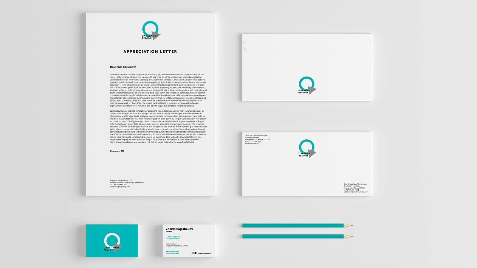
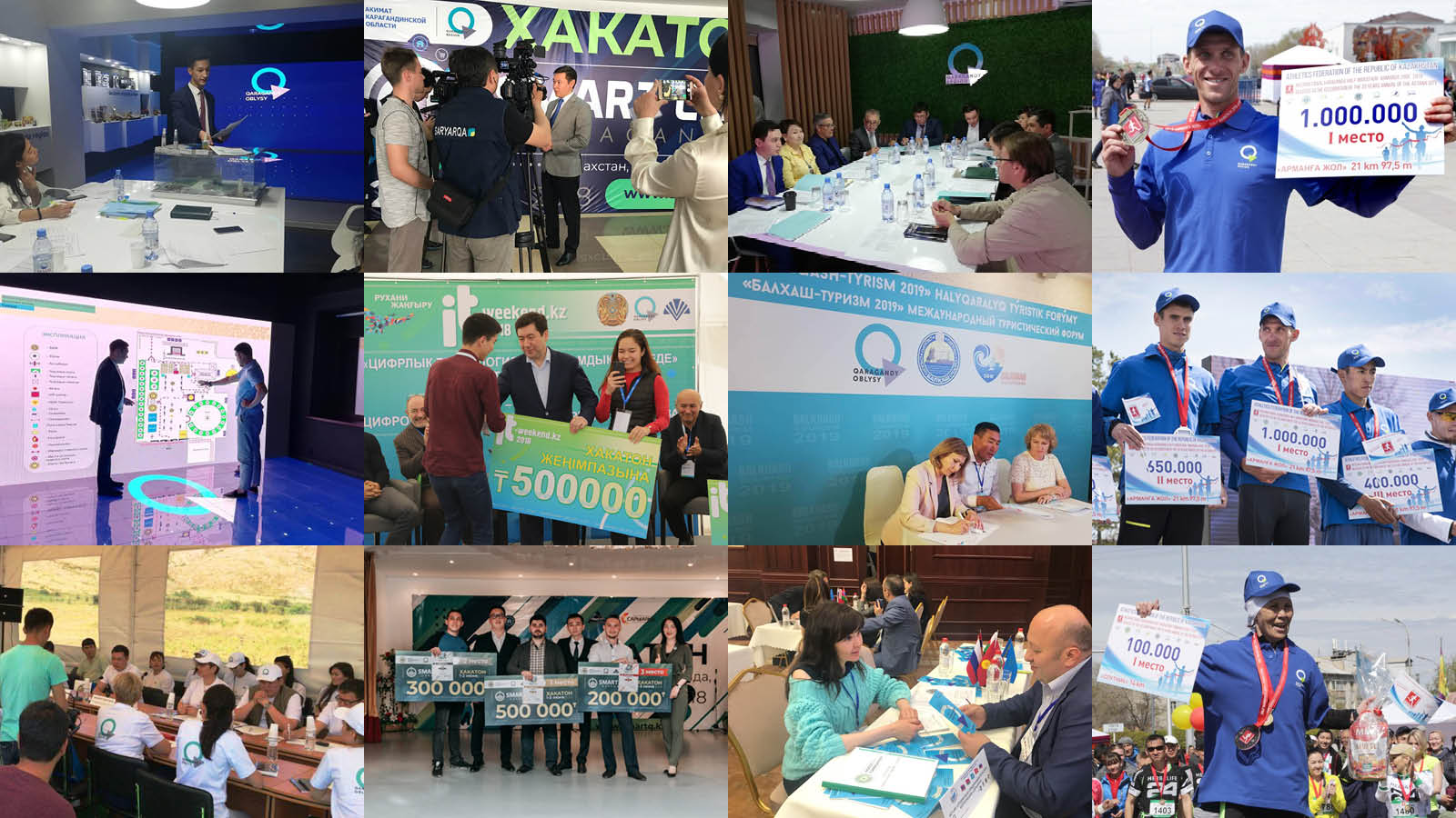
The logo had been approved and was immediately put into use; it first appeared on Karaganda City Marathon in early May 2018. Then we started to get things rolling – regional hackathons, Jezkiik festival, city events and meetings in the Akimat, 24 videos for social media, 2 films in 4 languages: (Kazakh, Russian, English, Chinese) for international road shows, dozens of official documents, presentations abroad, etc. The logo is continuing to be implemented; the logo is marching around the country!
(1) In Russian the words “swimming pool” and “basin” (“coal basin”) are homonyms, therefore, it should be said that you cannot swim in those basins.
(2) In Soviet Union, there was a widely-known rhymed answer in Russian to the question “Where?” – “In Karaganda”.
(3) Shanyrak is a circle-shaped structural part topping the yurt’s dome.
(4) Yurt – is a portable, round tent covered with skins or felt and used as a dwelling by Kazakhs.
(5) Zhuzes – Kazakh tribal unions.
(6) Bies – “judges” in Kazakh.